How to Create A Stunning Minimalist UX Design

Created by Alex Sav -
The importance of user experience design is pretty much on top of the list for web or app projects. It is especially true when you consider the advance of application, brand, the web design. However, when you pay attention to the fads, it appears that the UX design has been getting a lot of transformation. Converting into the good one is what you can learn.
The idea of a good one mostly relates to the surging change of taste. The current end-user ideas have focused on less is more aesthetic. The idea heavily implies the use of function and minimalist touch. This kind of UX design is not putting a heavy load on features. Rather, they focus on function and performance.
The unique point is that the stunning minimalist UX design means one does not need to put too much into their work. In other words, going the extra mile is not always better. In this case, the principle is one of a kind that makes the current fads can hit varying targets. Yes, it is the best way to capture attention in many possible conditions. But, how to design it? Let's learn it.

Created by Alex Sav
About Minimalist Approach
Before you start the UX design, it is better to know the details about the concept. In this case, the terms simple, minimalist, and elegant are pretty much associated with each other. The three concepts become one as they can bump up the UX effectiveness. At the same time, they are always making the scheme have a better aesthetically pleasing focus.
At the same time, the method does help reach out to almost all of the diverse fields of human activity and interest. The point is that minimalism will be one of the design areas that can be used in many areas. It is also considered as a simple intake, approach, or exposure toward something while still emphasizing conveying the message.
Surprisingly, there are many ways to explain and introduce the method. You can say that a minimalist design is to focus on function and decrease any unnecessary details. At the same time, you can also interpret the idea as a simplistic, elegant, and aesthetic approach to the project. The point is aesthetic, simple, and functions.

Created by Saturn Design
So, how does it work as a minimalist UX design? In this field of work, you can say that the method has a more significant effect. It is because the theory helps enhance the wide range of users and functions. At the same time, the interaction and progression of the UX will be up to the roof. It means that the website and application, in particular, will have performance upgrades.
Organizing such themes and UX is not easy. One of the reasons comes from the fact that a website means a lot for the brand or the product. One needs to pay attention to the audience interaction, action, and interest in the UX. Thus, even the minimalist and simplistic approach can turn into a complex project.
While the creation point is pretty complicated, the result is what many audiences are looking for. Minimalist design in UX helps create an uncomplicated portrayal and function for the website. It turns into a method that helps the UX design free from the clutter, noises, and less important points. Thus, the audience can get straight to the message or learn the details.

Created by Roman Lel
How One Can Categorize The Design
Regardless of what kind of field or product that uses the method, there are points where you can describe the influence as most of the UX, application, or design, in general, will try to feature some of the essential characteristics of the minimalistic approach. Some of them have been mentioned in the previous parts, which are simplicity, function, and clarity.
But to make it even better to learn, those who want to make a minimalist UX design will need something to jot down. The characteristic is not only about the three; you also need to consider the meaningful expression. To highlight the point, many designers will use pictures, graphics, or illustrations. Thus, the audience can capture the message from the simple expression.
However, you can also pinpoint the expression through contrast and hierarchy. The practice for this minimalist idea can vary from the field, information, and design. But the typography and the color can depend on the brand identity. Moving on to the next characteristic is the proportion and compositions.
The point of the minimalist design is to help people see elegant, clear, and easy-to-understand details. Thus, composition and proportion are the keys. Many UX designs will pay attention to the white space and typography to make the web better. The functionality will be the next thing to see.

Created by YULIIA MEI
In this case, the UX design works the best with the method. The reason goes to the fact that every element in your UX will give a clear function rather than a mere decoration. While it does not mean that you are not allowed to make decorations, the amount of superfluous elements is greatly reduced.
Some other characteristics of minimalism are the core detail, ratio balance, typography beauty, and the use of sufficient vacant space. You can see that all of the characters do not display any specific theme, field, or activities. It means that people can use the method for any web or application design. It also explains that the method has a high versatility objective.
The best thing to point out about the minimalistic design is the user-friendly traits. The particular point brings out the best use of UX, which should present user-end-focused design. That is why the motive and the element in this particular theme are pretty clear and simple. When the minimalist UX design is done right, it will bring an effective and spontaneous aspect.
Again, adopting such a powerful method is not an easy feat. It can give a sophisticated look, elegant, and fit any kind of field. But when the designer did not heed any details and just put anything simple. The minimalist concept will lose its main point, which is functional and also aesthetic. So, how exactly does it works in UX design? Read further for the details.

Created by Nikiprojek
How It Affect And Work In UI And UX Work
At this point, you might have learned and read all of the possible effects of the theme in the UX world. However, there are some points that you should understand how the minimalistic theme can work or destroy your project. How so? UX is a pretty sensitive project that demands a lot of consideration. It is because you are dealing with brand and viewer.
That is why many designers that are interested in doing a minimalist UX design will pay more attention to certain elements. The best pinpoint is not only simple and functional. But, the minimalist design should also enhance the visual. It is where the project gets more complicated. How can a simple and limited element fascinate people?
The answers are on the use of subtle and carefully selected elements. The texture, color, and fonts should be useful as well as bring an uncomplicated experience for the user. How? Precision and targeted ideas. Using the minimalist approach means the UI and UX should be simple but also not empty or meaningless.

Created by Elina Liubinskaya
Every element and the spot on the work will have meaning or function. So, everything will feel like one part of having a sense of inclusion. At the same time, the minimalist idea also makes the UX design have an elegant and stylistic touch. It means that the element will not turn into an unnecessary non-functional decorative foundation. Rather, everything has meaning.
In websites and applications, such a minimalist design is the key to better performance. Less decorative items, non-sense addition, and features will make the web or app load faster. The viewer and users also have direct exposure to the product elements. Thus, it enhances the chance of them understanding the message without getting distracted by other features.

Created by Roman Yarmishko
Things To Pinpoint On Minimalist UX
Yes, the UX design is a good practice and an example of the minimalist approach. Many websites already use the idea to deliver the functionality rather than the heavy product introduction. The best example is the Google search main page. The company makes a straightforward message and highlights the function with fewer features or elements on the page.
It puts the main function in the middle of the screen, uses colorful tags to make it stand out, and avoids distracting pictures surrounding it. Thus, Google has nailed the idea of incorporating whitespace as part of the minimalist UX design. It makes the site easier to use and understand. So, from the example, you can underline some points to consider.
1. White Space And Flat Design
Google shows the good use of white space and flat design. You can see how the negative space between content and the main function itself is highlighted by the composition. At the same time, the plan itself is pretty simple, with the main usage in the center of the page. It also uses flat designs such as font to logo to emphasize the function and aesthetic.

Created by MD Moin Uddin
2. Only Use Important Content
One thing that also makes the Google main page nail the minimalist UX design idea is how it only uses the necessary content. Regardless of any event or background, the main page will only feature the main function. That is why it can make a simple approach and also emphasize the function. You can do the same by eliminating unnecessary elements.

Created by Roman Lel
3. Using Contrast To Pinpoint Emphasize
Minimalist UX can look amazing and also unexpectedly direct with the use of contrast. This is where you will need to apply high contrast to help pinpoint the function and the message. If you look at Google's main page, the company put the colorful logo along with a search bar. It helps people see the main function and element of the site.
The site also uses white space around it with less decoration if it is not necessary. Even though they have unique events, they do it by putting the contrast right in the middle. Thus, people or users still understand the main message and function. The use of contrast helps drive people's attention to certain areas, which you can use in UX design with minimalist concepts.

Created by Roman Lel
4. Straightforward Typography
The point of simple and minimalist goes along with a straightforward approach. And one of the essentials that you can use is typography. In this case, a bold and not too fancy typeface is mostly popular. However, it does not mean you have to use Calibri or Arial. Minimalist UX design also pays attention to the aesthetic point of view.
So, your typography should be clean, straightforward, emphasize the content, and aesthetically pleasing. The point is to consider the typography and its hierarchy. Take a look at many professional, elegant minimalist web UX. You can see how the font, size, weight, kerning, spacing, and arrangement make the look.

Created by Lucía Vega
5. Adding Photos And Graphic
The minimalist approach does not always fear a picture or graphic element. In many cases, the use of images is the vital point of the UX design. The illustration can explain the element function, back up the message, convey more emotion, and complete the project. However, the element can also turn into a disaster. So, mind the number and its purpose.

Created by Roman Lel
Implementing The Principal
From the previous points, you can pinpoint that UX design with a simplistic and minimalistic approach demands a lot of attention. You have to look for the functionality over numbers. However, it also needs to be an aesthetically pleasing project. So, if you are interested in using it for a UX project, try these practices.
1. Focus On The Main Element
The first thing that you should consider is the main element. What kind of role that you want to deliver to the users? Do you want to show information, help, or offer a service? If you know the main purpose of the UX, it will be easier to point out the minimalist elements. As an example, a website that gives information about a product.
It means that the main element is the body and the text. To make it the center, you should direct the audience to it. In this case of minimalist UX Design, you can play around with the typography, arrangement, contrast, etc. Try to eliminate unnecessary details such as unrelated pictures or moving animation. It will only deter people's attention and miss the focal message.

Created by Roman Lel
2. Simplify The Text And Body
The idea of simplifying the text and body is not only for writing-heavy content. You can also use it to emphasize some other elements such as the diagram, graphic, or details. The best idea that you can take from this point is to get rid of the exercise copy in the content. Remember that pictures or illustrations can tell more than text.
So, to avoid being a lackluster UX design, you can opt out of the copy. Try to emphasize the graphics and the content. If you want to explain further, use a different page. So, people can focus on every information and detail you have in it. The minimalist UX can look very simple, but it still highlights the point and helps deliver the important message.

Created by Kamron Dalimov
3. Use Functional Animation
Again, the point of a minimalist plan is to strip down unnecessary features. Adding animation can either help or make the work worst. So, be mindful of it. If you think functional animation helps people understand the information, it will make the web more effective. But if it is just a decorative display, get rid of it.

Created by SurendarV
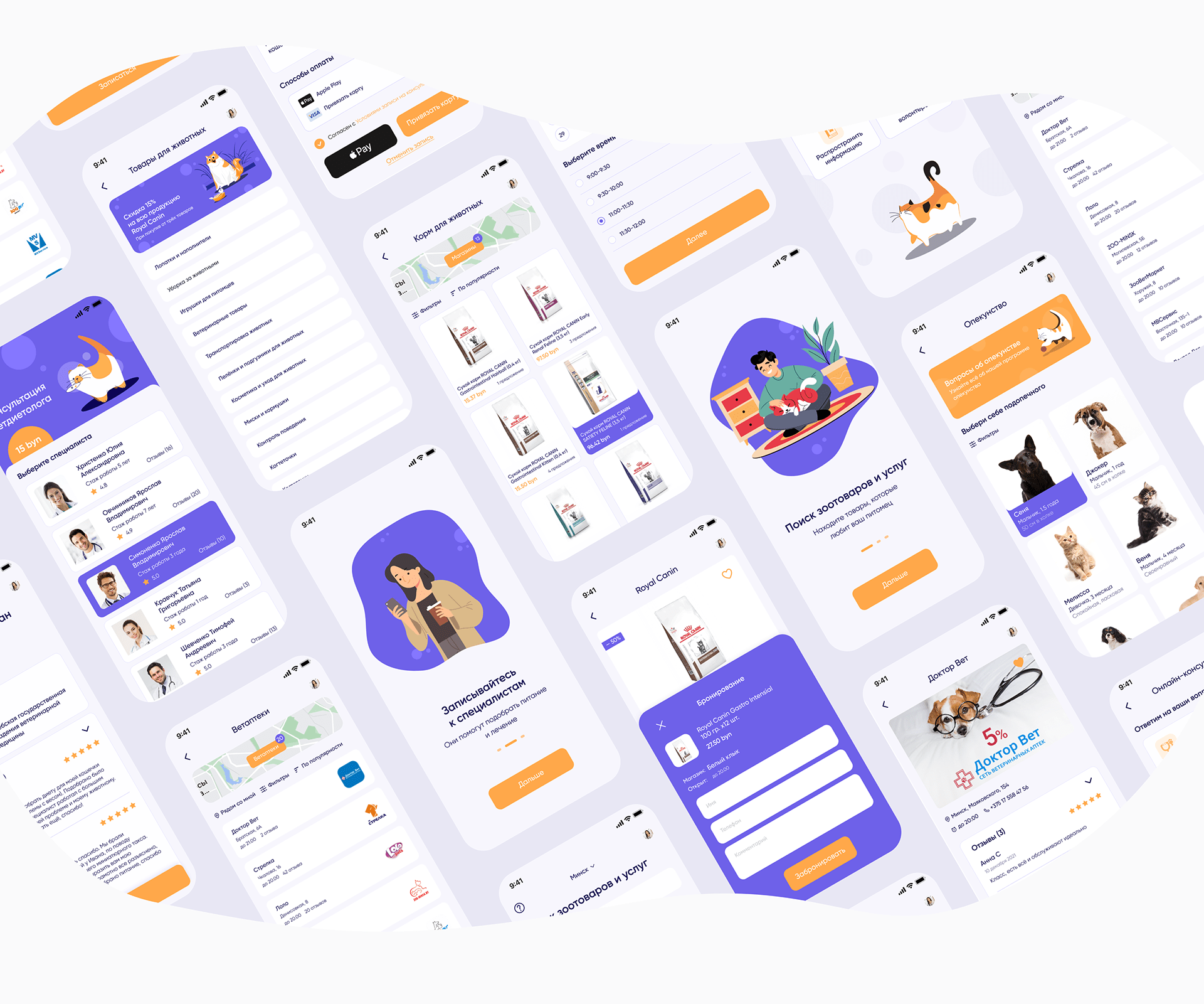
4. Stripping Down Unnecessary Addition
How much unnecessary addition do you need to strip? While minimalist UX design means simple, it does not necessarily force you to kill all of the addition to the point it looks empty. Remember that it should be functional. Adding one or two decorations can work to enhance the aesthetic. So, don't get too overboard with the content features. You only need to make it clean and direct.
Created by Rita Saralidze
5. Function Focused Navigation System
As said, every element needs to have a purpose, so your navigation will also get better. The best benefit of using minimalist for your UX is to make it easier to use. What if you add too many elements to the content and people don't know what to do? For example, you put several buttons and graphics with different landing pages.
Knowing that the UX is lacking direction, people will lose in your work. It is a nightmarish experience for your viewer or users. That is why a minimalist UX design will look up to their navigation. You can also use hierarchical distribution and arrangement. So, they know what the most important point and systems of your website are.

Created by Mohamed Hassan
Conclusion
It is safe to say that the minimalist design in UX is not a new thing. However, the trend has changed the principle, and the idea gained more attention. The lack of superficial features and focus on the function is the key point of the idea. The elements used on the UX are mainly to build high-quality content details and strip down unnecessary features which fit with the modern audience.





Leave a Comment