How to Print Logo Designs on Packaging

Source: DXD Studio, MAOWOO Cat Food Packaging & Identity, Behance, https://www.behance.net/gallery/169305023/MAOWOO-Cat-Food-Packaging-Identity
Printing logo designs on packaging is a critical step in establishing a strong brand presence. Whether for retail boxes, food containers, or shipping packages, a well-printed logo enhances recognition and professionalism. However, the process involves more than just placing a design on a surface—it requires careful consideration of materials, printing techniques, and quality control.
The right printing method ensures that logos remain clear, vibrant, and durable throughout the product's lifecycle. Factors such as packaging material, ink selection, and color accuracy play a crucial role in achieving a high-quality print. Additionally, understanding how different surfaces affect print adhesion can help prevent fading, smudging, or distortion.
With numerous printing options available, businesses should select the most suitable approach based on budget, packaging type, and brand aesthetics. A well-executed printing process ensures consistency, professionalism, and a lasting impression on consumers.
Choose the Right Printing Method
Selecting the right printing method is essential to achieving high-quality results when adding logo designs to packaging. Various printing techniques are available, each offering unique advantages depending on the material, budget, and design complexity.
Offset printing is a widely used method that delivers sharp, high-resolution images with precise color accuracy. It is ideal for large production runs of paper-based packaging, such as boxes and cartons. This method ensures consistent logo quality across multiple prints.
Digital printing is a flexible option suitable for short runs and custom packaging. It allows for quick modifications and eliminates the need for printing plates, making it a cost-effective solution for brands requiring frequent design updates. This method works well for various packaging materials, including paper, plastic, and cardboard.
Flexographic printing is a preferred choice for printing on flexible packaging, such as plastic bags and pouches. It uses rubber printing plates and fast-drying inks, making it an efficient option for high-volume production.
Screen printing is an excellent choice for rigid packaging, including glass, metal, and wood. It produces durable and vibrant prints, ensuring the logo remains visible and long-lasting.
Choosing the appropriate printing method depends on the material, print durability, and production scale. By selecting the right approach, brands can ensure their logo maintains clarity, vibrancy, and professional appeal on all packaging types.
Select High-Quality Materials
The choice of packaging material directly impacts the quality and durability of printed logo designs. Different materials react differently to inks and printing techniques, making it crucial to select the right option for optimal results.
Paper-based materials, such as cardboard and kraft paper, are commonly used for retail and shipping packaging. These surfaces work well with offset and digital printing, allowing for sharp and detailed logo designs. Additionally, they can be coated or laminated to enhance durability and aesthetic appeal.
Plastic packaging is frequently used for food, cosmetics, and consumer goods. Depending on the type of plastic, certain printing methods, such as flexographic or digital printing, are better suited to ensure ink adhesion and resistance to wear. Some plastics may require pre-treatment, such as corona treatment, to improve print quality.
Glass and metal packaging present unique challenges due to their non-porous surfaces. Screen printing and UV printing are excellent choices for achieving vibrant and long-lasting prints. These methods ensure that logos remain intact even under varying temperature conditions and frequent handling.
Eco-friendly materials, such as biodegradable paper, compostable plastics, and recycled cardboard, require specialized inks and printing methods to maintain quality while staying sustainable. Water-based and soy-based inks are often preferred for environmentally responsible printing.
Selecting high-quality materials ensures that printed logos maintain their appearance and durability. The right combination of material and printing technique enhances brand presentation and provides a professional finish to product packaging.
Ensure High-Resolution Logo Files
Using high-resolution logo files is essential for achieving sharp and professional results when printing on packaging. Low-resolution images can lead to pixelation, blurriness, and loss of detail, making the logo appear unrefined and unprofessional.
Vector file formats, such as AI, EPS, and SVG, are the best choices for printing. Unlike raster images, which rely on pixels, vector graphics use mathematical equations to maintain clarity at any size. This ensures that the logo remains crisp and well-defined, whether printed on a small label or large packaging.
If raster files must be used, they should be in high-resolution formats like PNG or TIFF with at least 300 DPI (dots per inch). Lower resolutions may cause noticeable degradation in print quality. Additionally, logos should be created in CMYK color mode rather than RGB to match printing standards accurately.
Before sending a logo for printing, it is essential to check for any unnecessary compression or distortion. Converting images from low-quality sources, such as screenshots or web-optimized JPEGs, will not improve resolution and may compromise the final print.
Proper file preparation, including outlined text, embedded images, and adequate bleed margins, ensures seamless reproduction of the logo on packaging. Providing printers with the correct file format and resolution helps maintain brand integrity and guarantees a polished, high-quality result.

Source: Lowkey Design, Aokka Visual Identity and Packaging, Behance, https://www.behance.net/gallery/125310231/AOKKA-VISUAL-IDENTITY-AND-PACKAGING
Consider Color Accuracy
Color accuracy plays a crucial role in maintaining brand consistency and ensuring that printed logo designs look as intended on packaging. Different printing processes and materials can affect how colors appear, making it essential to use standardized color systems.
The CMYK (Cyan, Magenta, Yellow, and Black) color model is the industry standard for printing, as it provides more accurate color reproduction compared to RGB, which is primarily used for digital displays. Converting logo files to CMYK before printing helps prevent unexpected color shifts.
For brands that require precise color matching, the Pantone Matching System (PMS) is highly recommended. Pantone colors are pre-mixed, ensuring uniformity across different print runs and materials. This is especially important for maintaining consistency when printing logos on various types of packaging, such as paper, plastic, and metal.
To achieve the best results, it is advisable to request color proofs or test prints before full-scale production. This allows for adjustments to be made if necessary, ensuring that the final print closely matches the intended brand colors.
Additionally, the choice of packaging material can influence color perception. Matte, glossy, or textured surfaces can alter how colors appear once printed. Understanding how ink interacts with different finishes helps in selecting the right approach for optimal color vibrancy.
Test Logo Placement
Proper logo placement on packaging enhances brand visibility and ensures a professional presentation. Testing placement before final printing helps determine the most effective positioning for maximum impact.
A logo should be positioned in a way that aligns with the packaging’s design and structure. Placing it too close to edges, seams, or folds can result in distortion, misalignment, or partial obstruction. Testing different locations on a packaging prototype allows designers to identify the most visually appealing and functional position.
For flat packaging surfaces, such as boxes and labels, centering the logo or aligning it with key design elements ensures balance. On curved or irregularly shaped packaging, such as bottles and tubes, placement must be adjusted to maintain readability from various angles. Testing how the logo appears on mockups helps prevent warping or loss of detail due to packaging contours.
Size also plays a critical role in placement. A logo that is too small may be overlooked, while one that is too large can overwhelm other design elements. Prototyping different sizes on sample packaging helps achieve the right proportion.
Additionally, considering brand hierarchy is essential. If multiple design elements are present, the logo should remain a focal point without competing with text or images.
Conducting print tests and reviewing logo placement under real-world conditions ensures consistency and brand recognition across all packaging types.
Account for Printing Bleeds
Accounting for printing bleeds is crucial to ensuring that logo designs print accurately on packaging without unwanted gaps or misalignments. A bleed refers to the extra margin beyond the trim line where the design extends, preventing blank edges when packaging is cut.
Without proper bleed settings, slight shifts during the cutting process may result in visible white borders around the logo. To avoid this issue, most printers require a bleed of at least 1/8 inch (3mm) beyond the final trim size. This ensures that even minor variations in cutting do not affect the integrity of the printed logo.
When preparing a logo design for packaging, it is important to extend background colors, patterns, or other graphical elements into the bleed area. However, essential details, such as the logo itself, should remain within the safe zone, which is slightly inside the trim line. This prevents critical design elements from being cut off during production.
Different packaging materials and printing techniques may require varying bleed allowances. Consulting with the printer beforehand ensures the correct specifications are followed. Additionally, reviewing test prints before final production helps verify that the bleed settings function as intended.
By accounting for printing bleeds, brands can achieve a polished, professional appearance for their logo designs on packaging. Proper preparation minimizes errors, maintains consistency, and enhances the overall quality of printed packaging materials.
Optimize Logo Size for Readability
Ensuring that a logo remains clear and legible on packaging requires careful consideration of size. A logo that is too small may lose visibility, while an oversized logo can disrupt the packaging design. Optimizing the logo size maintains brand recognition without overwhelming other design elements.
The ideal size depends on the type of packaging and viewing distance. Small product labels require a compact yet readable logo, while larger boxes or bags offer more space for a bolder design. Testing different logo sizes on packaging prototypes helps determine the most effective dimensions for clarity and impact.
Font size and icon proportions also affect readability. If a logo includes intricate typography or detailed graphics, increasing its size ensures that fine details remain sharp when printed. A general guideline is to maintain a minimum logo height of 0.5 inches (12mm) for small packaging and 1 inch (25mm) for larger formats.
Additionally, the printing method influences logo visibility. Offset and digital printing produce sharp details even at smaller sizes, whereas screen printing or flexographic printing may require a slightly larger logo to maintain clarity.
To ensure readability, it is recommended to conduct test prints on actual packaging materials. This allows brands to adjust the size based on real-world conditions, preventing issues like blurring, distortion, or reduced impact. By optimizing the logo size, businesses can achieve a professional and well-balanced design that strengthens brand identity on all packaging formats.

Source: John John Dias, Todo Dia & Co, Behance, https://www.behance.net/gallery/173008993/Todo-Dia-Co
Use Protective Coatings
Applying protective coatings to printed logo designs on packaging enhances durability and preserves visual quality. Coatings safeguard against environmental factors such as moisture, friction, and UV exposure, ensuring that logos remain vibrant and intact throughout the product’s lifecycle.
One of the most common options is gloss coating, which adds a shiny finish that enhances color richness and contrast. This is ideal for packaging that needs a premium, eye-catching appearance. Matte coatings, on the other hand, offer a smooth, non-reflective finish that provides a sophisticated look while reducing glare.
For added durability, UV coating is an excellent choice. This protective layer is cured under ultraviolet light, creating a hardened surface that resists fading, scratches, and chemical exposure. It is particularly useful for packaging that will be frequently handled or exposed to sunlight.
Another effective option is lamination, which involves applying a thin plastic film over the printed surface. This not only protects the logo from smudging or tearing but also enhances the packaging’s texture and feel. Soft-touch lamination gives a luxurious, velvety texture, making the product packaging more appealing to consumers.
Selecting the right protective coating depends on the packaging material and the desired aesthetic. Testing different finishes ensures that the logo retains its clarity and brand appeal. By using protective coatings, businesses can extend the longevity of printed logo designs and maintain a high-quality presentation across various packaging formats.
Test Print Samples
Testing print samples is an essential step in ensuring that logo designs appear correctly on packaging before full-scale production. A test print helps identify potential issues such as color inconsistencies, misalignment, or poor resolution that may not be visible in digital proofs.
One of the key aspects to check in a test print is color accuracy. Different printing methods and materials can affect how colors appear, so it is important to verify that the logo maintains its intended brand colors. Comparing the test print to digital proofs or Pantone color swatches ensures consistency.
Another crucial factor is print clarity and resolution. A logo should appear sharp and legible without pixelation or blurring. Fine details, such as small text or intricate graphics, must be examined closely to ensure they print correctly at the chosen size.
Material compatibility is also important. The same logo may look different on glossy, matte, or textured packaging surfaces. Testing samples on the actual packaging material ensures the final result meets expectations.
Additionally, reviewing test prints allows for adjustments to placement and proportion. A logo that looks perfect on screen may require repositioning or resizing to fit the physical packaging properly.
Adapt Logo for Different Packaging Shapes
Adapting logo designs for different packaging shapes is essential to maintaining brand consistency and ensuring a visually appealing presentation. Packaging comes in various forms, including flat, curved, cylindrical, and irregular shapes, each requiring specific design adjustments.
For flat surfaces, such as boxes and cartons, a centered or balanced logo placement typically works best. The logo should align with other design elements, maintaining proper proportions and spacing.
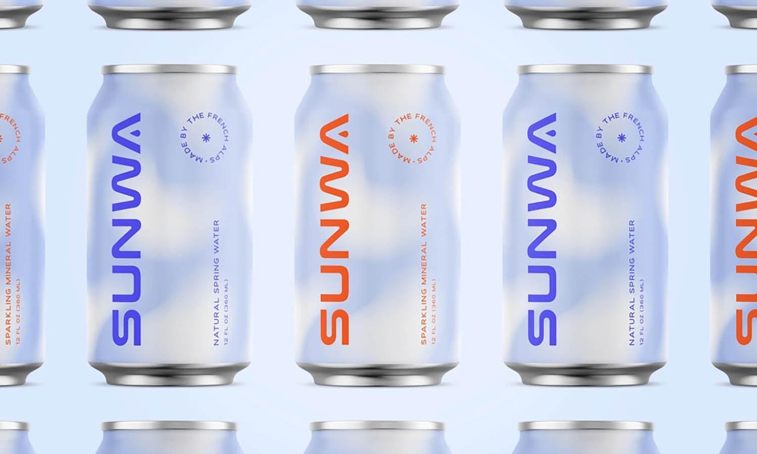
For curved surfaces, such as bottles, cans, and tubes, logo distortion can occur if not properly adjusted. Expanding or slightly modifying the logo to follow the natural curvature of the packaging prevents warping. Additionally, testing different placements helps maintain readability from multiple angles.
Cylindrical packaging, like jars and beverage containers, often requires the logo to wrap around the product. Ensuring that key design elements remain visible from a primary viewing angle prevents important details from being obscured.
For irregularly shaped packaging, such as custom die-cut boxes or molded containers, strategic placement is crucial. Testing logo placement on physical prototypes helps determine the most effective positioning for visibility and impact.
In some cases, a stacked or simplified version of the logo may be necessary for smaller packaging formats to maintain legibility without losing brand identity. Adjusting logo size, spacing, and proportions ensures a professional look across all packaging variations.
Conclusion
Printing logo designs on packaging requires careful planning to achieve a professional and visually appealing result. From selecting the right printing method and high-resolution logo files to ensuring color accuracy and proper placement, each step plays a crucial role in maintaining brand integrity. Testing print samples and adapting logos to different packaging shapes help prevent errors and enhance overall presentation. Protective coatings further improve durability, ensuring the logo remains vibrant throughout the product’s lifecycle. By following these best practices, businesses can create high-quality printed packaging that strengthens brand recognition and leaves a lasting impression on consumers.
Let Us Know What You Think!
Every information you read here are written and curated by Kreafolk's team, carefully pieced together with our creative community in mind. Did you enjoy our contents? Leave a comment below and share your thoughts. Cheers to more creative articles and inspirations!


Leave a Comment