
Logo Design Elements & Psychology Guide

A strong logo is rarely the result of one clever symbol or attractive typeface. It comes from several visual decisions working together to create a clear, memorable impression. The most important logo design elements include shape, color, typography, imagery, composition, and negative space. Each influences how a logo looks and how people interpret the brand behind it.
That is where psychology becomes useful. Certain shapes can feel stable or energetic, colors can suggest warmth or trust, and typography can make a brand appear traditional, modern, playful, or refined. These reactions are not universal rules, but they can help designers make more intentional choices.
Understanding how visual elements affect perception makes it easier to design logos that communicate rather than simply decorate. This guide explores the main elements of logo design, the psychological associations behind them, and how to combine them into a coherent and recognizable identity.
What Are the Core Logo Design Elements?
The core logo design elements are the visual components that determine how a logo communicates and functions. Most successful designs rely on some combination of shape, color, typography, imagery, and composition.
Shape and Form
Shape creates the basic visual structure of a logo. Geometric forms often feel controlled and precise, while organic shapes can appear softer or more expressive. A clear silhouette also makes a logo easier to recognize at small sizes.
Color
Color influences mood, contrast, and brand recognition. A palette can make the same symbol feel energetic, sophisticated, playful, or restrained.
Typography
Typography communicates through both words and letterforms. Serif, sans serif, script, and display styles each create different impressions, while weight and spacing add personality.
Symbols and Imagery
Symbols can communicate ideas without relying entirely on words. They may be literal, abstract, or metaphorical, but they work best when they support the brand rather than add unnecessary complexity.
Composition and Space
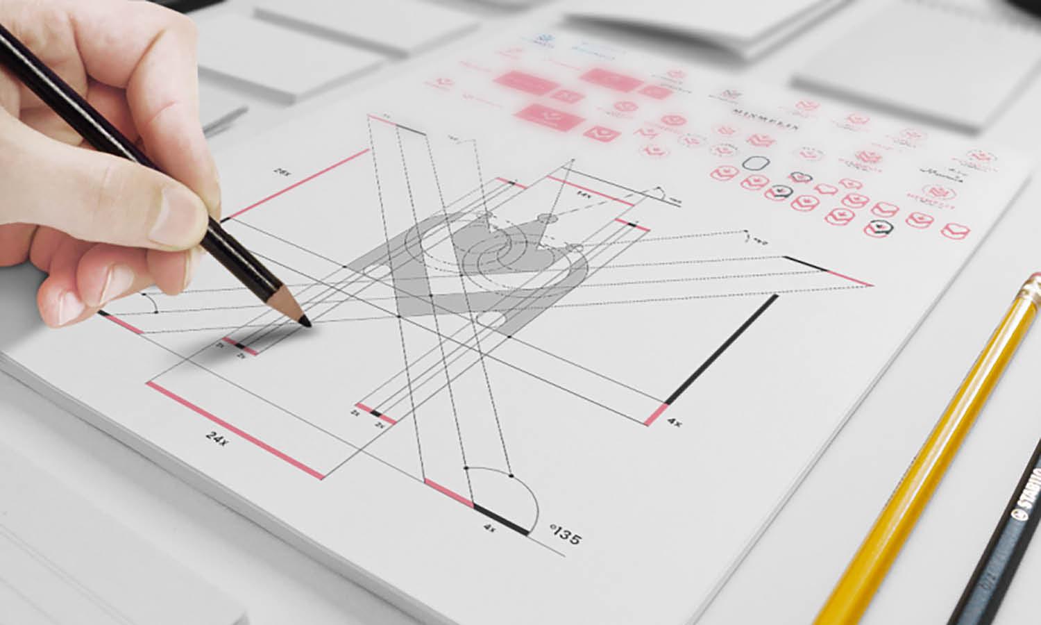
Alignment, scale, proportion, and negative space determine how the parts of a logo relate to each other. Good composition creates clarity and makes the design feel intentional.
How Psychology Influences Logo Perception
People often form an impression of a logo before consciously examining its details. Color, shape, contrast, familiarity, and visual balance can all influence this response.
First Impressions and Visual Processing
Simple visual structures are generally easier to recognize because viewers can process them quickly. A strong silhouette, clear contrast, and limited number of competing elements make a logo easier to understand at a glance.
Complexity is not always bad, but every additional detail creates more information to interpret. This is one reason many recognizable logos rely on simple forms.
Association and Learned Meaning
Logo psychology is influenced by experience and context. A color or symbol may carry one association in a particular industry and a different meaning in another culture or setting.
Designers should therefore treat psychological associations as useful tendencies rather than fixed rules.
Emotion and Brand Personality
Visual choices can reinforce personality. Rounded forms may feel welcoming, heavier typography can suggest confidence, and restrained color palettes may appear more sophisticated.
The goal is to make sure the visual language supports the qualities the brand genuinely wants to communicate.
Shape Psychology in Logo Design
Shape is one of the most immediate logo design elements because viewers can recognize an outline before they read text or analyze finer details.
Circles and Curved Shapes
Circles and rounded forms often feel softer and more approachable than sharp geometric shapes. They can suggest continuity, movement, unity, or connection.
Curved shapes can work well for brands that want to appear friendly, collaborative, accessible, or fluid.
Squares and Rectangles
Squares and rectangles create a stronger sense of structure. Their straight edges and predictable proportions can suggest stability, organization, reliability, and control.
These qualities make them useful where clarity and confidence are important, although overly rigid compositions can feel impersonal.
Triangles and Angular Forms
Triangles and sharp angles often create a sense of direction or energy. Depending on their orientation, they may suggest movement, progress, strength, tension, or precision.
Organic and Irregular Shapes
Organic shapes are less predictable and can feel natural, expressive, or individual. They are often associated with creativity, nature, flexibility, and informality.
Using Negative Space
Negative space is the empty area around or within a shape. Designers can use it to reveal secondary symbols, simplify compositions, or add visual interest.
The technique works best when the hidden element supports the concept naturally rather than becoming a visual gimmick.
Color Psychology and Logo Design
Color is one of the most noticeable logo design elements, but its psychological effect is more nuanced than simple charts suggesting every color has one universal meaning.
Choosing Colors for Brand Personality
Warm colors such as red, orange, and yellow often appear energetic, while cooler colors such as blue and green can feel calmer or more restrained.
Saturation also matters. Bright colors can feel lively and youthful, while muted colors may appear more sophisticated. Darker palettes can create authority, whereas lighter palettes often feel softer.
Common Color Associations
Red can suggest excitement, urgency, or energy. Blue is often connected with trust, professionalism, and calmness. Green can evoke growth, freshness, or nature. Yellow may feel optimistic and visible, while black can communicate simplicity, elegance, or authority.
These meanings are not guaranteed. Industry, cultural context, surrounding colors, and execution can all change how a palette is perceived.
Color Relationships and Contrast
Colors should be evaluated in relation to one another. Complementary colors can create strong contrast, while analogous palettes often feel more harmonious.
Contrast also improves visibility and helps establish hierarchy.
Designing Beyond Color
An effective logo should not depend entirely on color to remain recognizable. Testing it in black and white reveals whether its shapes and structure are strong enough to work independently.
Typography Psychology in Logo Design
Typography does more than display a brand name. The form of the letters contributes directly to the personality of the logo.
Serif Typefaces
Serif typefaces often communicate tradition, heritage, editorial sophistication, or established credibility, although modern serif designs can also feel contemporary.
Sans Serif Typefaces
Sans serif typefaces generally appear cleaner and simpler. They are frequently used by technology, lifestyle, and modern service brands that want an accessible or streamlined appearance.
Script and Handwritten Typefaces
Script and handwritten styles can feel personal, elegant, artistic, or informal. They can create strong personality but may become difficult to read at small sizes.
Display and Custom Lettering
Custom lettering gives designers greater control over distinctiveness. Unique letterforms can become recognizable assets in their own right.
However, originality should not come at the expense of clarity. A highly unusual wordmark loses value if people cannot read or remember it.
Weight, Spacing, and Letterform Details
Small typographic decisions matter. Heavy weights may feel confident, generous letter spacing can create refinement, and tightly spaced letters can feel more compact or energetic.
Composition, Balance, and Visual Hierarchy
Individual logo elements may be attractive on their own, but composition determines whether they function successfully together.
Balance and Proportion
Balance describes how visual weight is distributed across the logo. Symmetrical arrangements can feel stable and formal, while asymmetrical layouts may appear more dynamic.
The relationship between a symbol and wordmark is especially important. One should not overpower the other unless that hierarchy is intentional.
Visual Hierarchy
Hierarchy guides attention. Size, contrast, weight, and positioning can determine whether people notice the symbol, brand name, or another element first.
Negative Space and Breathing Room
Adequate spacing keeps important forms distinct. Crowding symbols and typography together can make even a simple logo feel visually complicated.
Scalability
Composition must remain effective across different sizes. Fine lines, small gaps, and subtle details that work on a large screen may disappear on a mobile interface or favicon.
How to Combine Logo Design Elements Effectively
The strongest logos do not rely on one impressive element. Their shapes, colors, typography, and composition reinforce a shared idea.
Start With the Brand Message
Before selecting visual treatments, define what the logo needs to communicate. A brand that values precision may require very different forms from one built around warmth or creativity.
Beginning with meaning reduces the temptation to choose elements simply because they are fashionable.
Create Consistency Between Elements
Visual compatibility helps a logo feel intentional. A geometric symbol paired with structured typography can communicate precision, while rounded forms combined with softer letterforms may create a more approachable impression.
Not every element has to express the same personality. Controlled contrast can create interest, provided the overall result remains coherent.
Remove Elements That Do Not Add Meaning
More visual information does not necessarily create more meaning. Extra icons, colors, lines, and decorative effects often compete for attention.
If an element does not improve recognition, communication, or distinctiveness, removing it may strengthen the design.
Test the Complete Logo
A finished concept should be evaluated as a complete system. Check whether it is recognizable, readable, appropriate for its audience, and consistent with the intended brand personality.
It should also work at small sizes, in monochrome, and across realistic applications.
Common Mistakes When Using Logo Design Elements
Understanding design psychology is useful, but applying it too literally can create predictable or ineffective results.
Relying Too Heavily on Psychology Rules
A blue logo is not automatically trustworthy, and a circle is not automatically friendly. Visual associations depend on context, execution, and audience expectations.
Using Too Many Elements
Multiple colors, symbols, fonts, and effects can make a logo difficult to remember. A clearer idea is usually more effective than several competing messages.
Following Trends Without Considering Longevity
Popular gradients, type styles, or effects may feel contemporary today but dated later. Trends can inspire a direction, but they should not replace a strong concept.
Ignoring Context
A logo needs to make sense within its industry, culture, audience, and practical applications. A visual decision that works for one market may communicate something entirely different in another.
Designing Elements Separately
Color, shape, typography, and spacing should be evaluated together. A strong symbol paired with incompatible typography can weaken the entire identity.
Frequently Asked Questions
What Are the Most Important Logo Design Elements?
The main logo design elements are shape, color, typography, symbols or imagery, composition, and negative space. Their importance varies depending on the logo style. A wordmark may rely heavily on typography, while a symbol-based identity may place more emphasis on shape. The strongest logos use these elements as a coordinated system.
How Does Psychology Affect Logo Design?
Psychology helps designers understand how visual characteristics may influence perception. Shapes, colors, typography, contrast, and familiarity can suggest certain moods or qualities. However, these associations are affected by culture, context, and personal experience, so psychological principles should guide design decisions rather than dictate them.
Which Shapes Work Best in Logo Design?
There is no single shape that works best for every logo. Circular forms may appear friendly or connected, rectangular forms can suggest stability, and angular shapes may communicate energy or direction. The right choice depends on the brand's personality, positioning, audience, and intended message.
How Many Colors Should a Logo Use?
Many effective logos use a limited number of colors because simpler palettes can improve recognition and consistency. However, there is no mandatory number. The palette should support the concept and remain practical across different applications. A strong logo should also continue to function when reproduced in monochrome.
Should the Font and Symbol Have the Same Personality?
The font and symbol should feel compatible, but they do not have to express exactly the same characteristics. Contrast can make a logo more distinctive when it is deliberate. What matters is that both elements support a coherent overall brand impression.
Conclusion
Effective logo design comes from understanding how individual visual choices work together. Shape creates structure, color influences mood, typography establishes personality, and composition determines how clearly the identity communicates.
Psychological associations can help designers make more purposeful decisions, but they should never be treated as universal formulas. Audience expectations, cultural context, industry conventions, and practical use all influence how a logo is interpreted.
The most successful logo design elements support a clear idea without unnecessary complexity. When every part contributes to recognition, meaning, and consistency, the finished logo becomes a functional visual expression of the brand.
Related Articles





Leave a Comment