
10 Steps to Create a Stunning iOS Icon Design
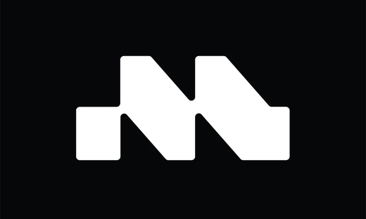
Source: Ahmed Kamal, App Icons & Logo Symbols Pack, Behance, https://www.behance.net/gallery/101678987/App-Icons-Logo-Symbols-Pack
The interface of an app sets the stage for user interaction, and at the forefront of this experience is the iOS icon. An app’s icon is more than just an aesthetic marker; it embodies the essence of the app and plays a crucial role in its success. Therefore, mastering the art of iOS icon design is essential for developers and designers aiming to make a significant impact on the Apple App Store. A well-crafted icon not only catches the eye but also conveys the app's functionality and core message at a glance, making it a fundamental element in user engagement.
Designing an iOS icon requires a blend of creativity, technical skill, and strategic thinking. It should stand out in a sea of applications and inspire potential users to download and explore your app. This article will guide you through the essential steps to create an iOS icon that is both visually compelling and seamlessly integrated into the iOS ecosystem. Whether you are designing for a game, a utility app, or any other type of application, these guidelines will help you develop an icon that resonates with your target audience and enhances your app's overall user experience.
Understand Apple’s Design Guidelines
When embarking on the journey of iOS icon design, the first crucial step is to familiarize yourself with Apple’s Human Interface Guidelines. These guidelines provide a framework that ensures your icons not only look appealing but also align with the operational standards of iOS devices. Apple emphasizes a clean, straightforward design ethos that should be reflected in your iconography. These standards dictate everything from the icon’s dimensional requirements—which include specific pixel dimensions for different devices—to the minimalistic approach that avoids unnecessary embellishments.
By adhering to these guidelines, designers can ensure that their iOS icons are both aesthetically pleasing and functionally optimal across all Apple platforms. The guidelines also stress the importance of recognizing the context in which an app icon will be viewed, from the App Store to the home screen, ensuring that your icon design remains effective and engaging in varying user environments. Following Apple’s design rules is not just about compliance; it’s about ensuring your iOS icon delivers a seamless and intuitive user experience that embodies the qualities of the brand and software it represents.
Focus on Simplicity and Clarity
In iOS icon design, simplicity and clarity are paramount. A well-designed icon should communicate the essence of the app at first glance. This means opting for a design that is not only visually striking but also easy to recognize. The use of minimal elements helps to achieve clarity, ensuring that the icon is understandable in a split second. This approach is critical because app icons are often viewed quickly, and users make split-second decisions based on their first impressions.
By focusing on a simple, high-impact design, you allow your app to stand out in the crowded app marketplace. Simplifying an icon can involve using bold, geometric shapes and limiting the color palette to a few complementary colors. Every element included should serve a clear purpose, avoiding any decorations that do not contribute to the overall understanding of the app’s function. Keeping the icon clear and uncluttered aids in its scalability, ensuring that it looks good on a variety of screen sizes and device types.
Use the Right Grid System
A fundamental step in iOS icon design is utilizing the correct grid system to structure your icon’s layout. This technique ensures that all visual elements are harmoniously balanced and aligned, which is vital for creating an aesthetically pleasing and functional icon. An 8px grid system is commonly recommended for iOS icons. This framework allows designers to precisely place each component, providing a uniform look that maintains consistency across different app icons. Using a grid system also helps in scaling the icon for different resolutions and devices without losing the integrity of the design.
The grid serves as a guide that designers can use to measure distances and alignment, ensuring that elements such as symbols, text (if used), and decorative features are optimally positioned for visual clarity. This disciplined approach to design not only enhances the icon's appearance on various Apple devices but also contributes to a better user experience by making icons more recognizable and accessible.
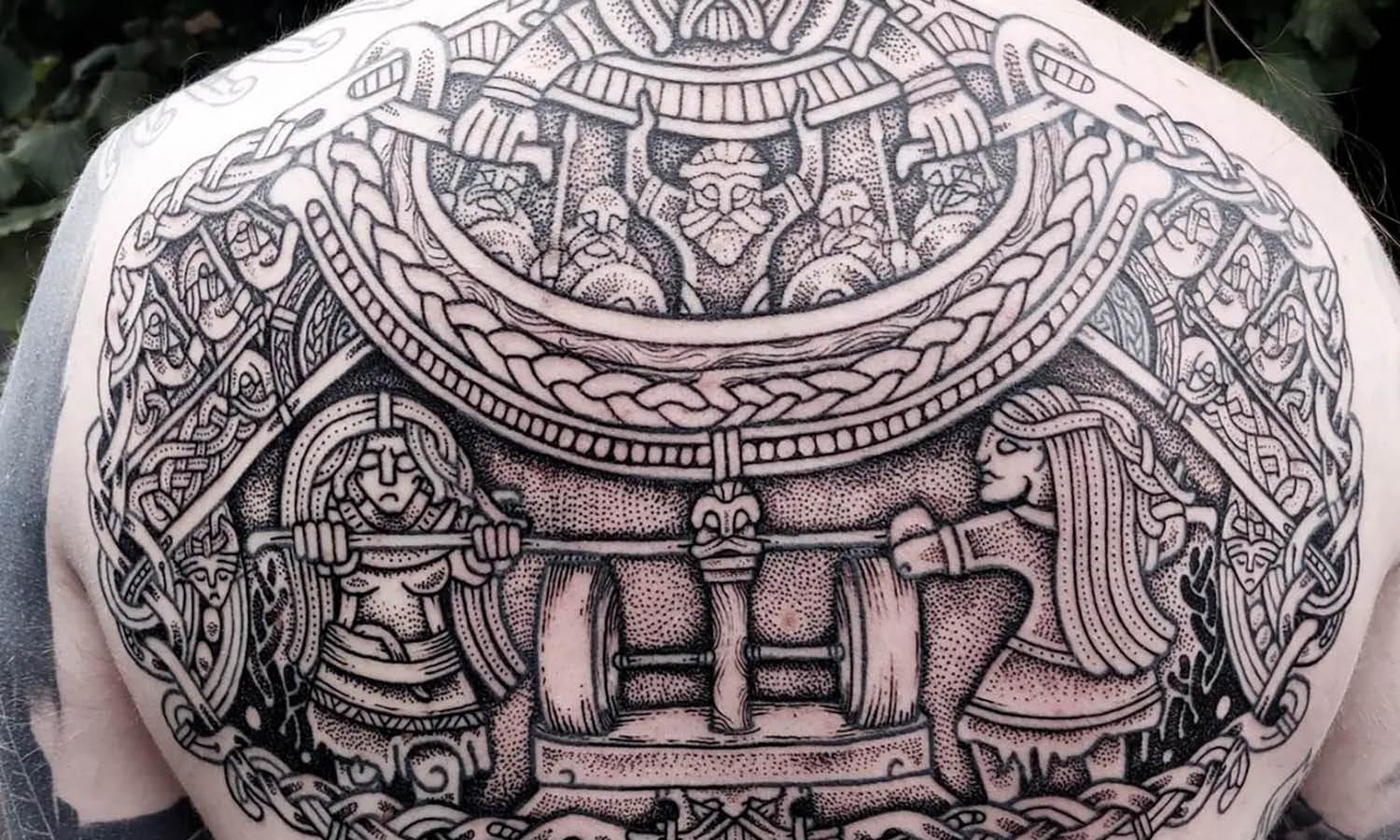
Source: Sergei Shilo, GoDog - iOS Application for Dog Training, Behance, https://www.behance.net/gallery/100318769/GoDog-iOS-Application-for-dog-training
Keep the Icon Shape Consistent
Consistency in icon shape is crucial for maintaining a cohesive look within the iOS ecosystem. Apple typically favors icons with rounded corners, which not only aligns with its sleek, modern design philosophy but also ensures that icons look uniform on the home screen. Keeping a consistent shape for your iOS icon design not only enhances user familiarity but also aids in brand recognition. When users browse the App Store, an icon with a recognizable and consistent shape quickly stands out. This consistency should extend beyond just the outer shape; it should inform the placement of graphic elements within the icon as well.
Whether you choose a circle, square, or another geometric shape, the key is to maintain this form factor across various marketing materials and app versions to strengthen brand identity. This strategic consistency helps build a visual connection between the icon and the app’s brand, making it easier for users to identify your app at a glance among a multitude of others. Adhering to this principle of design consistency will not only fulfill Apple’s guidelines but also position your app as a professional and reliable choice for users.
Incorporate Meaningful Symbols
When designing iOS icons, the incorporation of meaningful symbols can significantly enhance the icon's ability to communicate the app’s purpose. Symbols are powerful tools in visual communication, capable of conveying complex information quickly and effectively. In iOS icon design, it’s essential to choose symbols that are instantly recognizable and clearly relate to the app's functionality. This direct association helps users understand the app’s purpose at first glance, a critical factor in the user's decision to engage with the app further.
For example, a note-taking app might feature a pencil or notepad symbol, while a navigation app might use a compass or map icon. These symbols should be simplified to their most essential form to ensure clarity and recognizability even at smaller sizes. The use of universal symbols can transcend language barriers and is particularly effective in global markets where an app might reach users with diverse linguistic backgrounds.
Furthermore, the chosen symbol should align with the design aesthetics of the iOS operating system—clean, minimalistic, and modern. This alignment not only adheres to Apple’s design standards but also ensures that the icon looks at home on the device’s screen. By carefully selecting and designing symbols that resonate with the app's core features and user expectations, designers can craft an iOS icon that is both beautiful and functional, enhancing the overall user experience.
Choose Appropriate Colors
Choosing the right color palette is essential in iOS icon design, as colors can powerfully affect how users perceive the app. Color choices should align with the app's branding and functionality, while also ensuring optimal visibility and aesthetic harmony on the user interface. When selecting colors for an iOS icon, consider the emotional impact of colors—blue can evoke feelings of trust and clarity, red can signify energy and passion, and green often represents tranquility and health.
The color palette should be limited to a few complementary colors to avoid visual confusion and maintain clarity even at smaller icon sizes. This simplicity ensures that the icons are easily recognizable and the design remains clean and uncluttered. Additionally, it’s important to test color visibility under different lighting conditions and against various backgrounds to ensure the icon remains effective in all potential user environments.
Furthermore, consider the psychological and cultural connotations of colors in your target audience. What works in one culture may carry different implications in another, potentially affecting user engagement. Utilizing contrast effectively can also enhance readability and recognition, crucial elements in a small visual space like an app icon.
In sum, appropriate color selection not only enhances the aesthetic value of the icon but also reinforces its usability and recognition, making it a critical component in the success of the app’s visual identity.
Avoid Using Text
Text in iOS icon design is generally discouraged due to several reasons. First, the small size of app icons means that text can become unreadable, especially on devices with smaller screens. This can lead to a cluttered look and diminish the icon's visual impact. Instead, the focus should be on creating a visually expressive icon that communicates its function through graphical elements alone.
Icons are meant to be a quick visual representation of the app, and adding text can complicate this quick recognition. In cases where branding is important, consider using a logo that can be clearly identified without accompanying text. If text is absolutely necessary, such as with initials or a very short brand name, it should be incorporated with extreme caution. Ensure the text is legible at all sizes and does not overwhelm the graphic elements of the icon.
Moreover, text can pose localization challenges. Apps that aim for a global market need to consider multiple languages, making text use impractical. A visual symbol that is universally understood can eliminate the need for different icons for various languages, simplifying the design process and improving the app’s adaptability and scalability.
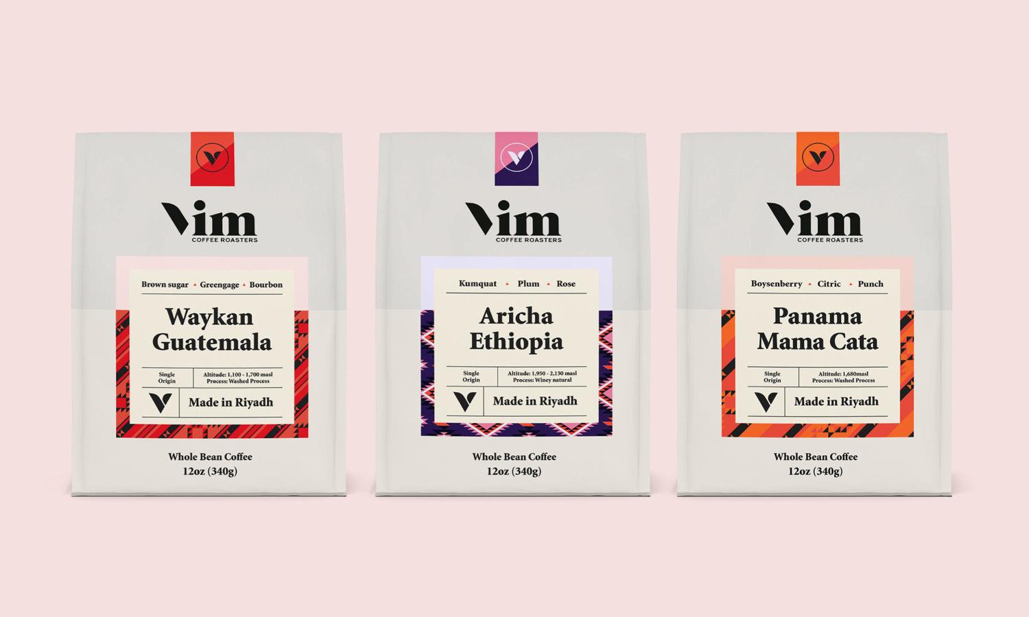
Source: Bhanuka Dushyantha, iOS App Icon Folio, Behance, https://www.behance.net/gallery/116227913/iOS-app-icon-folio%20
Test Against Different Backgrounds
One crucial aspect of iOS icon design is ensuring that the icon stands out effectively against various backgrounds. Since users can personalize their wallpaper, which acts as the backdrop for app icons, the icon must maintain its visibility and aesthetic appeal across a diverse range of background colors and patterns. Testing your iOS icon against different backgrounds—light, dark, colorful, and patterned—ensures that it remains clear and recognizable in any user-defined environment.
This testing phase can reveal potential issues with color contrast and icon clarity. For instance, an icon that looks vibrant against a light background may not pop against a darker one. To address this, designers can use a consistent border or shadow around the icon, which helps maintain its visibility regardless of background variations. Additionally, ensuring sufficient contrast between the icon's core elements and its edges can prevent blending into backgrounds.
Moreover, this practice not only improves user experience but also aligns with accessibility standards, making the app more usable for individuals with visual impairments.
Maintain Visual Balance
Achieving visual balance in iOS icon design is critical for creating a harmonious and appealing image that attracts and retains user attention. A balanced icon ensures that no single element overwhelms others, making the icon easy to comprehend and aesthetically pleasing. This balance involves the strategic placement of icon elements, proportionate sizing, and symmetry or asymmetry that fits the icon’s overall design.
When designing an iOS icon, consider the weight distribution of visual elements. Heavier elements, or those that attract more attention through size or color, should be balanced by other elements to prevent the icon from appearing lopsided. For instance, if a prominent feature is placed on one side of the icon, consider visual counterweights on the opposite side to maintain equilibrium.
Additionally, the center of interest should ideally be centered within the icon or placed according to the rule of thirds to enhance visual interest and stability. This approach not only pleases the eye but also ensures that the icon is effective and recognizable at a glance, a crucial aspect given the small display size on mobile devices.
Refine Through Iteration
Refinement through iteration is a fundamental step in the iOS icon design process. It involves continuously revising and improving the icon based on feedback and testing to ensure it not only meets aesthetic standards but also functions effectively across various user interfaces. Iteration allows designers to experiment with different design elements, such as color schemes, shapes, and symbols, to determine which combination best conveys the app’s purpose while maintaining visual appeal.
The iterative process typically begins with the creation of multiple design concepts, from which the most promising are selected for further development. This approach allows designers to explore a range of creative ideas without being limited to a single initial design. Each iteration should be evaluated against criteria such as visibility, recognizability, and consistency with the app’s branding.
Feedback from users and stakeholders is invaluable during this phase, providing insights that may not be evident to the designers alone. This feedback can include how the icon looks on different devices, its impact in the crowded app store environment, and its effectiveness in conveying the app’s functionality.
Conclusion
Creating a stunning iOS icon design is a meticulous process that requires a deep understanding of visual principles and user experience. By adhering to Apple’s guidelines, maintaining simplicity, and incorporating meaningful symbols, designers can craft icons that are not only beautiful but also functional. Testing against various backgrounds and refining through iteration are essential to ensure the icon performs well in real-world scenarios. Ultimately, a well-designed iOS icon enhances user engagement and contributes to the success of an app, making it a critical element in the app development process.
Let Us Know What You Think!
Every information you read here are written and curated by Kreafolk's team, carefully pieced together with our creative community in mind. Did you enjoy our contents? Leave a comment below and share your thoughts. Cheers to more creative articles and inspirations!
Related Articles


Leave a Comment