Easy Guide to Create Stunning Sets of Icon Design
Source: Evgeniy Artsebasov, Various Icons, Behance, https://www.behance.net/gallery/89099639/Various-icons
In today’s digital world, icons play a pivotal role in enhancing user interfaces by providing intuitive and efficient navigation. Well-crafted icon design bridges communication between the application and the user, making complex processes simpler and visually engaging. Whether used on websites, applications, or digital media, icons consolidate vast information into small, digestible visual representations, making them essential components of modern design.
Creating a stunning set of icons requires a thoughtful approach that merges aesthetics with functionality. Each icon not only needs to be visually appealing but also instantly recognizable, ensuring users can comprehend their meanings without hesitation. This guide will walk you through the essentials of icon design, offering practical tips and techniques to help you develop cohesive, scalable, and adaptable icon sets that enhance user experience.
Prioritize Clarity and Simplicity
In icon design, prioritizing clarity and simplicity is paramount. Icons serve as visual cues that guide users through an interface, so it's essential they communicate effectively at a glance. This means every element of the icon must be easily recognizable and serve a clear purpose. Avoid the temptation to include excessive details that might clutter the design and confuse the user. Instead, focus on the essential features that convey the icon's message. Simple geometric shapes, for instance, are often more effective than intricate graphics.
They scale better across different resolutions, ensuring consistency whether viewed on a large desktop or a small mobile screen. Additionally, simplicity in icon design not only enhances usability but also supports faster load times and better performance on digital platforms. When creating icons, designers should constantly test their simplicity by scaling them down to the smallest size they will be displayed at and ensuring they remain comprehensible. This approach not only solidifies the usability of icons but also ensures that they function harmoniously within the overall design system.
Choose Consistent Visual Language
Choosing a consistent visual language is crucial for crafting a cohesive set of icons. This consistency should manifest in every aspect of the icon's design, including shape, color, and line style. By employing a unified style, icons can create a seamless experience for the user, making the interface easier to navigate and understand. Start by defining a style guide that outlines the specifics of your iconography, such as the outline thickness, corner radius, and fill types.
This guide ensures that all icons not only look like they belong to the same family but also reinforce the brand's visual identity. Consistency in visual language aids in building user trust and enhances the overall aesthetic of the digital environment where the icons are used. Furthermore, a consistent approach reduces cognitive load for users. When icons follow a predictable pattern, users spend less time deciphering each symbol and more time interacting with the content or task at hand.
For instance, if a set of icons is meant to guide a user through a checkout process, uniformity in design can lead to a smoother transaction experience. Thus, maintaining a consistent visual language in icon design is not just about aesthetics but also about enhancing functionality and user experience.
Opt for Universal Symbols
In icon design, the use of universal symbols can markedly enhance user comprehension and interaction across various platforms. Universal symbols, or icons that are widely recognized regardless of language or culture, provide immediate understanding, which is vital in today's global digital landscape. When designing icons, incorporating elements that are universally familiar—like a magnifying glass for search, a house for home, or a gear for settings—helps create an intuitive user interface. This approach not only streamlines user navigation but also reduces the learning curve associated with new applications.
Moreover, universal symbols are particularly advantageous in mobile and web applications where space is limited and clarity is paramount. These symbols serve as direct visual communications that need no translation, making them essential tools for designers aiming to reach a broad audience. To effectively utilize universal symbols in icon design, it’s crucial to research and test their recognizability across different target demographics. This ensures that the icons perform their function effectively, fostering an accessible and user-friendly design.
Source: Hugeicons Pro, User Icon Set, Behance, https://www.behance.net/gallery/210399395/User-Icon-Set
Focus on Scale and Proportion
Scale and proportion play critical roles in icon design, ensuring that icons are not only aesthetically pleasing but also functionally viable across all display sizes. Effective iconography requires that icons maintain their clarity and impact when scaled to different sizes for various devices. To achieve this, designers must consider the smallest size at which an icon will be used and ensure that it remains legible and effective at that scale. This often means simplifying details that might become lost or muddled when reduced.
Additionally, maintaining consistent proportions within a set of icons is key to cohesive visual communication. Each icon should be designed within a defined and consistent bounding box to ensure uniformity across the set. This consistent sizing helps users recognize and interpret icons quickly, enhancing the overall user experience. When icons are proportionally balanced, they contribute to a harmonious and intuitive interface, where each element is immediately recognizable and functions seamlessly within the digital landscape.
Designers should use vector graphics to facilitate easy scaling and adjustments, allowing for maximum flexibility and precision in size adjustments without loss of quality. By focusing on scale and proportion, designers ensure that their icons are versatile and adaptable, making them effective across various user interfaces and devices.
Use a Limited Color Palette
Utilizing a limited color palette in icon design not only strengthens visual coherence but also reinforces brand identity. When selecting colors for icons, it’s essential to choose hues that align with the brand’s overall color scheme, ensuring that the icons are instantly recognizable and reflect the brand's aesthetic. A restrained color palette simplifies design decisions and helps maintain focus on the icon’s function rather than its embellishment.
This approach enhances user recognition and aids memory retention, as consistent colors across a set of icons can cue specific actions or information within the user interface. Furthermore, a limited palette can improve the adaptability of icons across various backgrounds and applications, ensuring visibility and legibility in different contexts. This is particularly important in responsive design where icons must function well on different devices and under varying lighting conditions.
To select an effective color palette, consider the emotional impact of colors and their visibility against potential backgrounds. Typically, a palette of two to three primary colors, supplemented with neutrals for contrast, works well. This strategy not only creates a visually appealing set, but also supports a clear and direct user experience.
Maintain Spacing and Alignment
Maintaining proper spacing and alignment is crucial in icon design to ensure clarity and visual harmony. Adequate spacing around icons helps to separate and define each element, preventing the interface from appearing cluttered or overwhelming to users. This is especially important in complex interfaces where multiple icons are presented together; consistent spacing helps to create a clean and organized layout that enhances user navigation and interaction.
Alignment, on the other hand, ensures that icons are visually connected and part of a coherent system. When icons are aligned correctly, either by their edges or centers, they form a structured arrangement that supports a seamless visual flow. This orderliness is vital for user interfaces, where predictability in design facilitates quick comprehension and decision-making. To effectively maintain spacing and alignment, designers should employ grids and guidelines during the design process.
These tools help in positioning icons precisely and uniformly, ensuring that all elements are consistently placed relative to one another. Moreover, considering alignment not only in terms of horizontal and vertical axes but also in relation to text and other interface elements is key. Proper alignment enhances the readability of accompanying text and improves overall aesthetic appeal.
Utilize Grids and Guides
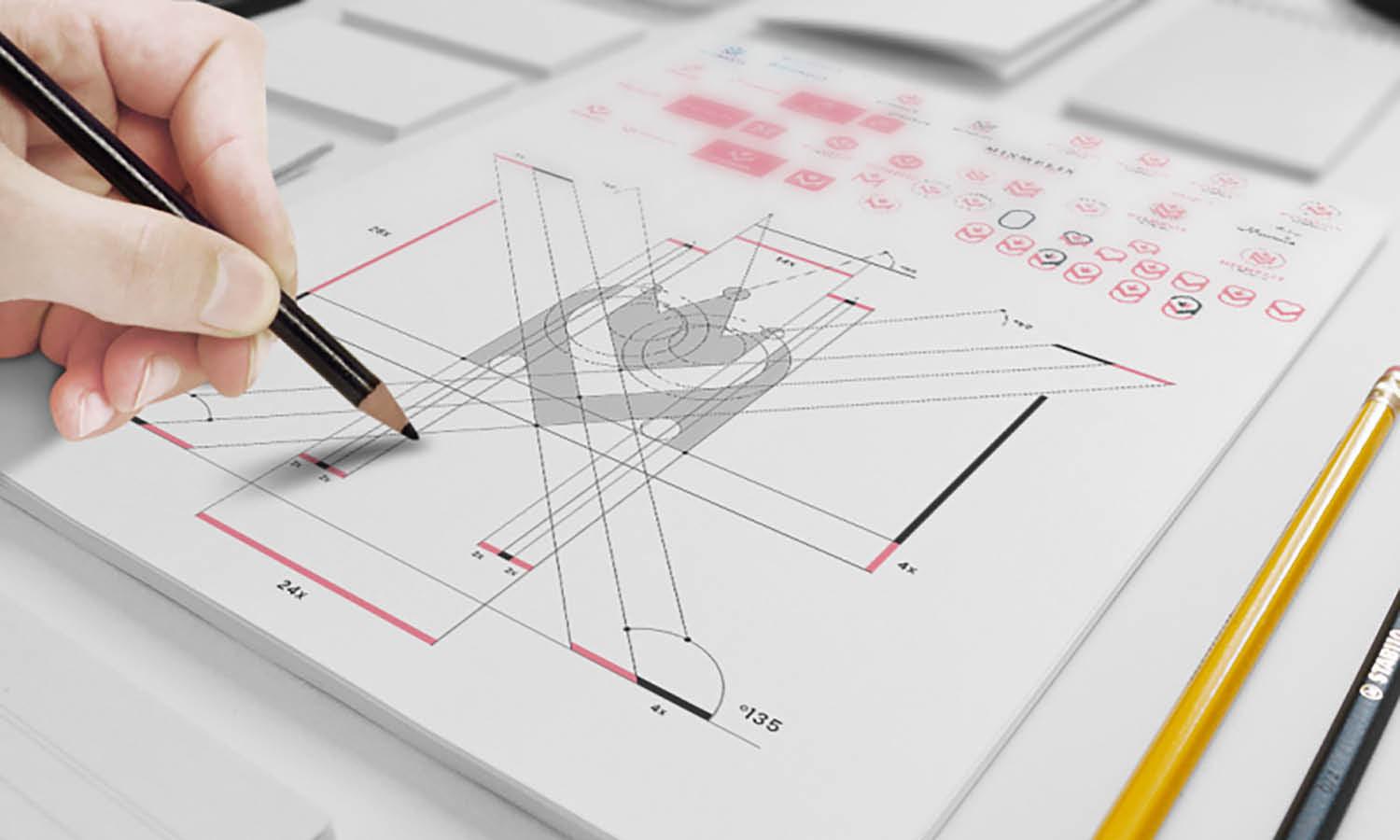
Utilizing grids and guides is a fundamental step in professional icon design, ensuring consistency and precision throughout a set. Grids serve as a framework that designers can follow to align elements symmetrically, achieving balance and uniformity in iconography. This structural basis is crucial when creating multiple icons to ensure that they all carry the same proportions and are visually cohesive when displayed together.
Guides, on the other hand, help in maintaining consistent spacing, alignment, and scale across different icons. They are particularly useful in complex designs where maintaining exact distances and symmetrical relationships is essential. By setting up a grid system and using guides, designers can also streamline the design process, making it faster and more efficient to produce icons that are not only aesthetically pleasing but also functionally practical. This methodical approach minimizes revisions and adjustments in later stages of the design process, saving time and resources.
Emphasize Readable Shapes
In icon design, emphasizing readable shapes is critical to ensuring that each icon communicates its function clearly and quickly. Readable shapes are simple, distinct, and recognizable, even at a glance or when scaled down to smaller sizes. This clarity is essential because icons often need to be understood across different cultures and languages, making visual immediacy a top priority. To achieve this, designers should focus on using geometric or familiar shapes that convey universal meanings. For example, a circle can signify continuity or a globe, while a square might suggest stability and order.
Avoiding overly complex or abstract shapes ensures that the icons are intuitive and can be easily interpreted by a broad audience. Additionally, using bold and unambiguous forms helps icons stand out against varying backgrounds and alongside competing visual elements within an interface. This visibility is particularly important in mobile and web applications, where screen space is limited, and user attention is at a premium. Designers should also consider the psychological implications of shapes, as different forms can evoke different emotions and responses.
For instance, rounded edges are often perceived as softer and safer, whereas sharp corners might convey precision and efficiency. By thoughtfully choosing shapes that are readable and appropriate for the intended application, designers enhance the usability of their icons, making digital environments more accessible and user-friendly. This focus on readability in shapes not only improves the aesthetic quality of icons but also boosts their functional efficacy.
Source: Hugeicons Pro, E-Commerce Icon Set - Hugeicons Pro, Behance, https://www.behance.net/gallery/208538883/E-Commerce-Icon-Set-Hugeicons-Pro
Balance Aesthetic with Functionality
In icon design, achieving a balance between aesthetic appeal and functionality is paramount. This equilibrium ensures that while the icons are visually engaging, they also perform their primary role of communication effectively. Aesthetics in icons contribute to the overall user experience, making an interface more inviting and enjoyable to navigate. However, the functionality of these icons carries even more weight, as each icon's design should make its purpose clear and unambiguous to users.
To maintain this balance, icons should be designed with simplicity and recognition in mind, using geometric forms or familiar imagery that are easily decipherable at a glance. The choice of color, shape, and size should complement the intuitive use of the icon, not detract from it. For example, a trash bin icon that is elegantly designed but looks too similar to a gift box icon may confuse users.
Consistent styling, such as uniform line widths and matching corner radii, can help reinforce the functionality while maintaining a sleek design. Regular testing on different devices and under various conditions can also ensure that these icons remain effective and appealing across all platforms.
Use Cohesive Icon Metaphors
Employing cohesive icon metaphors is crucial in enhancing user understanding and interface intuitiveness in icon design. A well-chosen metaphor bridges the gap between visual symbol and functionality, allowing users to recognize and interpret icons quickly. To establish cohesion, icons should be based on common experiences and universally recognized symbols that transcend cultural boundaries. For example, using a padlock icon for security settings or a pencil for editing functions can leverage users' pre-existing knowledge to communicate icon functions clearly.
Consistency in metaphor usage across an icon set also plays a significant role in reinforcing user learning and memory. By using visually similar elements and styles, users can more easily associate icons with their actions, reducing cognitive strain and boosting interface efficiency. Additionally, it is important to avoid mixing metaphors within the same icon set to prevent confusion. For instance, if a trash can represents deletion in one part of an application, using it to signify something else in another part can lead to user errors.
Testing with diverse user groups can help validate the effectiveness of icon metaphors and ensure they are intuitive across different demographics. Through careful selection and consistent application of icon metaphors, designers can create a more harmonious and user-friendly digital environment.
Conclusion
Effective icon design is crucial for creating intuitive and visually appealing digital interfaces. By balancing aesthetic appeal with functionality, employing universal symbols, maintaining cohesive metaphors, and ensuring icons are scalable and legible across various devices, designers can significantly enhance user experience. A well-crafted icon set not only complements the design of the application or website but also facilitates smoother navigation and interaction, making it essential for successful user interface design. Ultimately, thoughtful icon design plays a pivotal role in the digital landscape, bridging communication gaps and making technology more accessible and enjoyable for all users.
Let Us Know What You Think!
Every information you read here are written and curated by Kreafolk's team, carefully pieced together with our creative community in mind. Did you enjoy our contents? Leave a comment below and share your thoughts. Cheers to more creative articles and inspirations!


Leave a Comment