Monospaced Font: Basic Typography Guide for Designers

Source: Tom Robin Karisson, Aber Mono, Behance, https://www.behance.net/gallery/133228829/ABER-MONO-(free-typeface)
When it comes to typography, choosing the right font can significantly impact readability, style, and overall design effectiveness. One of the most distinctive and practical type categories is the monospaced font. Unlike proportional fonts where each character varies in width, monospaced fonts assign equal space to every letter and symbol. This uniform spacing brings a unique rhythm and visual consistency, making monospaced fonts highly favored in both digital and print environments.
Traditionally associated with typewriters and coding environments, monospaced fonts have evolved beyond their utilitarian roots. Designers now use them creatively in branding, editorial layouts, data-heavy interfaces, and minimalist design systems. Their structured appearance not only enhances legibility but also brings a clean, modern aesthetic to any project.
In this guide, we’ll explore the fundamentals of monospaced typography—from its defining characteristics and history to practical applications in modern design. Whether you're creating a developer-centric user interface, an identity for a tech startup, or simply looking to add visual order to your typographic palette, understanding the strengths of a monospaced font is essential.
Understanding Monospaced Fonts
Monospaced fonts, also referred to as fixed-width fonts, are a distinct type of typography where every character occupies the same amount of horizontal space. Unlike proportional fonts, where letters like "i" are narrower than "w," monospaced fonts ensure uniform spacing regardless of the character. This unique characteristic creates a structured and organized appearance, making monospaced fonts particularly effective for specific applications.
Historically, monospaced fonts gained prominence during the typewriter era. Their equal spacing was a mechanical necessity, as typewriter keys were designed to align characters uniformly. This legacy has carried forward into the digital age, where monospaced fonts are celebrated for their clarity and simplicity.
For designers, understanding monospaced fonts is essential for creating designs that require precision and consistency. They are commonly used in coding environments because the uniform spacing helps developers easily spot syntax errors. Additionally, monospaced fonts excel in tabular data and grid-based designs, where alignment is crucial.
Beyond functionality, monospaced fonts offer a unique aesthetic appeal. Their clean, minimalist look can add a retro or technical vibe to projects. When paired with proportional fonts, they can create compelling visual contrast, making them a versatile choice for modern typography.
Key Features Of Monospaced Fonts
Monospaced fonts stand out from other font types due to their distinctive characteristics, which make them an invaluable tool in typography and design. At their core, monospaced fonts ensure that each character—whether a letter, number, or punctuation mark—occupies the same width. This feature creates a visually consistent and balanced appearance, making them ideal for tasks that demand precision.
One key feature of monospaced fonts is their uniform spacing, which enhances readability in structured environments. This is particularly useful in programming, where consistent character alignment allows developers to read and debug code more efficiently. Similarly, their spacing makes them ideal for tabular data, financial reports, and other applications where alignment is critical.
Monospaced fonts are also known for their simplicity and clarity. The lack of proportional adjustments means fewer distractions, allowing the reader to focus on the content. This clarity is why monospaced fonts are frequently used in technical documents, command-line interfaces, and user manuals.
Another notable feature is their aesthetic versatility. Monospaced fonts evoke a vintage typewriter feel while fitting seamlessly into modern minimalist designs. This blend of retro and contemporary styles gives designers a broad range of creative applications, from branding to editorial layouts.
Popular Uses Of Monospaced Fonts
Monospaced fonts have carved out a niche in various industries due to their practical and aesthetic qualities. Their equal spacing and structured appearance make them indispensable for a range of applications, both functional and creative.
One of the most prominent uses of monospaced fonts is in coding and programming. The uniform spacing helps developers easily read and align code, reducing errors and enhancing efficiency. Integrated development environments (IDEs) and text editors like Visual Studio Code and Sublime Text often default to monospaced fonts for this reason.
In data presentation, monospaced fonts are equally invaluable. Financial reports, spreadsheets, and tables benefit from their consistent alignment, which ensures that numerical data remains clear and easy to compare. Designers working on technical documents or forms often turn to monospaced fonts for similar reasons.
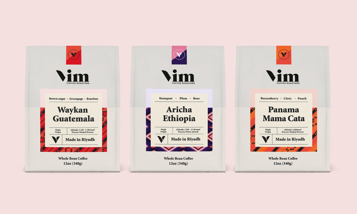
Beyond functionality, monospaced fonts are widely used in branding and graphic design. Their retro, typewriter-inspired aesthetic appeals to brands seeking a minimalist or nostalgic look. Designers incorporate them into logos, packaging, and editorial layouts to evoke a sense of precision or creativity.
Monospaced fonts also play a crucial role in digital interfaces. Command-line tools, terminal emulators, and even subtitles for films or games use these fonts for their clarity and uniformity.

Source: Wacana TypeFoundry, Free Font Karsa Mono, Behance, https://www.behance.net/gallery/199567299/FREE-FONT-Karsa-Mono
Legibility In Monospaced Typography
Legibility is one of the defining strengths of monospaced fonts, making them an invaluable choice for designers working on projects where clarity is paramount. The consistent width of each character ensures that text is visually organized and easy to read, even in challenging contexts.
One of the key factors contributing to the legibility of monospaced fonts is their predictability. Each character aligns perfectly with those above and below, creating a grid-like structure. This is particularly advantageous in programming, where developers need to differentiate between similar symbols, such as "O" and "0" or "I" and "l." The consistent spacing reduces visual noise and allows users to focus on the content.
Monospaced fonts also excel in presenting tabular data and complex information. In financial reports, technical documents, or forms, the even alignment ensures that columns of numbers or text remain clear and easy to compare. This precision enhances usability and comprehension, especially when working with large datasets.
Another factor in their legibility is their simplicity. Monospaced fonts typically avoid ornate details, which keeps the focus on the message rather than the design. This makes them ideal for user interfaces, command-line tools, and instructional materials.
Famous Monospaced Fonts
Monospaced fonts have a rich history and a diverse selection of iconic typefaces that continue to influence design and typography. Among these, a few standout examples are celebrated for their functionality, aesthetic appeal, and adaptability in various contexts.
Courier is perhaps the most recognizable monospaced font. Designed in the 1950s by Howard “Bud” Kettler, it became synonymous with typewriters and remains widely used today. Its clean, straightforward design makes it a favorite in scripts, technical documentation, and retro-inspired projects.
Consolas, developed by Lucas de Groot, is another prominent monospaced font, specifically tailored for coding. Known for its excellent legibility and slightly rounded edges, it’s a default choice in many programming environments.
Fira Code, a modern variation, has gained popularity among developers. It incorporates ligatures, which merge common programming symbols for better readability without sacrificing its monospaced integrity.
Another notable option is Monaco, designed for Apple systems. Its sleek and minimalistic design pairs well with digital interfaces, particularly in older macOS applications.
Lastly, IBM Plex Mono, part of the IBM Plex family, has become a go-to choice for designers seeking versatility and modern aesthetics. Its geometric precision and humanist influences make it equally effective in branding and technical design.
Monospaced Fonts In Graphic Design
Monospaced fonts are more than functional tools; they are powerful design elements that can enhance the visual impact of creative projects. Their unique structure and minimalist aesthetic make them a popular choice for designers looking to convey precision, simplicity, or innovation.
In graphic design, monospaced fonts are often used to create a technical or industrial feel. Their association with typewriters and computer terminals lends them a nostalgic quality, making them ideal for retro-inspired designs. At the same time, their clean and orderly appearance aligns with modern minimalist trends, making them versatile for contemporary branding and editorial work.
One notable application is in logos and identity design. Monospaced fonts can project reliability and professionalism, qualities often sought by technology companies, coding schools, or finance brands. Their uniformity adds a sense of balance and stability to a design, reinforcing the message.
Monospaced fonts are also frequently used in layouts that emphasize data or structure. Magazines, websites, and posters that feature tabular information or grid-based compositions can benefit from the alignment and clarity provided by monospaced typography.
Additionally, designers use monospaced fonts to create visual contrast. Pairing them with proportional fonts can add depth and hierarchy to a composition, guiding the viewer’s eye through the design.
Choosing The Right Monospaced Font
Selecting the right monospaced font is a critical decision for designers aiming to balance functionality with aesthetic appeal. With countless options available, understanding the context and purpose of the project can help narrow down the choices.
Start by considering the intended use. If the project involves coding, development, or technical documents, opt for a monospaced font designed for legibility and precision, such as Consolas or Fira Code. These fonts are optimized for screen reading and ensure clarity in complex scripts or numerical data.
For branding or creative designs, focus on the tone and style of the project. Fonts like IBM Plex Mono or Courier can evoke modern sophistication or retro nostalgia, respectively. Their distinctive character can reinforce a brand’s identity while maintaining the clean structure typical of monospaced fonts.
Another key factor is readability. Evaluate how the font performs at different sizes and on various devices. Fonts with well-differentiated characters, like Monaco or Source Code Pro, can enhance usability across digital and print platforms. Designers should also consider customization. Some monospaced fonts offer variable weights or additional stylistic sets, enabling greater flexibility to align with a project’s visual needs.

Source: Radina Riki Mutaqin, Atexa Mono Typeface, Behance, https://www.behance.net/gallery/186964123/Atexa-Mono-Typeface
Pairing Monospaced Fonts With Other Styles
Pairing monospaced fonts with other styles is an effective way to create dynamic and visually engaging designs. The contrast between the uniformity of monospaced fonts and the fluidity of proportional fonts allows designers to achieve balance and hierarchy within their compositions.
When pairing fonts, consider the purpose and tone of the project. Monospaced fonts work well as a secondary or accent typeface, providing contrast to a primary sans-serif or serif font. For instance, pairing a bold, proportional serif like Times New Roman with a clean monospaced font such as Courier can create a compelling juxtaposition of traditional and technical elements.
Hierarchy is another important factor. Use monospaced fonts for specific sections like captions, subtitles, or data tables to differentiate them from the main body text. Their consistent spacing can add clarity and structure without overpowering the overall design.
Designers should also experiment with weight and size variations. Pairing a lightweight monospaced font with a bold sans-serif creates a striking contrast that draws the viewer’s attention to specific elements.
Color and spacing can further enhance the pairing. Monospaced fonts often benefit from generous line spacing to maintain their readability, while proportional fonts may require tighter kerning for balance.
Monospaced Fonts In Branding
Monospaced fonts have become a powerful tool in branding, offering designers a way to communicate precision, professionalism, and modernity. Their clean, structured appearance creates a distinctive aesthetic that can elevate a brand's identity and establish a memorable impression.
One of the key advantages of using monospaced fonts in branding is their versatility. They can evoke a sense of innovation and technology, making them a popular choice for brands in software, tech startups, and digital solutions. At the same time, their typewriter heritage provides a nostalgic quality, which can be leveraged by brands seeking a retro or artisanal vibe.
Monospaced fonts are particularly effective in logotypes and wordmarks. Their uniformity lends a sense of balance and consistency, ensuring that the logo appears polished and professional. Designers can use this quality to create a minimalist yet impactful brand identity.
In addition to logos, monospaced fonts work well in secondary branding elements such as taglines, website headers, or product packaging. Their clarity and readability make them ideal for conveying technical details or instructions, which can reinforce the perception of reliability and expertise.
Pairing monospaced fonts with other styles within a branding system can create visual contrast and depth. For example, a monospaced font can complement a modern sans-serif or classic serif, adding a layer of sophistication.
Customizing Monospaced Typography
Customizing monospaced typography allows designers to tailor these fonts to fit specific project needs, enhancing both their functionality and visual appeal. While monospaced fonts have a distinct structure, subtle adjustments can transform their appearance and improve their effectiveness in design.
One of the simplest ways to customize monospaced typography is through spacing adjustments. Increasing the line height can enhance readability, especially when working with dense blocks of text or small font sizes. Similarly, adjusting letter spacing (tracking) can help refine the overall look, ensuring that the text doesn’t appear too cramped or loose.
Another approach is experimenting with weight variations. Many monospaced fonts offer multiple weights, from thin to bold, allowing designers to emphasize certain elements or create hierarchy within the text. For instance, using a bold weight for headers and a regular weight for body text can add clarity and structure to a layout.
Designers can also explore color and texture to give monospaced typography a unique edge. Gradient fills, textured overlays, or subtle shadows can bring depth and creativity to monospaced fonts, making them stand out in print or digital designs.
Conclusion
Monospaced fonts hold a unique and enduring place in typography, offering both functional precision and distinctive aesthetic appeal. For designers, they provide a versatile tool for projects ranging from coding and technical documents to branding and creative design. Their uniform spacing, clean lines, and adaptability make them ideal for a wide range of applications. By understanding their key features, uses, and customization possibilities, designers can leverage monospaced fonts to create visually compelling and effective designs. Whether used for structure, style, or storytelling, monospaced fonts continue to inspire creativity and innovation in the world of typography.
Let Us Know What You Think!
Every information you read here are written and curated by Kreafolk's team, carefully pieced together with our creative community in mind. Did you enjoy our contents? Leave a comment below and share your thoughts. Cheers to more creative articles and inspirations!


Leave a Comment