How to Ensure Your Graphic Artworks Are Not Pixelated
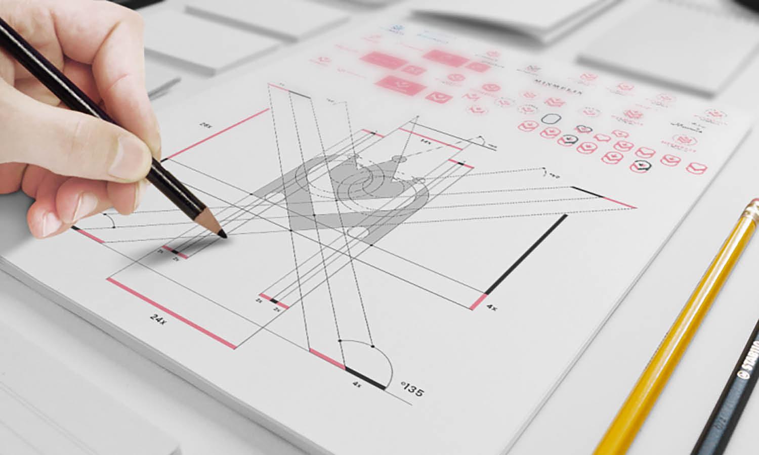
Source: Miguel Bardales, Brandonauts, Behance, https://www.behance.net/gallery/102754337/Brandonauts
In the digital age, graphic artworks are at the forefront of visual communication, whether it be in advertising, web design, or digital media. However, a common pitfall in creating digital graphics is the issue of pixelation, which can significantly degrade the quality of an image, making it appear blurry or jagged. This not only affects the aesthetic appeal but can also impact the effectiveness of the message conveyed. To address this, it's crucial for designers to understand the underlying causes of pixelation and implement strategies to avoid it. By focusing on the best practices in resolution management, file formats, and software tools, designers can ensure that their graphic artworks remain sharp and clear, no matter the platform on which they are displayed.
This guide will walk you through various preventative measures and techniques to maintain the integrity of your visuals, providing a comprehensive approach to producing high-quality, non-pixelated graphic artworks. With the right knowledge and tools, you can elevate the quality of your designs and make a lasting impression in the visual world.
Understand Resolution Basics
One of the foundational steps in preventing your graphic artworks from becoming pixelated is understanding resolution basics. Resolution, in terms of digital graphics, refers to the density of pixels in an image, typically measured in pixels per inch (PPI). High-resolution images have more pixels per inch, which results in finer detail and sharper clarity. When creating graphics, it's crucial to start with a high PPI setting, particularly if the final output is for print or large displays where clarity is paramount. A common standard for high-quality prints is 300 PPI, while digital screens typically display images well at 72 PPI.
It's important to set the resolution before beginning your design to avoid pixelation when the image is enlarged. Adjusting the resolution after creating your artwork can degrade image quality, leading to the unwanted pixelation effect. By comprehensively understanding and applying the correct resolution settings from the start of your project, you can ensure that your graphic artworks remain crisp and clear, maintaining their intended impact and aesthetic appeal.
Use Vector Graphics When Possible
For designers aiming to avoid pixelation in their graphic artworks, utilizing vector graphics is a highly effective strategy. Unlike raster images, which are made up of pixels, vector graphics are composed of paths defined by mathematical formulas. This allows them to be scaled up or down infinitely without any loss of quality, making them ideal for applications where different sizes are needed, such as logos, banners, and other marketing materials. Programs like Adobe Illustrator and CorelDRAW are specifically designed for creating and manipulating vector graphics.
When designing with vectors, not only can you ensure crisp edges and clear lines at any size, but you also gain the flexibility to adjust colors and shapes without compromising on quality. Adopting vector graphics into your design workflow not only enhances the scalability and adaptability of your creations but also secures their quality against the risks of pixelation. This approach is particularly valuable in professional settings where graphic artworks need to maintain their integrity across various media and dimensions.
Use High-Resolution Images in Your Graphic Artworks
To avoid pixelation in your graphic artworks, it's crucial to start with high-resolution images. High-resolution refers to the density of pixels in an image, which directly influences its clarity and detail. For printing, images should typically have a resolution of 300 DPI (dots per inch) to ensure sharp and clear output. For digital media, a minimum of 72 DPI is acceptable, but higher resolutions will provide better quality, especially on devices with high-definition displays.
When sourcing images, opt for the highest quality available and check the pixel dimensions to ensure they are suitable for your project size. If your artwork will be displayed on large formats, like banners or posters, even higher resolutions may be necessary. Remember, increasing the size of a low-resolution image using software only interpolates pixels and can result in blurry and pixelated results. Instead, always source or create images at the size or larger than you will actually need. This practice ensures that your graphic artworks retain their intended visual impact without degradation, keeping edges crisp and details visible.
Avoid Resizing Up
One of the fundamental rules in graphic design to prevent pixelated artworks is to avoid resizing images upwards. Enlarging an image beyond its original dimensions causes a significant loss in clarity because the software has to guess and fill in additional pixels, often resulting in a blurry or grainy appearance. This process, known as interpolation, can deteriorate image quality and should be avoided whenever possible.
Instead, always ensure that the original image size meets or exceeds the requirements of your project. If larger images are needed, consider using vector graphics that can scale infinitely without loss of quality, or source higher-resolution images from the beginning. Planning ahead in this way allows you to maintain the quality of your graphic artworks across different mediums.
If resizing cannot be avoided, use sophisticated image-editing software that offers advanced scaling algorithms, such as bicubic or Lanczos resampling, which can minimize quality loss. However, even the best software cannot fully compensate for inadequate initial image quality, so prioritizing proper sizing from the start is key to producing high-quality, non-pixelated graphic artworks.
Choose the Right File Format
Selecting the appropriate file format is crucial for maintaining the quality of your graphic artworks and preventing pixelation. Each file format comes with its own set of advantages and limitations, making some better suited for specific types of images and applications. For instance, raster images like photographs are best saved in JPEG format for web use due to its compression capabilities, which reduce file size while retaining reasonable quality. However, for images that require transparency or frequent resizing, PNG is a superior choice because it supports lossless compression, meaning quality isn't sacrificed for file size.
For graphic artworks that include text, sharp edges, or need to be scaled without loss of detail, TIFF is an excellent choice due to its support for high bit depths and lossless compression. Alternatively, vector files such as SVG, EPS, or PDF are ideal for designs that require scalability, such as logos or icons, because they maintain high quality at any size.
When preparing files for print, consider formats that are accepted by printers and retain high resolution, like PDF or TIFF. Understanding the strengths and weaknesses of each file format and choosing the right one for your project’s needs will ensure your graphic artworks remain clear and vibrant, without any pixelation.
Monitor Bit Depth
Bit depth is an essential factor in defining the color richness and gradation in your graphic artworks. It represents the number of bits used to indicate the color of a single pixel in an image. Higher bit depths allow for more colors and finer transitions between them, which can significantly enhance the visual quality of an image and reduce issues like banding, where clear distinctions between colors are visible.
For most graphic artworks, especially those involving complex gradients or subtle color changes, a bit depth of at least 24 bits per pixel (8 bits per channel) is recommended. This ensures that the artwork can display millions of colors, making the gradients appear smooth and the overall image more realistic. In professional printing or digital artworks intended for high-resolution displays, using a 32-bit depth can further improve visual fidelity, providing even greater color accuracy and depth.
Maintaining an adequate bit depth is particularly important when working with photographs or detailed digital paintings. Monitor and adjust the bit depth according to the complexity of the artwork and its final use to ensure that your graphic artworks are not only free from pixelation but also display the richest possible color and finest details.
Avoid Excessive Compression in Your Files
Excessive compression can severely degrade the quality of graphic artworks, leading to pixelation and a loss of detail. When saving and exporting files, particularly for web use, it's crucial to strike a balance between file size and image quality. JPEG, a commonly used compressed file format, allows for adjustable levels of compression. While this can help reduce file size, setting the compression too high can cause clear visual artifacts such as blurriness and banding.
To prevent this, always opt for the minimal level of compression necessary to achieve an acceptable file size without sacrificing too much image quality. Tools such as Adobe Photoshop offer "Save for Web" options, which allow designers to preview the quality of an image and adjust the compression settings before saving.
Additionally, consider the context in which the artwork will be viewed. High-quality images might be more critical for print or detailed online viewing, whereas slightly lower quality may be acceptable for thumbnails or images viewed on mobile devices. By carefully managing compression settings, designers can ensure that their graphic artworks remain visually appealing and free from pixelation across all viewing platforms.
Avoid Over-Editing
When striving to maintain the quality of graphic artworks, it is crucial to avoid over-editing, which can lead to pixelation and degrade the overall visual quality of your designs. Each adjustment—whether it's scaling, cropping, or applying filters—can potentially reduce the image's resolution if not done carefully. Particularly with raster images, repeated edits and adjustments can compress and irreversibly damage the original pixel structure, resulting in a blurry or pixelated appearance.
To preserve the integrity of your graphics, make strategic decisions about the edits you apply and always work from a duplicate of the original file to ensure that the original data is not lost. Utilize non-destructive editing techniques available in software like Adobe Photoshop, which allow you to adjust and tweak your image without altering the original pixel data. Layers and adjustment masks are invaluable tools for this purpose, as they enable you to apply changes that can be modified or removed at any time, thus maintaining the artwork’s original quality.
Furthermore, be mindful of the file formats you choose to save your edited images in. Formats like JPEG can introduce artifacts and additional pixelation each time the file is saved, while formats such as TIFF and PNG are better at preserving quality due to their lossless compression methods. By carefully managing how you edit and store your graphic artworks, you can prevent pixelation and ensure your visuals remain sharp and effective, even after extensive editing.
Use Anti-Aliasing to Smooth Edges in Digital Artworks
Anti-aliasing is a technique used in digital graphics to smooth out the edges of images and text, reducing the jaggedness that can occur when diagonal or curved lines are rasterized. This technique is particularly important in preventing pixelation in graphic artworks, as it helps to create a more polished and professional appearance.
When anti-aliasing is applied, the edges of pixels are blended with their surrounding pixels. This blending diminishes the stark contrast between the edge and the background, which is often what makes an edge appear jagged or pixelated. Most graphic design software, including Adobe Photoshop and Illustrator, offers anti-aliasing options for both text and shapes.
For text, it is crucial to adjust the anti-aliasing settings based on the font size and the background against which it is set. Smaller text generally requires a sharper form of anti-aliasing, while larger text might need a smoother blend. For graphical elements, consider the level of detail and the intended use of the image when adjusting anti-aliasing settings.
Utilizing anti-aliasing effectively can greatly enhance the clarity and quality of your digital artworks, ensuring they look good on any display and in any print format. Remember to preview your work at actual size to accurately assess the impact of anti-aliasing and adjust it as needed to achieve the best result.
Test Print Your Designs
Ensuring that your graphic artworks look just as good in print as they do on screen is crucial, which is why test printing is an essential step in the design process. A test print, often referred to as a proof, allows you to evaluate the quality of your artwork in the physical form it will ultimately take. This practice helps identify any issues of pixelation or color inaccuracies before the final production run.
When test printing, use the same material and printing method as you would in the final output to get an accurate representation of the end product. Check the printed proof under various lighting conditions, as colors can appear differently under artificial light compared to natural light. This can reveal visibility issues and color shifts that may not be noticeable on a backlit screen.
Pay close attention to how edges, gradients, and fine details transfer from digital to print. Pixelation often becomes more apparent in print than on digital displays, particularly if the original image resolution was not high enough. Adjusting the resolution, recalibrating colors, or even altering scale might be necessary based on the feedback from your test prints.
Conclusion
Ensuring your graphic artworks remain crisp and not pixelated involves a blend of knowledge and best practices. By understanding resolution basics, utilizing vector graphics, and avoiding over-editing, you can preserve the integrity and quality of your designs. Remember, the key to avoiding pixelation is to start with high-quality elements and use the appropriate tools and techniques from the outset. Keep these principles in mind, and your graphic artworks will maintain their visual impact and professional appearance across all media and platforms, ensuring your message is communicated clearly and effectively.
Let Us Know What You Think!
Every information you read here are written and curated by Kreafolk's team, carefully pieced together with our creative community in mind. Did you enjoy our contents? Leave a comment below and share your thoughts. Cheers to more creative articles and inspirations!






Leave a Comment