10 Tips to Experiment with Typography

Typography is a cornerstone of design that influences how content is perceived and understood. Whether you're a budding graphic designer or a seasoned professional, experimenting with typography can elevate your work and engage your audience more effectively. This craft extends beyond merely choosing fonts; it's about creating harmony between text and visual elements, setting the tone of your communications, and enhancing the overall user experience. In this article, we explore 10 insightful tips to help you experiment with typography. These tips aim to inspire creativity, refine your typographic palette, and inject new life into your designs.
With each experiment, you'll discover more about how typography can not only convey information but also evoke emotion and bring concepts to life. Whether you're working on a digital interface or a print layout, these foundational strategies will provide you with the tools to start playing with letter forms and text layouts innovatively. So, let's dive into the art and science of typography and see how you can push the boundaries of traditional typography to create compelling and visually appealing designs.
Mix And Match Font Styles
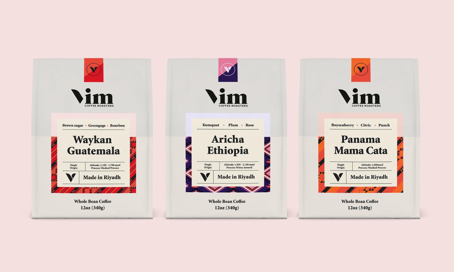
Mixing and matching font styles is one of the simplest yet most impactful ways to elevate your typography. Combining contrasting typefaces, such as pairing a classic serif with a sleek sans-serif, can bring a balanced and modern look to your design. This method allows you to establish a clear hierarchy and draw attention to key elements in your content.
To experiment effectively, start by identifying the tone and purpose of your project. For formal or traditional designs, a serif typeface like Times New Roman can serve as a strong base, complemented by a clean sans-serif like Helvetica for subtitles or supporting text. For playful or creative projects, try pairing script fonts with geometric sans-serifs to inject personality.
When combining fonts, limit your choices to two or three typefaces to maintain visual coherence. Overloading your design with too many fonts can make it feel cluttered and unfocused. Additionally, consider the proportions of the fonts. For instance, a bold, heavy serif can be paired with a lighter, more delicate sans-serif for an appealing contrast.
Testing your font combinations across different layouts is key. Pay attention to legibility and balance, ensuring your design works well both up close and from a distance. By thoughtfully mixing and matching font styles, you can create dynamic, visually compelling typography that enhances your message and resonates with your audience.
Play With Font Weights
Playing with font weights is a powerful way to create depth, hierarchy, and emphasis in typography. Font weights range from ultra-thin to extra-bold, offering endless opportunities for creative exploration. By using varying weights within the same typeface, you can guide the viewer’s eye and highlight important information without introducing new fonts.
Start by selecting a typeface with a versatile weight range, such as Roboto or Open Sans. Use heavier weights, like bold or black, for headings and key messages to immediately grab attention. For subheadings, try medium or semi-bold weights to provide a subtle contrast while maintaining emphasis. Reserve lighter weights for body text to ensure readability and a clean appearance.
To create balance, consider spacing and proportions. Bold weights often require more generous spacing to avoid feeling cramped, while thin weights benefit from tighter tracking to enhance clarity. Adjusting these details ensures a polished and professional finish.
You can also use font weights to experiment with contrast. Pair an extra-thin weight with a bold one for a striking visual effect. This approach works particularly well in modern, minimalist designs where text becomes a focal element.
Adjust Letter Spacing (Kerning)
Kerning, or the adjustment of space between individual letters, is a fundamental aspect of typography that significantly impacts readability and aesthetics. When executed effectively, kerning creates a balanced and harmonious text appearance, ensuring that letters flow naturally and cohesively.
To start experimenting with kerning, observe how letter pairs interact. Certain combinations, such as "AV" or "TY," often have uneven gaps due to the shape of the characters. These gaps can make text appear awkward or misaligned. Adjusting kerning manually allows you to correct these inconsistencies and create a more polished design.
Kerning is particularly important in large-scale text, such as logos, headlines, or display type. Even minor spacing errors become glaringly obvious at larger sizes, so taking the time to perfect letter placement is crucial. Tools in design software like Adobe Illustrator or Photoshop often include kerning controls, enabling precise adjustments.

Source: Danila Konstantinov, Poster Collection, Behance, https://www.behance.net/gallery/96649409/poster-collection
Use Oversized Typography
Oversized typography is a bold and eye-catching design choice that can dramatically enhance the impact of your message. By using larger-than-life text, you create an immediate focal point that draws the viewer’s attention and establishes hierarchy within your design.
This technique works well for headlines, titles, or any text you want to emphasize. Oversized typography allows you to convey emotions, make strong statements, and guide your audience through the content with ease. The key is to pair large-scale text with a minimalist layout, ensuring the typography remains the central element without overwhelming the design.
When experimenting with oversized typography, consider the typeface carefully. Clean and legible fonts, such as sans-serifs or bold serifs, are often the most effective. Additionally, explore how oversized text interacts with negative space. Allowing the letters to breathe can amplify their visual presence and create a balanced composition.
Explore Vertical Typography
Vertical typography is a striking design technique that breaks away from traditional horizontal text layouts. By stacking letters or words vertically, you can create an innovative and dynamic visual statement that draws attention and adds a sense of movement to your design.
This approach works particularly well for modern and minimalistic designs where you want typography to take center stage. Vertical typography is commonly used in posters, signage, and magazine layouts to create a bold and memorable impression. It’s also effective in web design, especially when used to accentuate headings or navigational elements.
When experimenting with vertical typography, choose typefaces that maintain legibility when rotated or stacked. Sans-serif fonts, with their clean and simple lines, are often a reliable choice. You can also explore letter spacing and alignment to enhance readability and balance.
Negative space is crucial in vertical layouts. Allow adequate breathing room around the text to prevent it from feeling cramped or overwhelming. Additionally, consider how vertical typography interacts with other elements in your design. Pair it with horizontal text or shapes to create contrast and visual harmony.
Color and texture can further elevate vertical typography. Try bold, contrasting colors for a dramatic effect or subtle gradients for a softer, more elegant look. By integrating vertical typography thoughtfully, you can introduce a fresh perspective to your designs, capturing the viewer’s attention while maintaining readability and visual appeal.
Use Color Wisely
Color is a powerful tool in typography that can significantly enhance the impact and clarity of your designs. When used strategically, color can draw attention, evoke emotions, and highlight key information. The choice of color in typography should be made with consideration of the message and the audience. For instance, warm colors like red and orange are often associated with energy and passion, making them ideal for calls to action. Cooler tones such as blue and green tend to evoke calmness and trust, suitable for corporate communications.
To experiment with typography using color, start with a limited palette to avoid overwhelming your audience. Typically, two to three colors will suffice. Use a dominant color for the body text that provides strong contrast against the background, ensuring readability. A secondary color can highlight important points or headings, guiding the reader’s eye through the design.
Layer Text Over Images
Layering text over images is a widely used design technique that combines visuals and typography to create striking and cohesive compositions. This approach is especially effective in advertisements, social media graphics, websites, and editorial layouts, where the integration of text and imagery enhances the overall impact of the design.
The key to successfully layering text over images lies in achieving balance and readability. Start by selecting an image with a relatively simple background. Overly busy or cluttered visuals can make the text difficult to read and visually overwhelming.
Contrast is critical. Use bold or high-contrast fonts that stand out against the image. Light-colored text works well on darker images, while dark text is ideal for lighter backgrounds. Adding a semi-transparent overlay or gradient between the text and image can further enhance clarity while preserving the visual integrity of the design.
Experiment with text alignment and placement. Positioning text strategically—such as aligning it with natural lines or empty spaces in the image—creates harmony and ensures the text does not obstruct key visual elements.
Pairing thoughtful typography with compelling imagery results in designs that are both aesthetically pleasing and highly communicative. By layering text over images with careful attention to detail, you can create memorable and impactful visuals.

Source: Kickin, Kickin - Poster Collection Vol 06, Behance, https://www.behance.net/gallery/97648629/Kickin-Poster-Collection-Vol-06
Combine Text And Shapes
Combining text and shapes is a creative way to add structure, style, and visual intrigue to your typography. By integrating geometric or organic forms into your designs, you can transform static text into dynamic compositions that draw attention and convey a sense of artistry.
Start by experimenting with basic geometric shapes like circles, rectangles, or triangles. Text can be placed inside, around, or on top of these shapes to create unique layouts. For example, wrapping text along the curve of a circle or aligning it with the edges of a triangle adds depth and movement to your design.
Shapes can also serve as background elements. Use solid or gradient-filled shapes behind text to provide contrast and enhance legibility, especially when working with detailed or textured backgrounds. Transparent or semi-transparent shapes can add subtle highlights without overpowering the typography.
Organic shapes, such as freeform blobs or hand-drawn elements, can introduce a playful or artistic quality. Pairing these with modern typefaces creates an engaging juxtaposition that feels fresh and innovative.
The interaction between text and shapes should feel deliberate and balanced. Avoid overcrowding or misaligning elements, as this can disrupt the flow of the design. By thoughtfully combining text and shapes, you can create designs that feel polished, intentional, and visually captivating, offering endless opportunities for creativity and experimentation.
Explore 3D Typography Effects
3D typography effects are a captivating way to add depth, dimension, and a sense of realism to your designs. By transforming flat text into three-dimensional elements, you can create a visually engaging experience that grabs attention and elevates your message.
To begin experimenting with 3D typography, consider the tools and techniques available. Many design software programs, such as Adobe Illustrator, Photoshop, or specialized 3D software like Blender, offer features to create 3D text. Start with basic extrusion or bevel effects to give your text a simple three-dimensional appearance.
Lighting and shadows play a critical role in enhancing the realism of 3D typography. By adjusting the angle and intensity of light sources, you can create dramatic or subtle effects that bring your text to life. Shadows add a sense of grounding, making the typography appear as though it’s interacting with the surrounding space.
Texture is another element to explore. Adding metallic, wood, or fabric textures to your 3D text can evoke a tactile feel and align your typography with the overall theme of your design. Keep usability and readability in mind. While 3D effects can be visually striking, overly complex designs may distract from your message. Use clean, bold fonts and maintain clear contrast between the text and background.
Explore Different Typefaces
Exploring different typefaces is an essential aspect of mastering typography. Each typeface carries its own personality and emotional impact, which can significantly influence the message conveyed by your design. When selecting typefaces, consider the context and purpose of your project. For example, serif fonts, known for their traditional and formal feel, are often used in print media such as books and newspapers. In contrast, sans serif fonts offer a clean and modern look, making them ideal for digital interfaces.
Experimenting with various typefaces allows designers to find the perfect match for the tone and content of their communication. It's beneficial to mix and match different families of typefaces to create a dynamic layout. For instance, pairing a bold sans serif headline with a delicate serif body text can produce a striking contrast that captures the viewer’s attention.
Additionally, venturing into decorative or display typefaces can add a unique flair to special sections of your design. However, use these eye-catching fonts sparingly to avoid overwhelming your audience and detracting from the legibility of your content.
When experimenting with typefaces, also consider the practical aspects such as readability, especially in long texts, and compatibility across different platforms and devices. A well-chosen typeface not only enhances the visual appeal of your design but also reinforces the readability and effectiveness of your message. By exploring different typefaces, you can expand your typographic repertoire and discover new ways to make your designs stand out.
Conclusion
Mastering the art of typography is crucial for any designer looking to enhance their visual communication. By experimenting with different typefaces, playing with color, and understanding the fundamentals of text placement and scale, designers can create more engaging and effective designs. Remember, typography is not just about making words legible; it's about making them resonate with the audience. Embrace the diversity of typography to express ideas creatively and impactfully. Whether you're designing for print or digital, the right typographic choices can transform your content from ordinary to extraordinary.
Let Us Know What You Think!
Every information you read here are written and curated by Kreafolk's team, carefully pieced together with our creative community in mind. Did you enjoy our contents? Leave a comment below and share your thoughts. Cheers to more creative articles and inspirations!




Leave a Comment