
Tips on How To Create A Logo Design with Procreate

Source: Muhammad Bagus Prasetyo, Label Design, Dribbble, https://dribbble.com/shots/19398640-Label-Design
Creating a logo on an iPad can feel much more natural than building one with a mouse, especially when your process begins with drawing. Procreate gives you a flexible space for sketching ideas, adjusting shapes, experimenting with lettering, and refining artwork directly with Apple Pencil. However, a successful logo still depends on careful decisions rather than drawing tools alone. When you create logo design with Procreate, the goal is to move from loose exploration toward a simple, recognizable mark that works beyond the canvas. A clear concept, organized layers, controlled strokes, balanced shapes, and sensible export choices all contribute to a stronger result. The following workflow keeps the process focused from the first sketch through the final file.
Start With a Clear Logo Concept
Before opening a new canvas, decide what the logo actually needs to communicate. Procreate makes experimentation quick, but drawing without a direction can easily produce attractive artwork that says little about the brand.
Define the Main Idea
Start with a few words describing the brand's personality, purpose, and desired impression. A children's brand might call for playful forms, while a technology company may benefit from something cleaner and more structured. Choose one central visual idea rather than trying to represent every aspect of the business. A simple concept is usually easier to recognize, reproduce, and remember.
Gather Simple Visual References
Collect a small number of references related to symbols, lettering styles, shapes, or visual moods that fit your direction. Procreate's Reference feature can also help you keep inspiration visible while sketching. References should guide your thinking rather than become templates to copy. Their purpose is to help you understand visual possibilities before developing an original solution.
Set Up Your Procreate Canvas Correctly
A sensible canvas setup gives you enough room to draw cleanly and make adjustments without constantly fighting pixel limitations.
Choose a Generous Canvas Size
Start larger than the final logo is likely to appear. For example, a square canvas of several thousand pixels on each side provides plenty of working room for most logo sketches and refined raster artwork. A larger canvas cannot turn Procreate into vector software, but it does preserve more detail while you work and reduces problems caused by enlarging small artwork later.
Keep the Background Simple
A plain white, neutral, or transparent background makes shapes easier to judge. Avoid designing against decorative imagery because it can distract you from spacing, contrast, and silhouette. Keeping the background on its own layer also makes transparent export much easier later.
Build the Logo From Rough Sketches
One of Procreate's biggest strengths for logo creation is speed during the sketching stage. You can test several ideas without treating every line as permanent.
Sketch Multiple Variations
Use a simple pencil brush and draw different arrangements of your concept. Try changing the symbol, proportions, lettering placement, orientation, and relationship between elements. Do not spend too long perfecting the first sketch. Producing several variations helps prevent you from settling on an idea simply because it was the first one you drew.
Compare Your Strongest Concepts
Once you have several sketches, step back and compare them at roughly the same size. Look for the concept that communicates most clearly with the least visual effort. Pay attention to recognizability, composition, distinctive features, and unnecessary complexity. Select one or two promising ideas for refinement instead of polishing every sketch.

Source: Ilham Herry, Logo Collection, Dribbble, https://dribbble.com/shots/17431673-Logo-Collection
Refine the Logo With Layers
Layers make it possible to improve a logo without destroying the original sketch. They also help separate elements that may need independent adjustment.
Separate Major Elements
Keep the rough sketch, refined symbol, lettering, guides, and other major components on separate layers whenever possible. Naming important layers can save time once the file becomes more complex. Separate layers also make repositioning or resizing individual elements much easier than editing a flattened drawing.
Lower Sketch Opacity for Tracing
Reduce the opacity of your rough sketch and create a fresh layer above it. Trace the important forms while correcting awkward curves, uneven proportions, and accidental marks. Treat the sketch as guidance rather than something you must follow exactly. Refinement is the stage where a promising idea becomes deliberate artwork.
Use Clean Brushes and Controlled Strokes
Brush choice has a major effect on how polished a Procreate logo appears. Highly textured brushes can be appealing for illustration but may introduce unwanted irregularity into a clean identity mark.
Choose Brushes With Consistent Edges
For most logos, use brushes with solid, predictable edges and limited texture. Monoline-style brushes are particularly useful for controlled outlines and lettering. A handmade brand may intentionally benefit from irregular strokes, but the texture should support the concept rather than appear because of an unsuitable brush.
Use Drawing Assistance When Helpful
Procreate's QuickShape feature can turn rough strokes into cleaner lines, circles, rectangles, and other basic forms. Drawing guides can also help with alignment, symmetry, and geometric construction. These tools are especially helpful when you create logo design with Procreate that relies on precise shapes. Use them to improve control without removing all personality from the drawing.
Simplify Shapes and Improve Logo Balance
A logo needs to communicate quickly, often at sizes much smaller than the canvas on which it was created. Refinement therefore includes deciding what can be removed.
Remove Unnecessary Details
Look for tiny lines, secondary decorations, textures, or internal shapes that contribute little to recognition. Details that look impressive while zoomed in may disappear or create visual noise when the logo is reduced. Try identifying the design from its overall silhouette. If the main form is already distinctive, additional details may not be necessary.
Check Spacing and Proportions
Examine the negative space around and inside the logo. Uneven gaps can make otherwise clean artwork feel awkward. Also compare the visual weight of different elements. A heavy symbol beside very thin lettering, for example, may need adjustment so the composition feels intentional.
Test the Design at Small Sizes
Zoom out frequently rather than judging the logo only at full canvas size. Important shapes should remain understandable when the artwork appears much smaller. This simple test often exposes weak spacing and overly complicated details more quickly than close inspection.
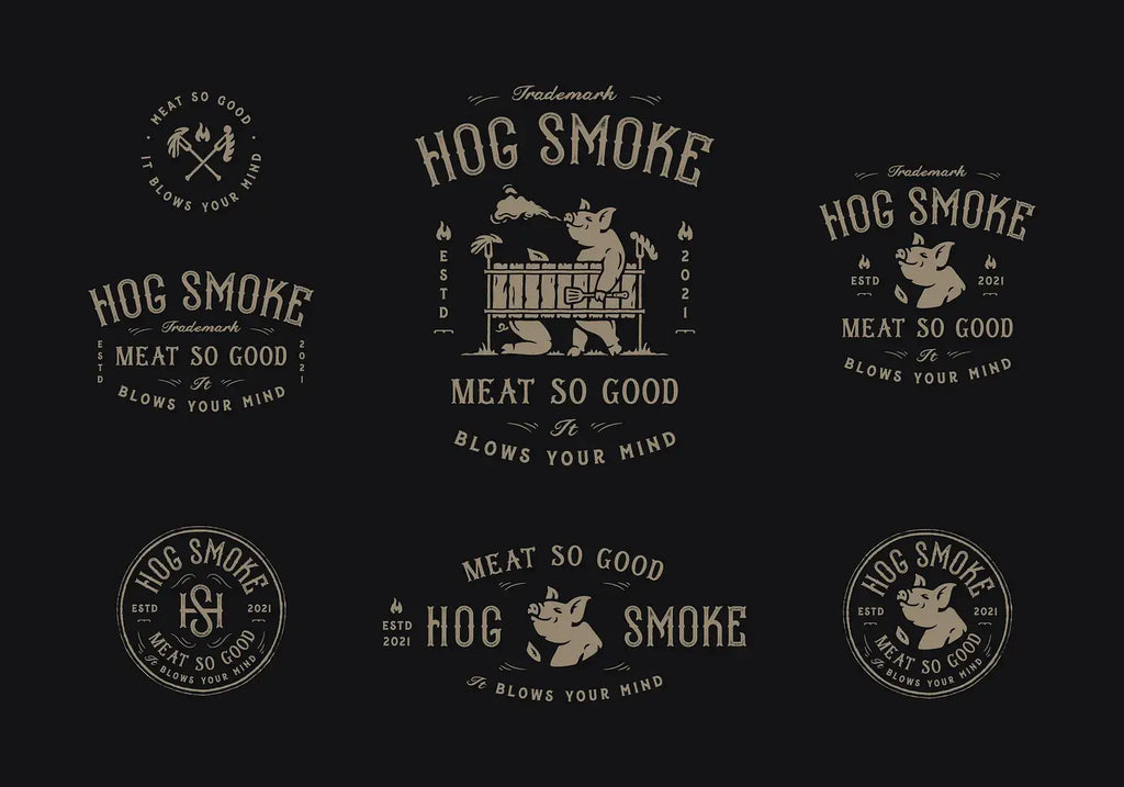
Source: Dusan Sol, Hog Smoke BBQ, Dribbble, https://dribbble.com/shots/16560373-Hog-Smoke-BBQ
Develop a Simple Color Version
Color can strengthen personality, but it should not compensate for a weak structure. Establish the basic logo form first, then experiment with a controlled palette.
Test the Logo in Black First
Turn the artwork into a single-color version and examine whether the symbol remains clear. If shapes merge together or important features disappear, adjust the structure before adding color. A strong monochrome version also gives you greater flexibility for future applications.
Add a Controlled Color Palette
Once the design works in one color, introduce a limited palette that supports the intended identity. Too many colors can make a small logo harder to reproduce consistently. Keep sufficient contrast between neighboring elements and test how the colors behave on both light and dark backgrounds.
Review and Clean Up the Final Artwork
Before exporting, inspect the logo as if you were seeing it for the first time. Small drawing errors are easy to overlook after working on the same file for a long period.
Inspect Edges and Connections
Zoom in and check curves, corners, intersections, and filled areas. Remove stray marks and repair uneven connections that were left behind during sketching. Then zoom back out. A technically perfect edge matters less than how the complete logo reads at normal viewing size.
Check Symmetry and Alignment
Use guides where alignment is important, particularly with geometric marks. However, do not assume every logo needs perfect symmetry. Slight visual adjustments can sometimes make a shape appear more balanced than mathematically exact positioning.
View the Logo in Different Contexts
Place the finished design temporarily against light and dark backgrounds. You can also preview it at sizes similar to a profile image, label, or other realistic application. These tests reveal whether the logo remains recognizable outside the comfortable scale of your working canvas.
Export Your Procreate Logo Properly
Exporting correctly preserves the strongest version of your work and prevents unnecessary rebuilding later.
Save a Procreate Working File
Keep the original layered Procreate file even after the logo is approved. Layers give you a way to adjust colors, spacing, or individual elements later without starting again. Creating a duplicate before major final edits can provide an additional backup.
Export a Transparent PNG
When you need a raster logo without a background, turn off the background layer and export the artwork as a PNG. Transparency makes the file easier to place over different surfaces and layouts. Export at a useful resolution rather than reducing the master artwork unnecessarily.
Understand Procreate's Raster Limitation
Procreate creates raster artwork, meaning the image is built from pixels. Enlarging it far beyond its original dimensions can therefore produce visible pixelation. For applications requiring true vector files, such as infinitely scalable artwork or certain professional production workflows, the finished Procreate concept may need to be recreated or converted carefully in vector software.
Conclusion
Learning to create logo design with Procreate works best when you treat the app as more than a digital sketchbook. Start with a focused concept, explore several rough ideas, and use layers to refine the strongest direction without losing flexibility. Clean brushes, simplified shapes, careful spacing, and small-size testing help transform hand-drawn artwork into a more functional logo. Color should support a design that already works structurally, while final cleanup ensures distracting imperfections do not survive into the exported file. By keeping Procreate's raster limitations in mind, you can use its intuitive drawing workflow effectively while preparing artwork for appropriate real-world applications.
Let Us Know What You Think!
Every information you read here are written and curated by Kreafolk's team, carefully pieced together with our creative community in mind. Did you enjoy our contents? Leave a comment below and share your thoughts. Cheers to more creative articles and inspirations!
Related Articles










Leave a Comment