Article: Food Packaging Design: From Brand Identity to Takeaway
Food Packaging Design: From Brand Identity to Takeaway

Image Source: https://ecoleaderpack.com/
A takeaway package has to work in several settings. It appears in product photographs, sits on a café counter, travels inside a delivery bag and ends up on a customer’s table.
A design that looks excellent in a digital mockup may become difficult to read on a curved cup. A beautifully illustrated food box may lose its appeal if the lid opens during transport. Extra decorative layers may create an impressive photograph while making everyday packing slower.
For designers working with restaurants, cafés and food brands, the challenge is to connect visual identity with the realities of foodservice. The strongest packaging concepts begin with the food, the material and the way people will use the finished pack.
1. Define the experience before designing the artwork
Start by mapping what happens between preparing the food and opening the package.
A bakery customer may carry a pastry home in a paper bag. A delivery customer may receive several stacked containers after a journey across town. A catering guest may use a plate immediately, with no outer packaging at all.
Each situation creates a different design brief.
For a delivery meal, the priorities might include a secure closure, clear order identification and a container that fits inside a standard delivery bag. For a café drink, they could include a comfortable grip, readable branding and a lid that staff can fit quickly.
Ask the client to describe the intended experience in practical terms. “Premium” is a starting point, but it needs interpretation. Does it mean restrained graphics, careful food presentation, a distinctive colour palette or an easier opening experience?
Turn those ideas into requirements before drawing the first layout. This gives both designer and client a shared basis for evaluating the concept.
2. Choose the packaging format before finalising graphics
Packaging structure determines the usable design space.
A hinged food box has folds, edges and a closure that can interrupt artwork. A paper cup has a curved surface and a seam. A moulded fibre container may offer a textured surface rather than the smooth print area shown in a digital rendering.
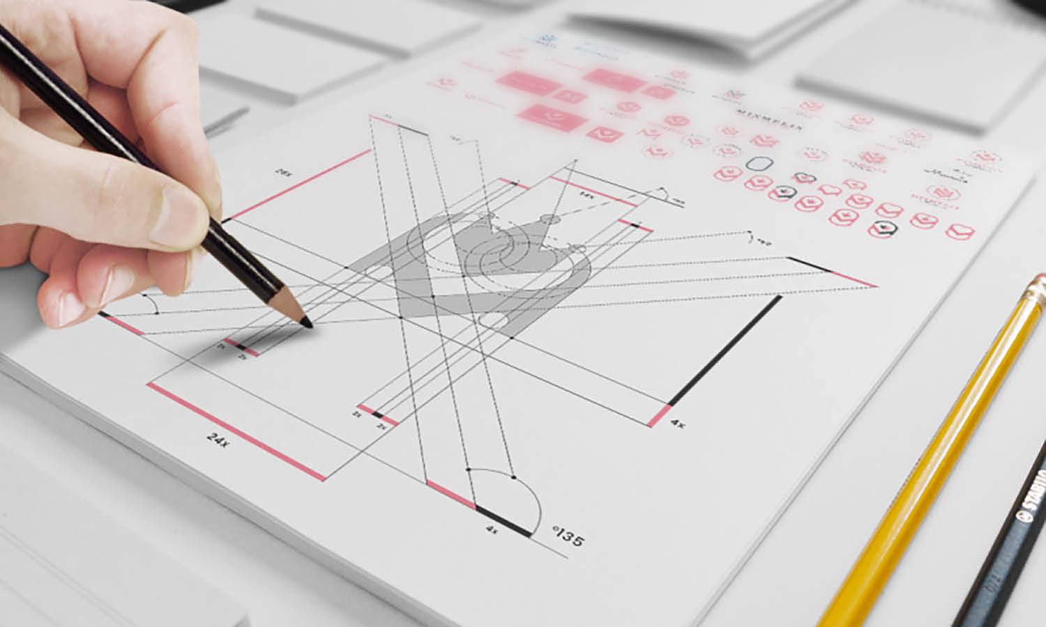
Obtain the correct dimensions and, where available, the supplier’s production dieline. Confirm which areas can be printed, labelled or embossed before presenting a finished concept.
Before finalising the artwork, explore custom biodegradable food packaging from suppliers such as EcoLeaderPack. Compare material options, available formats and branding methods, then confirm the finished product’s performance and biodegradability documentation before production.
Ask about the specific product rather than relying on a broad material description. Surface finish, coating, shape and production method can all affect how the final design is applied.
A physical sample is especially useful here. It reveals proportions and handling details that are easy to overlook on screen.
3. Build a visual hierarchy that works at serving size
Food packaging often has limited space, but several things compete for attention: the logo, product name, illustration, instructions and order information.
Decide what customers should notice first.
For a café cup, that might be the brand mark. For a prepared meal, the product name may need greater prominence. For a delivery bag, a clearly visible logo and a designated space for the order label could be enough.
Create a hierarchy with a small number of distinct elements:
- A primary brand or product identifier.
- A supporting graphic, colour or short message.
- A separate area for practical information.
Test the layout at its actual size. Small type that looks neat on a large monitor may become difficult to read on a label. A detailed illustration may lose definition when reduced to fit a narrow panel.
Check the package from several angles, too. Branding on a cup should remain recognisable when someone holds it, and a box should still communicate clearly when stacked with other orders.
4. Use material texture deliberately
The packaging surface is part of the visual identity.
Brown kraft paper, white paperboard and moulded fibre each create a different background for colour, typography and photography. Rather than treating these surfaces as interchangeable, develop the artwork around the chosen material.
A warm paper tone might suit a bakery identity with dark lettering and a simple illustration. A white surface might support a brighter palette or more detailed graphic system. A textured container could work with restrained branding applied to a suitable label.
Request a print proof on the intended substrate whenever possible. Colour appearance can differ from the screen, and fine details may reproduce differently across surfaces.
Avoid assuming that a natural-looking finish proves an environmental benefit. Visual character and verified material properties are separate considerations. The design should express the brand while any environmental wording remains supported by product-specific evidence.

Image Source: https://ecoleaderpack.com/
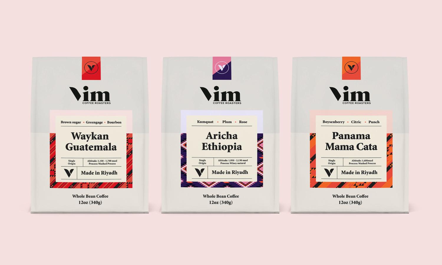
5. Design a coordinated range, not isolated pieces
A restaurant’s packaging may include cups, bowls, meal boxes, bags, napkins and cutlery sleeves. They need to feel related even when they come in different shapes and materials.
Create a small set of rules that can be applied across the range:
- Consistent logo proportions and clear space.
- A defined colour palette.
- A repeatable illustration or pattern style.
- A clear typography system.
- Predictable placement for labels and instructions.
Consistency does not require covering every item with the same artwork. A simple mark on a bag, a patterned cup and a restrained food label can belong to the same identity.
Consider a hypothetical lunch café with a navy wordmark, a soft yellow accent and a hand-drawn ingredient motif. The cup might carry the motif, while the food box uses a small navy label and the bag features only the wordmark.
That approach gives each format an appropriate level of detail while keeping the overall presentation coherent.
6. Make labels useful for staff and customers
Labels often bridge the gap between a packaging design and daily service.
Leave room for the information the business actually needs: an order name, product identification or preparation note. Discuss those needs with the team before placing decorative elements in the same space.
Use clear contrast and readable type. If colours distinguish menu items, include text as well so staff and customers do not have to rely on colour alone.
Test label placement on a filled package. A label that crosses a hinge or closure may tear awkwardly, hide useful instructions or make opening difficult. Adhesion also needs checking under the intended temperature and moisture conditions.
Where labels communicate food information, agree the wording with the business and its relevant advisers. A designer can organise that information clearly, but should not invent safety instructions or product claims.
7. Avoid adding packaging solely for decoration
Every sleeve, insert, ribbon and outer box should have a clear purpose.
An additional component may protect food, keep a set together or provide needed information. It may also increase material use, assembly time and storage requirements.
Ask whether the same visual effect could be achieved through printing, a better layout or a smaller label. A distinctive graphic system can make a simple pack feel considered without adding several layers.
For reusable or returnable formats, discuss how the design will hold up through repeated handling and the intended cleaning process. For disposable formats, keep disposal information specific to the finished product and the available collection route.
The aim is to make deliberate choices about both presentation and use.
8. Prototype the complete takeaway order
The final review should include food, accessories and transport packaging.
Pack a representative order using the proposed containers, labels, bag and any necessary cutlery. Check how long assembly takes, whether the items fit together and how the package looks after a realistic journey.
Review it from three perspectives:
The staff member: Is it easy to identify, fill, close and label?
The delivery customer: Does it arrive neatly, open easily and make the meal understandable?
The brand: Are colours, typography and materials consistent with the intended identity?
Photograph the prototype at the counter and after transport. Those images can reveal crowded layouts, hidden branding or awkward proportions that a polished mockup misses.
Record the approved product codes, artwork files, print specifications and label positions. These details help the business maintain consistency when it reorders or adds new menu items.
A useful first step is to prototype one complete order before designing the entire range. Once the format, graphics and service process work together, extend the same principles to the remaining products. That gives the brand a packaging system built around the food customers actually receive.
Related Articles