30 Best Boat Logo Design Ideas You Should Check

Source: Jordan Wilson, Kayak, Dribbble, https://dribbble.com/shots/18201972-Kayak
Dive into the vibrant world of boat logo design, where creativity sets sail! Whether you're a seasoned sailor in the design industry or just dipping your toes into these waters, preparing a logo that encapsulates the spirit of the sea can be a thrilling adventure. In this article, we'll cast a wide net to capture some of the most innovative and inspiring boat logo designs. From sleek and modern to whimsical and classic, each logo we explore promises to spark your imagination and maybe even stir a wave of inspiration.
Get ready to navigate through a sea of curves, colors, and creativity as we showcase top-tier designs that are making a splash in the design world. Perfect for entrepreneurs aiming to brand their maritime ventures or designers seeking to expand their portfolio, these ideas are not just logos; they are beacons guiding you towards successful branding shores.
So, hoist your sails and let’s embark on this creative journey, exploring how these logos can not only represent a brand but also tell a captivating story of adventure and exploration on the high seas!
Boat Logo Design Ideas

Source: Victor Murea, GrowthCraft, Dribbble, https://dribbble.com/shots/24928836-GrowthCraft-Logo-Exploration

Source: Conceptic, To the Stars, Dribbble, https://dribbble.com/shots/17429900-To-the-stars

Source: Chad Patterson, Dave and Tim, Dribbble, https://dribbble.com/shots/11034021-Dave-and-Tim-Merch-Design

Source: Ugo Borrey, BlackBoat, Dribbble, https://dribbble.com/shots/9832226-BlackBoat-Clothing-Brand-Daily-Logo-Challenge-Day-23

Source: Jordan Jenkins, Landed, Dribbble, https://dribbble.com/shots/24456737-Landed-Logo

Source: Emily Mills, Wayfinder, Dribbble, https://dribbble.com/shots/17648706-Wayfinder-Logo

Source: Luka, Mariner, Dribbble, https://dribbble.com/shots/6848387-MARINER

Source: Galya Korn, Otago, Dribbble, https://dribbble.com/shots/19032528-Hotel-Logo

Source: Logorilla, Datasail, Dribbble, https://dribbble.com/shots/17699567-datasail

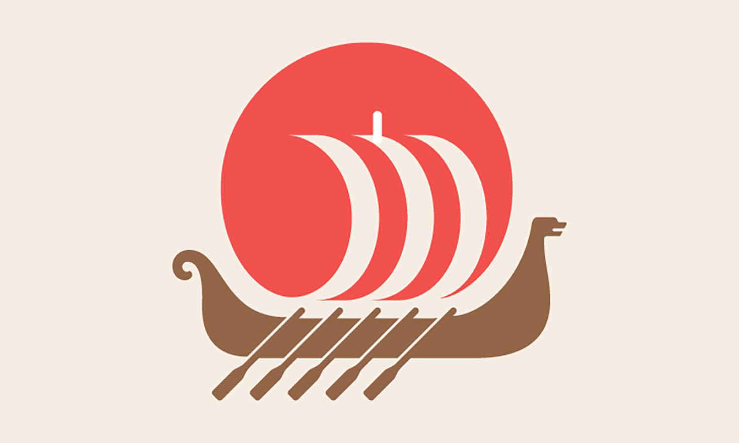
Source: David Dreiling, Vikings Boat, Dribbble, https://dribbble.com/shots/3528632-Vikings-Boat

Source: Matthieu Martigny, Dribbble, https://dribbble.com/shots/19587091-BOAT-LOGO

Source: Rahat Al Yeasin, Bengal Boats, Dribbble, https://dribbble.com/shots/16511774-Logo-Bengal-Boats

Source: Andrew Korepan, Phantom, Dribbble, https://dribbble.com/shots/19019013-Phantom

Source: Nadia Castro, Dribbble, https://dribbble.com/shots/9718627-Boat

Source: Dmitry Krino, Portage Media Co, Dribbble, https://dribbble.com/shots/15615369-Portage-Media-Co

Source: Daniel Bodea, Seasign, Dribbble, https://dribbble.com/shots/5795389-SeaSing

Source: Designollo, Oceania Studio, Dribbble, https://dribbble.com/shots/6261928-Oceania-Studio

Source: Fjolla Nishlija, Marinero, Dribbble, https://dribbble.com/shots/6697751-Sea-Food-Restaurant

Source: LogoCaptain Studio, Boat & Bag, Dribbble, https://dribbble.com/shots/18908115-Boat-Bag

Source: Eugene MT, BoatHelpex, Dribbble, https://dribbble.com/shots/6436801-BoatHelpex-Logo-Design-Concept-for-sale

Source: Mike Berg, Minnesota Gopher, Dribbble, https://dribbble.com/shots/9360198-Minnesota-Gopher

Source: Md Rasedul Jamal, Behance, https://www.behance.net/gallery/234604277/sailor-boat-logo

Source: Stefan Kitanović, Hendriks Grooming, Dribbble, https://dribbble.com/shots/10001502-Hendriks-Grooming-Logo

Source: Angon Mangsa, Okie Outfitters, Dribbble, https://dribbble.com/shots/17828377-Okie-Outfitters

Source: Lucian Radu, Space Sailing Ship, Dribbble, https://dribbble.com/shots/19300811-Space-Sailing-Ship-Logo

Source: Val Waters, District Seafood, Dribbble, https://dribbble.com/shots/7017127-Seafood-Logo-Two

Source: David Galletly, PostMap Club, Dribbble, https://dribbble.com/shots/5818402-PostMap-Club-Logo

Source: Graph_uvarov, Signature Yacht, Dribbble, https://dribbble.com/shots/14510859-Signature-Yacht-Logo-Logo-was-Sold

Source: Babu Ahmed, Lemon Boat, Dribbble, https://dribbble.com/shots/18069571-Lemon-boat-Logo

Source: Jordan Wilson, Kayak, Dribbble, https://dribbble.com/shots/18201972-Kayak
What Are the Key Elements of an Effective Boat Logo Design?
Navigating the waters of boat logo design? Anchoring your brand with a logo that truly resonates requires a mix of creativity, strategy, and nautical flair. Here are five key elements to consider when designing a boat logo that is both captivating and effective. Grab your compass, and let’s chart the course to a standout logo!
Clarity of Purpose
First and foremost, your boat logo design should clearly reflect what your brand is all about. Is it luxury yacht charters, rugged fishing adventures, or perhaps sleek speedboats? Each theme lends itself to different design elements. A clear, focused logo tells your audience immediately what they can expect from your brand, like a lighthouse guiding ships safely to shore.
Memorable Simplicity
In the vast sea of logos, simplicity helps your design stand out and be remembered. The most effective boat logos often have a simple yet powerful design that can be easily recognized at a glance. Think of it as the clean line of a well-designed hull cutting through the waves – simple, smooth, and efficient. This doesn’t mean your logo can’t be detailed or intricate, but the overall form should be identifiable quickly and from a distance.
Nautical Imagery
Integrating nautical elements into your logo can immediately place your brand within the maritime world. Classic symbols like anchors, sails, and waves are popular, but don’t be afraid to think outside the boat! For instance, a clever use of marine animals, mythical sea creatures, or even navigational tools like compasses and sextants can add a unique twist to your design.
Appropriate Color Palette
Colors play a crucial role in conveying the mood and personality of your brand. Blues and whites are natural choices for boat logos, evoking feelings of calm, trust, and cleanliness. However, depending on your brand’s identity, you might want to incorporate other colors. A touch of red can suggest excitement and passion, while green might speak to an eco-friendly venture. The key is to choose colors that complement each other and enhance the overall impact of the logo.
Versatility Across Media
A great boat logo design must work well across various media formats. From the side of a ship to the header of a website, your logo should be scalable and legible in different sizes and applications. It should look equally impressive on a small business card as it does on a large banner. This requires a thoughtful design process, ensuring the logo maintains its integrity whether it’s embroidered on a hat or emblazoned on a sail.
Creating an effective boat logo design is like setting the right course for a successful voyage. It requires a clear understanding of your brand’s destination, a streamlined design that’s easy to recall, the right splash of nautical imagery, a color palette that reflects your brand’s ethos, and the versatility to look good in any sea of competition. With these key elements in mind, your boat logo is sure to make waves in the marketplace, capturing the essence of your brand and steering it towards success.
What Are Some Creative Tips for Boat Logo Design?
When it comes to creating an eye-catching boat logo design, stepping out of the traditional anchor and embracing a sea of creativity is key. Boat logo designs are not just about maritime motifs; they're about capturing the spirit of the sea and the essence of the brand in one compact visual experience. Here are five creative tips to help you navigate the waters of boat logo design with flair and originality:
Dive Deep into Color Psychology
Colors are not just a part of the design; they tell a story. For boat logo designs, think beyond the standard blues and consider the emotions you want to evoke. Aquamarine can conjure feelings of tranquility, while dark navy may project strength and reliability. Don’t be afraid to experiment with sunset oranges or coral pinks to make your design pop and stand out in a sea of sameness.
Simplify with Symbolism
Boats and nautical themes are rich with symbolic imagery. Instead of the usual suspects like anchors and ship wheels, why not explore less common symbols? A compass, for instance, can symbolize guidance, making it perfect for brands that pride themselves on leading the way in their industry. Or consider integrating waves, which can signify movement and innovation. The key is to simplify these symbols so they’re easily recognizable even at smaller sizes.
Use Typography to Tell a Tale
The right typeface can elevate your boat logo design from good to legendary. Consider fonts that reflect the character of the sea—flowing, clean lines for a modern look, or perhaps something more traditional with a hint of old-world charm. Custom lettering can also add a unique touch, ensuring that your logo sails smoothly across various marketing channels.
Embrace Negative Space
Negative space is not just an artistic technique; it's a way to add a layer of sophistication to your logo design. Think of how the FedEx logo incorporates an arrow between the 'E' and 'x'. For a boat logo, perhaps the white space in a wave could form a seagull, or the gap in a sail could hint at the setting sun. This method not only grabs attention but also keeps viewers engaged as they discover hidden elements.
Anchor Your Design with Storytelling
Every brand has a story, and your logo is a powerful way to tell it. Consider the brand’s origins, its mission, and its vision for the future. Is it adventurous and daring, or more about luxury and relaxation? Incorporate elements that reflect these traits. If a brand prides itself on its heritage, vintage elements can add depth and context. For a more futuristic approach, sleek, abstract designs can convey innovation and forward-thinking.
Crafting a boat logo design that truly resonates requires creativity, a deep understanding of the brand, and a willingness to sail uncharted waters. By integrating these five tips into your design process, you’ll ensure that your boat logo not only stands out but also stays true to the brand’s core identity. So, set sail on your design journey with these creative strategies as your compass, and create a logo that's as vast and profound as the ocean itself!
What Are Common Symbols Used in Boat Logo Designs?
Ahoy, design adventurers! When it comes to crafting a captivating boat logo design, sailing the sea of symbols is essential. Whether you’re branding a yacht club or launching a maritime product, choosing the right symbols can help your logo not only float but soar. Let's dive into some of the most iconic and commonly used symbols in boat logo designs and how to give them a unique twist:
The Classic Anchor
Nothing says nautical like the trusty anchor. A universal symbol of stability and security, anchors are a popular choice for boat logo designs, often representing steadfastness and reliability. But don’t just drop any old anchor in your design! Customize it by intertwining it with other elements like ropes or chains, or perhaps even integrating the initials of the company to add a personal touch.
The Steady Helm
The ship's wheel, or helm, stands for direction, control, and steering towards success. It's perfect for businesses that want to emphasize leadership and trustworthiness. To spin this traditional symbol into a fresher look, consider stylizing the helm to appear more modern or incorporating elements of the sea, like waves or wind, to demonstrate how your brand navigates through challenges.
The Swift Sail
Sails harness the power of the wind and are emblematic of adventure and exploration. They can convey a sense of freedom and discovery, ideal for brands that are all about new horizons. Give your sails a unique flair by playing with geometric shapes or adding dynamic lines that suggest movement and speed, making your logo not just seen but felt.
The Mystical Compass
Guiding sailors since time immemorial, the compass is a symbol of guidance, precision, and exploration. It’s perfect for brands that pride themselves on providing direction and clarity to their clients. To modernize a compass symbol, use sleek, minimalistic lines or incorporate a glow effect to symbolize innovation and forward-thinking.
The Playful Dolphins and Marine Life
Incorporating marine wildlife like dolphins, whales, or even mythical creatures like mermaids can add a touch of fun and whimsy to your boat logo design. These creatures can represent harmony with the sea, environmental awareness, or simply the joy of marine life. Get creative by stylizing these figures into abstract forms or integrating them into other elements of the logo to create a cohesive and engaging design.
Using these common symbols in your boat logo design can help convey your brand's message at a glance, while creative tweaks ensure it stands out in a crowded harbor. Whether you anchor your design with stability or steer it towards adventure, remember that the most effective logos are those that reflect the unique spirit and values of the brand. So, set sail on your design voyage with these symbols as your guide, and craft a boat logo that truly encapsulates the essence of your brand!
What Color Palette Works Best for Boat Logo Designs?
Choosing the right color palette for your boat logo design is like setting the right course on a nautical chart – it can lead to smooth sailing or stormy seas in the realm of brand recognition. Here are five points to consider when selecting the perfect hues for your maritime brand :
Classic Nautical Colors - Timeless and Trustworthy
There's a reason why blues and whites are the go-to colors for boat logo designs. These colors are deeply rooted in nautical tradition, evoking feelings of trust, calmness, and professionalism. Blue, the color of the sea and sky, ranges from deep navy for a touch of elegance to bright aqua for a more playful vibe. White, on the other hand, conveys simplicity and cleanliness. Together, they create a classic, timeless look that's instantly recognizable in the marine industry.
Splashes of Bright and Bold
Who says boat logos have to stick to blues and whites? Adding splashes of bright and bold colors can make your logo stand out. Think about using reds for a touch of excitement and energy, or sunny yellows to convey optimism and friendliness. These colors can work wonderfully to accentuate key elements of your logo or to make your brand name pop.
Earthy Tones for a Touch of Nature
If your brand has an eco-friendly focus or if you're all about wooden boats and natural materials, earthy tones like greens, browns, and beiges might be your best bet. These colors suggest a connection to nature and sustainability, and can give your brand an organic, grounded feel. They work particularly well for brands that emphasize craftsmanship, tradition, and environmental responsibility.
Metallic Tones for a Touch of Luxury
For those in the luxury yacht business or high-end maritime services, incorporating metallic tones like gold, silver, or bronze can add a sense of sophistication and exclusivity. These colors suggest premium quality and are perfect for creating a logo that speaks of luxury and elegance.
Monochrome for Modern Minimalism
If your brand is all about modernity and sleek design, consider a monochrome palette. Black and grey can convey a sense of sleekness and sophistication, while a monochrome approach ensures your logo is versatile and looks great on any background. This color scheme is particularly effective for brands that want to project a contemporary, cutting-edge image.
The best color palette for your boat logo design depends on your brand's personality and target audience. Whether you opt for classic nautical hues, bright and bold splashes, earthy tones, luxurious metallics, or sleek monochrome, remember that your chosen colors should resonate with your brand’s identity and story. Just like a captain picks the right sails for the voyage, choose a color palette that will guide your brand to its desired destination in style and distinction!
What Style Should I Choose for My Boat Logo Design?
Selecting the perfect style for your boat logo design is like choosing the right boat for a sea adventure—it needs to fit the journey and make waves! The style of your logo not only conveys your brand’s personality but also anchors its presence in the competitive sea of the market. So, let’s dive into some stylish considerations that will ensure your boat logo not only floats but also sails smoothly across all branding oceans.
Classic and Timeless
For brands that pride themselves on heritage and tradition, a classic and timeless logo design is the way to go. Think crisp, clean lines, traditional nautical colors like navy blue and white, and iconic symbols such as anchors or ship wheels. This style exudes reliability and trustworthiness, perfect for yacht clubs, maritime insurance companies, or historic tour boats. By sticking to a classic look, your logo ensures that your brand remains relevant and respected through the tides of time.
Modern and Minimalistic
If your brand is all about innovation and sleek design, a modern and minimalistic style might be your beacon. This style uses simple shapes, limited color palettes, and a lot of negative space to create a clean and contemporary look. Think of a stylized wave or a sleek, abstract sail. These designs are particularly effective for new yacht manufacturers, high-tech maritime gadgets, or luxury cruise lines, offering a fresh and forward-thinking vibe that appeals to a sophisticated clientele.
Rustic and Handcrafted
Embrace the spirit of the sea with a rustic, handcrafted logo design. This style is ideal for fishing charters, seaside bistros, or artisanal boat-building companies. Use earthy tones, rough textures, and hand-drawn elements to convey warmth and authenticity. A logo that looks like it was sketched on a piece of driftwood or incorporates nautical rope and wood textures can connect with customers looking for genuine, down-to-earth experiences.
Adventurous and Playful
For brands that aim to capture the excitement and fun of boating, an adventurous and playful logo style is key. Use bright colors, dynamic shapes, and fun imagery like waves, fish, or even cartoon boats. This style works great for water sports companies, family-friendly cruises, or beachside rental services. It's all about making a splash and showing that your brand is all about good times and great adventures on the water.
Elegant and Luxurious
Convey sophistication and luxury with an elegant logo design. This style is perfect for high-end yacht clubs, luxury vessel manufacturers, or exclusive cruise lines. Use sleek lines, luxurious colors like gold, silver, or black, and incorporate elements like compasses or stars to suggest navigation and high-end service. An elegant logo promises a premium experience, appealing to those who wish to sail in style.
Choosing the right style for your boat logo design is crucial in setting the tone for your brand and attracting the right audience. Whether you opt for something classic and trustworthy, sleek and modern, or fun and adventurous, ensure that your logo is a true reflection of what your brand stands for. So hoist the sails of creativity and let your boat logo be the flag under which your brand sails proudly!
Conclusion
The right boat logo design can significantly elevate your brand, creating a memorable identity that resonates with your target audience. Whether opting for a classic, modern, rustic, adventurous, or elegant style, each design choice plays a crucial role in how your brand is perceived. A thoughtfully crafted logo not only stands out visually but also embodies the essence of your brand's story and values. As you navigate the waves of branding, remember that a well-designed boat logo is your first signal to the world about who you are and what you stand for in the vast ocean of the market.
Let Us Know What You Think!
Every information you read here are written and curated by Kreafolk's team, carefully pieced together with our creative community in mind. Did you enjoy our contents? Leave a comment below and share your thoughts. Cheers to more creative articles and inspirations!





Leave a Comment