
PlayStation Logo Design: History & Evolution

Image Courtesy of PlayStation
PlayStation is more than a gaming console—it is a cultural icon with an instantly recognizable visual identity. At its center is a logo that reflects innovation, creativity, and technological progress.
This article traces the PlayStation logo design across console generations, from its experimental beginnings to modern minimalism. Changes in color, typography, and form reveal how the brand evolved while preserving its identity.
For designers, gamers, and branding enthusiasts, its evolution shows how a strong symbol builds global recognition. Within entertainment logo history, PlayStation demonstrates the value of thoughtful design.
PlayStation Logo Design History
1994 - 2009
PlayStation grew from a Sony–Nintendo partnership begun in 1988. After the deal ended, Sony developed its own system, leading to PlayStation’s 1994 debut. Sony considered about 20 logo concepts featuring different letter arrangements, colors, and geometric forms. Some used colorful ovals or stylized initials; another placed a white “S” in the negative space of a “P.”
The chosen logo balanced vivid color with a memorable three-dimensional construction. The upright “P” and flattened “S” suggested spatial depth, supporting PlayStation’s emphasis on three-dimensional games while remaining readable as the product’s initials.
This solution also gave Sony a compact mark that could work across console hardware, game cases, television screens, and advertising without depending on a mascot or literal gaming image. Within brand logo history, it exemplifies how experimentation can produce a durable identity.
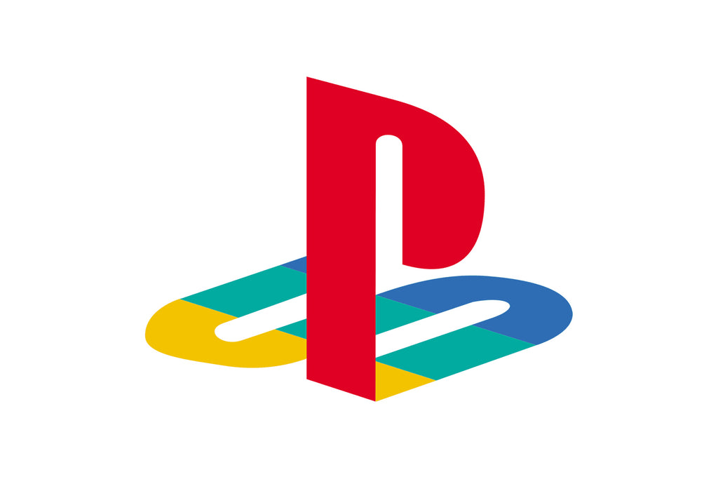
Image Courtesy of PlayStation
2000
PlayStation 2 introduced a generation logo suited to advancing technology. Its gradient-blue “PS2” monogram formed a continuous geometric line with square contours, creating a futuristic appearance. Beneath it, the console’s name appeared in a narrow custom black sans-serif. Open contours in the “A” characters complemented the geometric badge.
Working beside the established PlayStation emblem, the PS2 identity signaled technological change without abandoning recognition—a distinction later console branding continued. Its geometry, gradient, and custom typography captured the early-2000s digital aesthetic while presenting the hardware as a substantial step beyond the original console.

Image Courtesy of PlayStation
2006
PlayStation 3 adopted a restrained identity reflecting a more mature brand. The black “PS3” lettering used smooth, bold lines and softened contours, accompanied by a black sans-serif “PlayStation 3” inscription.
The uncluttered typography communicated technological sophistication without decoration. By its third generation, PlayStation no longer needed bright color for recognition; its name and emblem were already established.

Image Courtesy of PlayStation
2009 - Present
The PlayStation logo used since 2009 represents refinement and minimalism. Created by Japanese designer Manabu Sakamoto, who also worked on other Sony badges including VIAO, it preserves the familiar PS construction in black and white.
Removing the original colors improved reproduction across hardware, packaging, screens, and promotions without weakening recognition. The one-color emblem can also be printed, engraved, animated, reduced, or reversed against dark backgrounds.
By protecting the recognizable form while simplifying its treatment, Sony connected the brand’s heritage with a contemporary appearance. The result feels familiar and current, showing that subtle refinement can be as effective as replacing an established identity.

Image Courtesy of PlayStation
2013
PlayStation 4 maintained the established visual theme while distinguishing a new generation. The monogram retained the previous smooth lines and bold contours, with “4” providing the main update. The black PlayStation emblem appeared to its left, linking the badge to the master brand.
This selective modification refreshed the system without weakening recognition and unified its use across hardware, packaging, advertising, stores, and interfaces.

Image Courtesy of PlayStation
2020
PlayStation 5 continued this consistency. The numeral “5” replaced “4,” while the other elements remained intact.
The familiar cues connected console generations while clearly identifying the new hardware. The PS5 logo shows that thoughtful evolution can preserve what already works instead of pursuing radical transformation.

Image Courtesy of PlayStation
Who Created The Original Playstation Logo Design?
Japanese designer Manabu Sakamoto created the original PlayStation logo while working with Sony Computer Entertainment in the early 1990s. Sony needed a futuristic, energetic identity unlike competitors’ branding.
Sakamoto combined “P” and “S” in a three-dimensional emblem. The red “P” stands upright while the stylized “S” lies beneath it, creating depth suited to a system centered on 3D gameplay.
The Meaning Behind The Design
The compact logo paired vivid color with layered initials. Its palette stood out on packaging, discs, advertising, and store displays, while its depth reflected the transformation of console graphics.
Why The Original Logo Still Matters
Later applications became flatter and more minimal, but Sakamoto’s construction remained intact. Its typography, color, and dimension established a flexible symbol that still represents innovation and play.
Because it avoids literal imagery such as a controller, character, or storage format, technological changes have not made the logo obsolete.
Continue Reading
- Cartoon Network Logo Design: History & Evolution
- DC Comics Logo Design: History & Evolution
- Discovery Channel Logo Design: History & Evolution
- DreamWorks Animation Logo Design: History & Evolution
- ESPN Logo Design: History & Evolution
What Colors Are Used In The Playstation Logo Design And Why?
The 1994 logo paired a bright red upright “P” with an “S” in yellow, green, and blue. This palette gave the emblem impact on screens, shelves, and packaging.
The Meaning Behind The Original Color Palette
Red created a bold focal point, while yellow, green, and blue distinguished the layered sections of the “S,” clarifying its depth. Although often assigned individual meanings, the colors more clearly made the identity lively, approachable, and distinct from conventional electronics branding.
The Shift To Minimalism
As PlayStation matured, the emblem increasingly appeared in black, white, silver, or other single colors. These versions reproduce consistently on hardware, packaging, startup screens, and interfaces while allowing surrounding artwork to supply color.
Why The Colors Still Matter Today
The original palette remains iconic and evokes PlayStation’s early era. It can return for nostalgic or celebratory uses, while neutral versions handle everyday branding.
Both remain connected because the emblem’s silhouette, rather than any single color, carries most of its recognition.
What Does The Playstation Logo Design Symbolize?
The upright “P” and flattened “S” form a visual story about dimension, innovation, and interactive entertainment.
A Clever Play On Dimension
The vertical red “P” and horizontal multicolored “S” create depth suited to PlayStation’s arrival during gaming’s transition from two-dimensional to three-dimensional graphics.
The vertical form supplies height while the horizontal letter anchors it. Because the concept is not tied to a controller, character, or genre, it can represent the entire platform.
Color As A Symbol Of Creativity
The original colors added excitement while separating the planes of the “S.” Later black, white, and silver applications created a mature presentation without changing the interlocking form or its symbolism.
A Symbol Of Community And Culture
Decades of use on consoles, controllers, startup screens, games, merchandise, and esports events have given the emblem cultural meaning. For players, it recalls shared experiences, competition, exploration, and memorable stories.
What began as a clever monogram has become a familiar symbol of innovation, creativity, connection, and the community surrounding PlayStation.
Its original dimensional idea still recalls the rise of 3D gaming, but its accumulated meaning now extends to the experiences and relationships formed across generations of players.
Frequently Asked Questions
Who Designed the Original PlayStation Logo?
Manabu Sakamoto, a designer at Sony, is credited with creating the original PlayStation logo. He explored numerous concepts before the interlocking “P” and “S” design was chosen. His work also extended into the wider visual identity, helping the emblem function across packaging, print, television, and other brand applications.
What Do the “P” and “S” in the PlayStation Logo Mean?
The letters are the initials of PlayStation. The “P” stands upright, while the “S” appears flattened beneath it in perspective. This arrangement creates an illusion of three-dimensional space, making the brand name visually distinctive while reflecting the importance of 3D graphics to the original PlayStation experience.
Why Did the PlayStation Logo Change From Color to Black and White?
Monochrome presentation makes the logo easier to reproduce consistently on hardware, screens, packaging, merchandise, and small digital interfaces. The structure itself did not need to change because its silhouette was already widely recognized. The original colors remain part of PlayStation heritage and still appear in anniversary and nostalgic applications.
Did the PlayStation Logo Change for Every Console Generation?
No. PS2, PS3, PS4, and PS5 received their own generation-specific wordmarks, but these did not replace the central PlayStation emblem. Most visible changes involved typography, color, and presentation. The interlocking “PS” symbol continued to connect the consoles to one recognizable master brand.
Conclusion
The PlayStation logo shows how thoughtful visual identity can shape generations of entertainment. From its colorful three-dimensional beginnings to its modern monochrome treatment, the symbol has reflected technological progress while preserving its core form. Each console badge adapted to its era without weakening the master brand. For designers and gamers, its evolution demonstrates the value of experimentation, restraint, and continuity. More than a console mark, it remains an enduring emblem of creativity, innovation, and gaming culture.
You May Also Like
- Walt Disney Logo Design: History & Evolution
- Warner Brothers Logo Design: History & Evolution
- YouTube Logo Design: History & Evolution
- 20th Century Studios Logo Design: History & Evolution
- BBC Logo Design: History & Evolution
Let Us Know What You Think!
Every information you read here are written and curated by Kreafolk's team, carefully pieced together with our creative community in mind. Did you enjoy our contents? Leave a comment below and share your thoughts. Cheers to more creative articles and inspirations!
Related Articles












Leave a Comment