20th Century Studios Logo Design: History & Evolution
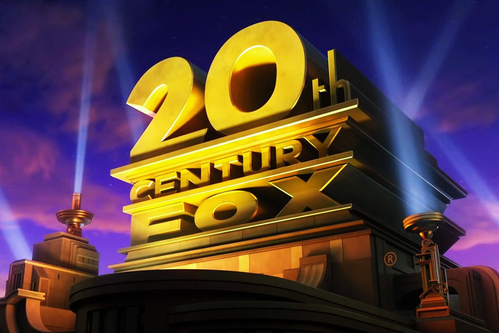
Image Courtesy of 20th Century Studios
The story of 20th Century Studios is inseparable from its iconic logo design, which has become one of the most recognizable visual symbols in film history. More than a simple title card, the logo represents cinematic ambition, storytelling excellence, and decades of Hollywood legacy. From its early architectural roots to its modern, polished presentation, each version reflects the era in which it was created.
This article explores the full journey of 20th Century Studios logo design, highlighting how the brand evolved visually while maintaining a strong and consistent identity. Over the decades, changes in typography, structure, lighting, and animation mirrored shifts in design trends, film technology, and audience expectations. Yet, the core elements remained familiar, allowing the logo to feel both timeless and adaptable.
From the original 20th Century Fox emblem to the refined 20th Century Studios identity seen today, the logo’s evolution is a valuable case study in thoughtful brand design. Designers, film enthusiasts, and creative professionals alike can gain insight into how visual storytelling, consistency, and innovation work together to create lasting recognition.
By examining the history and evolution of the 20th Century Studios logo design, this article reveals how a well-crafted visual identity can transcend generations and continue to define a brand in an ever-changing entertainment landscape.
20th Century Studios Logo Design History
1935 - 1968
The earliest chapter in the history of 20th Century Studios logo design can be traced back to 1935, when the original 20th Century Fox emblem was created by artist Emil Kosa Jr. This foundational logo set the visual tone for what would become one of the most recognizable identities in film history. Designed as a bold, three-tier structure, the emblem reflected strength, ambition, and cinematic grandeur from the very beginning.
The logo featured three distinct levels separated by strong horizontal lines, giving it a solid architectural feel. The enlarged “20th” dominated the top tier, immediately drawing the viewer’s attention and emphasizing scale and importance. Beneath it, the word “Century” appeared in clean, all-capital lettering, reinforcing the idea of longevity and prestige. The bottom tier displayed “Fox,” completing the studio’s name with balance and clarity.
Positioned at a three-quarter angle, the structure felt dynamic rather than flat, a smart design choice that added depth and presence. The white lettering was outlined with dark shadows, creating a three-dimensional effect that helped the logo stand out on screen. This early approach to 20th Century Studios logo design demonstrated how strong composition and visual hierarchy could establish a lasting brand identity that influenced decades of future logo evolution.

Image Courtesy of 20th Century Studios
1945 - 1972
In 1945, the studio introduced a significant shift in its visual identity, marking an important phase in the evolution of 20th Century Studios logo design. Departing from the earlier architectural and dimensional look, the company unveiled a completely new badge that embraced simplicity and modernity. This redesigned logo would remain in use for an impressive 27 years, becoming deeply associated with the studio’s mid-century film legacy.
The new emblem featured a flat, monochrome design that reflected changing design trends of the time. By removing complex shadows and depth, the logo achieved a cleaner and more contemporary appearance. The enlarged “20th” was positioned prominently at the top, instantly establishing hierarchy and brand recognition. Below it, “Century Fox” appeared in all-capital letters, reinforcing clarity and authority.
A modern sans-serif typeface was chosen for the lettering, characterized by bold strokes and classic proportions. This typographic shift signaled confidence and forward thinking while maintaining a timeless quality. The balanced spacing and strong letterforms ensured the logo remained legible and impactful across various media.
This era of 20th Century Studios logo design demonstrates how simplifying visual elements can strengthen brand identity. By embracing minimalism without losing recognizability, the studio created a logo that felt modern, versatile, and aligned with the evolving film industry of the mid-20th century.
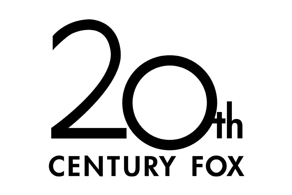
Image Courtesy of 20th Century Studios
1972 - 1982
In 1972, the studio reintroduced one of its most recognizable visual concepts, marking another important milestone in the evolution of 20th Century Studios logo design. The iconic three-story structure returned, reconnecting the brand with its earlier architectural identity while presenting it through a more refined and modern lens. This redesign balanced nostalgia with contemporary design sensibilities, appealing to both long-time audiences and new generations of moviegoers.
Unlike earlier versions, the structure was now enclosed within a distinctive double frame, adding definition and visual emphasis. The upper portion of the frame featured a subtle arch, which softened the overall geometry and gave the logo a more polished and complete appearance. This framing helped unify the composition and made the emblem feel more self-contained and versatile across different formats.
The typography also received a thoughtful update. The lettering was rewritten using a cleaner, more contemporary sans-serif typeface, replacing the heavier and more traditional styles of the past. This typographic shift brought a sense of freshness and sophistication to the logo while preserving its bold presence. The updated letterforms improved readability and aligned the logo with modern design trends of the 1970s.
This period of 20th Century Studios logo design demonstrates how revisiting classic elements, when paired with subtle modernization, can strengthen brand identity. By refining structure, framing, and typography, the studio successfully refreshed its visual language without losing the iconic character that audiences instantly recognized.

Image Courtesy of 20th Century Studios
1982 - 1994
In 1982, a major transformation took place in the evolution of 20th Century Studios logo design when the renowned Landor Associates design bureau reimagined the studio’s iconic emblem. This redesign marked a defining moment in the brand’s visual history, setting the foundation for the cinematic logo presentation that audiences continue to recognize today.
The updated logo was placed against a dramatic black background, instantly enhancing contrast and visual impact. One of the most memorable additions was the introduction of two bright searchlights positioned on either side of the structure. These searchlights added motion, atmosphere, and theatrical flair, turning the logo into a dynamic visual experience rather than a static symbol.
This redesign emphasized depth and scale, allowing the logo to feel grand and immersive on screen. The combination of lighting, shadow, and movement helped reinforce the studio’s association with cinematic spectacle and high-quality storytelling. The overall composition felt confident and polished, aligning the brand with the evolving expectations of modern film audiences.
More importantly, this version became the blueprint for future updates. Many of the visual elements introduced by Landor Associates continued to influence later adaptations, proving the lasting strength of the concept. This era of 20th Century Studios logo design demonstrates how thoughtful design decisions can shape a brand’s identity for decades while remaining flexible enough to evolve with time.

Image Courtesy of 20th Century Studios
1987 - 2020
In 1987, the studio introduced a refined update that would become one of the most enduring phases in the history of 20th Century Studios logo design. Rather than a complete overhaul, this version focused on strengthening existing elements, resulting in a more confident and visually powerful emblem that remained in use for more than three decades.
The most noticeable change was in the typography. The letterforms were redesigned to appear bolder and more solid, giving the logo a stronger presence on screen. The contours of the letters became more defined, improving clarity and making the text stand out even in dynamic, animated sequences. This typographic enhancement reinforced the studio’s authoritative image while maintaining familiarity.
Depth and dimension were also reintroduced during this period. Shadows and volumetric effects returned to the structure, adding richness and realism to the overall composition. These elements helped the logo feel grand and immersive, aligning perfectly with the cinematic experiences it introduced. The renewed sense of volume made the emblem more dramatic and visually engaging.
This version of the logo design proved remarkably timeless. Its balance of strength, clarity, and spectacle allowed it to adapt smoothly to advances in animation and visual effects without losing its identity. The longevity of this design highlights how thoughtful refinement can create a lasting brand symbol, making it one of the most recognizable eras in 20th Century Studios logo design history.

Image Courtesy of 20th Century Studios
2020 - Present
In 2020, the studio entered a new chapter with its official renaming to 20th Century Studios, a change that naturally led to a thoughtful update of its iconic visual identity. This moment marked a significant point in the ongoing evolution of 20th Century Studios logo design, as the brand sought to reflect a modern direction while honoring its cinematic legacy.
The redesigned logo, created by Picturemill, stayed firmly rooted in the familiar structure audiences had come to recognize over decades. Rather than reinventing the emblem, the designers focused on refinement. The most notable change appeared in the bottom line of the logo, where the previous name was replaced with the new “Studios” lettering. This subtle adjustment allowed the brand to move forward without losing its historical foundation.
The typography was carefully cleaned and modernized, with smoother lines and improved proportions. These updates gave the lettering a more contemporary and polished appearance while maintaining the bold character that defines the logo. The overall structure, lighting, and cinematic presentation remained intact, preserving the dramatic presence that opens countless films.
This current era of 20th Century Studios logo design demonstrates how respectful evolution can strengthen brand identity. By combining modern refinement with classic elements, the logo continues to feel relevant, confident, and unmistakably cinematic in today’s entertainment landscape.

Image Courtesy of 20th Century Studios
What Makes 20th Century Studios Logo Design So Iconic?
The 20th Century Studios logo design is iconic because it feels larger than life from the very first second it appears on screen. It does not simply introduce a film; it announces a cinematic experience. With its monumental structure, dramatic lighting, and unmistakable atmosphere, the logo has become a symbol of Hollywood storytelling recognized across generations and cultures.
One of the strongest elements of the 20th Century Studios logo design is its architectural presence. Inspired by Art Deco aesthetics, the logo resembles a towering landmark rather than a flat graphic. This choice instantly communicates power, stability, and prestige. The stacked typography and bold geometry give the impression that the studio itself is a foundation of the film industry, not just a participant in it.
The famous searchlights play a major role in elevating the logo from static branding to cinematic performance. Their sweeping motion adds anticipation and drama, guiding the viewer’s eye and building excitement before the story even begins. This movement transforms the logo into a living scene, reinforcing the idea that 20th Century Studios is a place where spectacle and storytelling meet.
Sound design further strengthens the emotional impact of the logo design. The orchestral fanfare paired with the visuals creates an instant emotional connection, triggering nostalgia and excitement at the same time. Even without visuals, the sound alone is enough to remind audiences of the brand, proving how deeply embedded the logo is in popular culture.
Another reason the 20th Century Studios logo design remains iconic is its consistency. While it has evolved to reflect modern technology and updated branding, the core structure has remained familiar. This continuity builds trust and recognition, allowing audiences to instantly associate the logo with quality filmmaking. The transition from 20th Century Fox to 20th Century Studios respected this legacy by refining details rather than abandoning the original concept.
From a designer’s perspective, the logo succeeds because it balances tradition with innovation. It adapts to new animation techniques, lighting technologies, and screen formats without losing its identity. This flexibility ensures that the logo feels relevant in every era while still honoring its history.
Ultimately, the 20th Century Studios logo design is iconic because it tells a story before the movie even starts. It represents ambition, craftsmanship, and cinematic heritage in a single visual moment. Few logos achieve that level of emotional resonance, and even fewer manage to sustain it for decades. That timeless connection is what truly makes this logo unforgettable.
How Does 20th Century Studios Logo Design Reflect Brand Identity?
The 20th Century Studios logo design is a perfect example of how a visual identity can communicate a brand’s personality without saying a single word. From the moment the logo appears on screen, it sets expectations. Audiences immediately associate it with cinematic scale, polished storytelling, and Hollywood tradition. That instant recognition is the result of decades of carefully maintained brand identity.
At its foundation, the logo design reflects strength and authority. The tall, stacked structure feels architectural, almost like a monument built to celebrate cinema itself. This sense of scale aligns with how 20th Century Studios positions its brand: confident, established, and deeply rooted in film history. It tells viewers that this studio is not chasing trends, but shaping them.
The searchlights are one of the most expressive elements of the logo design. They sweep the sky with purpose, symbolizing discovery, attention, and spectacle. From a branding perspective, they act like a spotlight on storytelling, reinforcing the idea that films from 20th Century Studios are meant to be seen, remembered, and celebrated. This theatrical motion adds personality and drama, making the logo feel alive rather than static.
Typography also plays a key role in expressing brand identity. The bold, capitalized lettering communicates clarity and confidence, while the refined proportions keep it elegant and timeless. Over the years, the type has been cleaned and modernized, but never stripped of its character. This careful balance shows that the studio values progress without forgetting its roots, a message that resonates strongly with audiences.
Consistency is another major reason the 20th Century Studios logo design reflects its brand so effectively. Even as technology advanced and naming changed, the core visual language stayed familiar. This consistency builds trust. When audiences see the logo, they already know the level of production, storytelling, and quality to expect. That emotional shortcut is a powerful branding tool.
The logo design also reflects adaptability, which is a subtle but important part of the studio’s identity. From early static versions to fully cinematic 3D animations, the logo has evolved alongside the film industry. Each update embraced new tools while preserving the soul of the design. This shows that 20th Century Studios respects innovation without abandoning tradition.
From a designer’s point of view, the logo succeeds because it behaves like a brand ambassador. Before the first scene begins, it communicates scale, emotion, and credibility. The 20th Century Studios logo design does not just represent a company; it represents an experience.
In the end, the logo reflects brand identity by combining history, emotion, and spectacle into one unforgettable introduction. It proves that when logo design is treated as storytelling, it becomes more than branding. It becomes part of the culture.
Conclusion
The story of 20th Century Studios and its logo design is a powerful example of how visual identity can become part of cultural history. Through decades of change, the logo has maintained its core structure while adapting to new technologies and audiences. Its monumental form, cinematic lighting, and iconic searchlights continue to represent ambition, storytelling, and craftsmanship. For designers, artists, and creative professionals, the evolution of 20th Century Studios logo design demonstrates the importance of consistency, adaptability, and clear visual storytelling. It stands as a lasting reminder that great design is built to endure, inspire, and connect across generations.
Let Us Know What You Think!
Every information you read here are written and curated by Kreafolk's team, carefully pieced together with our creative community in mind. Did you enjoy our contents? Leave a comment below and share your thoughts. Cheers to more creative articles and inspirations!





Leave a Comment