
National Geographic Logo Design: History & Evolution
Image Courtesy of National Geographic
The National Geographic brand is one of the most recognizable names in entertainment and media logo history, exploration, and storytelling. For over a century, it has inspired millions with breathtaking photography, groundbreaking documentaries, and powerful journalism. At the heart of this global identity lies a simple yet iconic symbol. The logo design, especially its famous yellow rectangle, has become a visual shorthand for curiosity, discovery, and trust.
In this article, we will explore the fascinating journey of the National Geographic logo design—how it began, how it evolved, and why it remains so effective today. Whether you are a designer, branding enthusiast, or simply a fan of the magazine and channel, understanding the National Geographic identity within broader brand logo history offers valuable insight into how powerful simplicity can be. Let’s take a closer look at the history behind this iconic visual identity.
National Geographic Logo Design History
1997 - 2001
The 1997 logo paired an elongated yellow rectangle with “National Geographic Channel” in a three-row serif wordmark. Resembling a magazine, screen, or window, the frame expressed the brand’s role as a gateway to distant places, cultures, and wildlife. Its bold lines matched the wordmark’s height, creating a balanced identity that joined tradition with television-era storytelling. Color, shape, and typography worked together to translate the organization’s established authority into a clear broadcast identity.
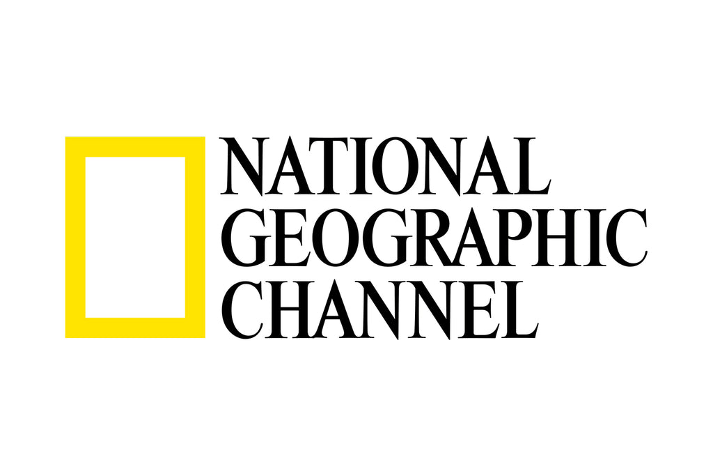
Image Courtesy of National Geographic
2001 - 2005
From 2001 to 2005, “National Geographic” remained unchanged while “Channel” adopted a smaller sans serif style beneath a dividing line. This subtle separation distinguished the television service without sacrificing recognition. The revision aligned with the organization’s growing media presence and shows how typography, scale, and spacing can clarify hierarchy. Even modest adjustments can update audience perception without replacing a brand’s defining symbol.
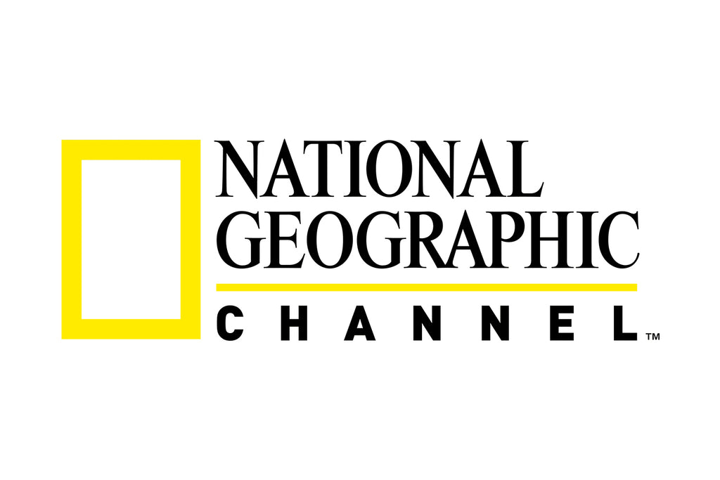
Image Courtesy of National Geographic
2005 - 2016
The 2005 update introduced cleaner sans serif typography and removed the dividing line, producing a more unified composition. “Channel” returned to a comparable size but appeared in gray, identifying the television component without overpowering the name. These precise changes modernized the logo while preserving the yellow rectangle and the recognition it carried. The result adapted well to broadcasts, promotions, and emerging digital formats, proving that small, purpose-driven refinements can sustain a familiar identity.
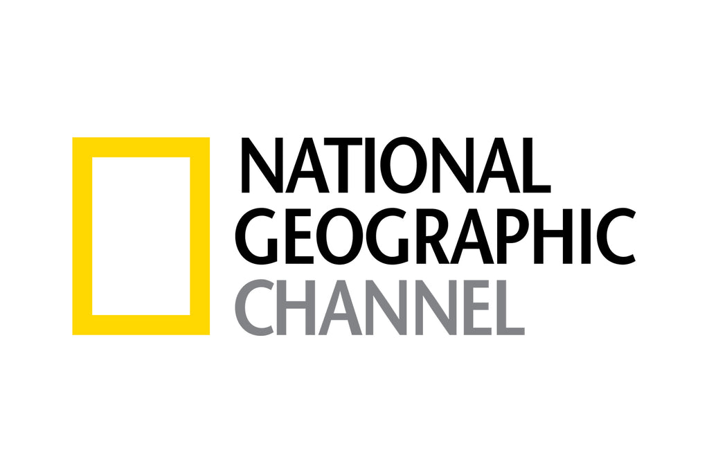
Image Courtesy of National Geographic
2016 - Present
In 2016, National Geographic removed “Channel” to create one identity for its society, magazine, publishing, television, travel, and digital activities. The reduction made the logo more versatile and allowed it to represent the entire organization rather than a single medium.
The current design retains the yellow frame as a window to discovery while using a simpler, universal wordmark. Whether seen with a documentary, magazine, travel guide, or digital story, it provides a consistent link to the brand’s tradition of exploration. Its evolution shows that an enduring logo need not change dramatically: careful typographic refinements and the removal of unnecessary elements can keep an identity relevant without weakening its heritage.
Image Courtesy of National Geographic
The Identity Before the Yellow Frame
The National Geographic Society was founded in Washington, D.C., in 1888, and the first issue of its journal appeared that same year. Its chestnut-brown cover featured black lettering and the Society’s original seal, which contained a map of the United States. There was no photography, bright color, or commercial-style emblem.
This restrained presentation reflected the publication’s original purpose. The journal primarily shared geographical knowledge and papers presented at Society meetings, so credibility mattered more than visual excitement. Its appearance resembled an academic document rather than the image-led magazine familiar to modern readers.
The earliest phase of National Geographic logo history is important because it shows how significantly the publication’s identity changed. According to National Geographic’s account of its first issue, the recognizable yellow border did not arrive until 1910. The eventual shift toward a brighter and more consistent cover helped transform an institutional journal into a distinctive publication.
Continue Reading
- Warner Brothers Logo Design: History & Evolution
- YouTube Logo Design: History & Evolution
- 20th Century Studios Logo Design: History & Evolution
- BBC Logo Design: History & Evolution
- Cartoon Network Logo Design: History & Evolution
How the Yellow Border Became a Visual Signature
The Arrival of the Yellow Border
When the yellow border appeared in 1910, it was not yet a standalone corporate logo. It was a structural part of the magazine cover, surrounding the title and ornamental design. Nevertheless, its vivid color immediately gave the publication a more recognizable presence.
The border created consistency from issue to issue. Subjects and headlines could change, but the yellow edge remained familiar. On a crowded shelf, readers could identify the publication by color and shape before reading its name. That repeated recognition allowed a decorative feature to begin performing the work of a brand mark.
Yellow was especially effective because it contrasted strongly with the darker tones often used in early printing. It also conveyed warmth and visibility without competing with the magazine’s serious editorial character.
Photography Changes the Role of the Frame
Photography eventually transformed the border from ornament into a meaningful frame. National Geographic had included photographs inside the magazine for decades, but images began taking a more prominent role on its covers during the mid-twentieth century.
A major milestone arrived in 1959, when photography appeared within the familiar yellow-bordered presentation. National Geographic identifies the September 1959 cover, showing a U.S. Navy fighter jet, as an early landmark in this transition. From then on, the frame increasingly surrounded images of landscapes, wildlife, cultures, scientific work, and exploration.
As photography became central to the cover, the rectangle acquired a new visual purpose. It no longer merely decorated the magazine; it framed a view of the world.
From Magazine Border to Brand Symbol
The yellow rectangle did not become iconic through a single dramatic launch. Its power developed gradually as generations of readers encountered it on magazine covers. Consistent repetition established a connection between the shape and National Geographic’s distinctive approach to visual storytelling.
Eventually, the border could be separated from the physical magazine and still remain recognizable. Reduced to a clean rectangular outline, it provided useful shorthand for the brand. This simplicity allowed it to appear beside a wordmark, on a television screen, in printed promotions, or as part of an animated sequence.
The open center of the symbol also encouraged interpretation. It can resemble a photographic frame, a window, a doorway, or even a screen. Each reading supports the idea of looking beyond familiar surroundings and encountering something new. However, these associations are best understood as natural interpretations rather than one fixed, officially declared meaning.
This gradual development distinguishes the identity from logos introduced through comprehensive corporate redesigns. The rectangle already carried decades of recognition before it became a widely used emblem. Designers did not need to invent a new symbol for exploration; they could refine an element audiences already associated with discovery, authority, and exceptional photography.
Its emptiness is also part of its strength. Rather than illustrating a globe, animal, camera, or compass, the frame leaves space for National Geographic’s subject matter to take center stage.
Why the National Geographic Logo Remains Effective
A Distinctive Color and Simple Shape
The logo relies on two basic ingredients: a yellow outline and a vertical rectangle. That simplicity makes it easy to recognize, reproduce, scale, and animate. It remains clear whether it appears on a magazine, television screen, mobile interface, sign, or piece of merchandise.
Yellow provides strong visibility, while the empty center allows surrounding imagery to remain important. The shape does not tell audiences what they must see. Instead, it suggests a space through which something can be discovered.
Consistency Across Different Media
National Geographic has changed enormously since 1888, but its best-known visual feature has remained stable. That consistency helps connect new documentaries and digital experiences with the publication’s long-established reputation.
The logo also demonstrates that adaptability does not require constant reinvention. Designers can update typography, spacing, movement, and supporting graphics while protecting the element audiences recognize most readily. National Geographic and the Yellow Border Design are registered trademarks of the National Geographic Society, reinforcing the rectangle’s role as a protected brand asset.
Frequently Asked Questions
When Did National Geographic Begin Using the Yellow Border?
The first National Geographic issue appeared in 1888 without the familiar border. The yellow cover treatment was introduced in 1910 and remained part of the magazine’s identity for decades. It later evolved from a recognizable cover feature into the independent rectangular symbol used throughout the wider National Geographic brand.
What Does the Yellow Rectangle in the National Geographic Logo Mean?
The rectangle is commonly interpreted as a window, doorway, photographic frame, or screen through which audiences can explore the world. These interpretations fit National Geographic’s emphasis on discovery and visual storytelling, although the symbol does not need one fixed meaning to communicate curiosity, access, and observation effectively.
Who Designed the National Geographic Logo?
The identity is better understood as an evolution than the work of one designer at one moment. Its yellow frame grew from the magazine’s historic border, while later brand specialists refined its use as a standalone symbol. Successive design teams also developed the typography and systems that support its modern applications.
Why Was “Channel” Removed From the National Geographic Logo?
“Channel” was removed during the 2016 global rebrand to create a unified identity across television, publishing, websites, social platforms, and other experiences. The shorter name no longer tied the brand to one medium. It also produced a cleaner wordmark while retaining the yellow frame that audiences already recognized.
Conclusion
The National Geographic logo history shows how a modest design feature can become a global symbol through consistency and meaningful use. Beginning as a magazine border, the yellow rectangle gradually developed into a flexible emblem for photography, exploration, science, and storytelling. Typography and supporting details changed as National Geographic entered television and digital media, but the frame remained recognizable. Its evolution offers a valuable design lesson: lasting identities do not always depend on radical reinvention. Sometimes, carefully preserving one distinctive element is the strongest way to move a brand forward.
You May Also Like
- Netflix Logo Design: History & Evolution
- Nintendo Logo Design: History & Evolution
- Pixar Logo Design: History & Evolution
- PlayStation Logo Design: History & Evolution
- Walt Disney Logo Design: History & Evolution
Let Us Know What You Think!
Every information you read here are written and curated by Kreafolk's team, carefully pieced together with our creative community in mind. Did you enjoy our contents? Leave a comment below and share your thoughts. Cheers to more creative articles and inspirations!
Related Articles









Leave a Comment