Fanta Logo Design: History & Evolution

Image Courtesy of Fanta
The story of Fanta logo design is a vibrant journey through color, culture, and creativity. As one of the most recognizable soft drink brands in the world, Fanta has continuously refreshed its visual identity to stay playful, energetic, and relevant. From its early beginnings in the 1940s to the bold and dynamic emblems we see today, the evolution of the Fanta logo design reflects changing design trends, marketing strategies, and global expansion.
Over the decades, Fanta has experimented with typography, color palettes, and graphic elements such as orange slices and splash effects to express its fruity personality. Each redesign highlights the brand’s youthful spirit while maintaining key elements that ensure instant recognition. Whether through retro-inspired lettering or modern, simplified forms, Fanta has successfully balanced innovation with brand heritage.
This article explores how Fanta logo design has transformed across generations, examining the visual shifts that shaped its identity. By understanding these changes, we gain insight into how thoughtful logo design can help a brand remain fresh, fun, and globally iconic while adapting to new audiences and markets.
Fanta Logo Design History
1940 - 1962
The early years of the Fanta logo design present a fascinating chapter in graphic design history. Created in 1940, the original Fanta logo featured a bold black logotype, entirely in lowercase. But what truly set it apart was the fancy, elongated tail of the letter "F," elegantly curved and giving a special mood to the entire image. This unique design choice wasn't merely aesthetic; it encapsulated a sense of style and intrigue that resonated with consumers of the time. For many graphic designers, the Fanta logo design from this era stands as a striking example of how simplicity can still hold profound creativity and elegance. It's a reminder that even in our fast-paced digital age, some classic design elements never lose their fizz. Whether you're a seasoned professional or just beginning your design journey, there's something inspiring to be drawn from this sparkling time in Fanta logo design.

Image Courtesy of Fanta
1962 - 1970
The next major shift in the Fanta logo design came in 1962, introducing a refreshing and cheerful vibe to the brand's visual identity. By adopting a light blue and white color palette, the logo radiated a sense of cool freshness. The redesign placed a white sans-serif inscription in title case on a rectangular blue badge, but what really made it pop was the upper bar's subtle curve downwards, resembling a smile. This seemingly simple change transformed the Fanta logo design into something more engaging, playful, and inviting. For graphic designers, the 1962 redesign illustrates how a minor alteration in shape and color can evoke entirely new emotions. It's a lesson in the power of subtlety and how it can breathe new life into a familiar brand, making the Fanta logo design from this period a classic case study in visual communication and design innovation.
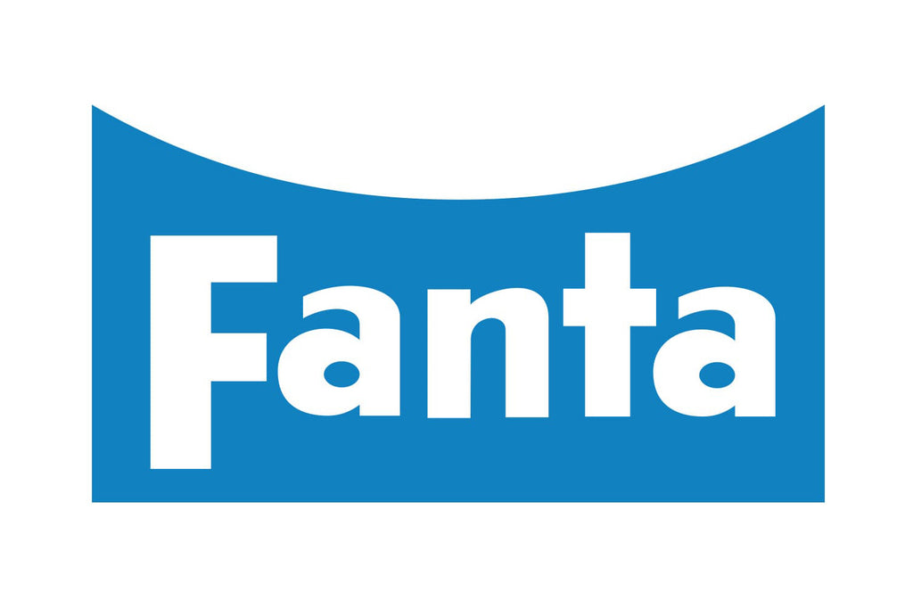
Image Courtesy of Fanta
1970 - 1980
The decade of the 1970s marked a bold evolution in Fanta logo design that graphic designers will find both inspired and instructive. The redesign in 1970 saw the inscription being redrawn, with its sans-serif typeface gaining smooth thick lines and more softened angles. The resulting black wordmark exuded a sleek and confident feel, a marked departure from the previous designs. But the standout feature was undoubtedly the introduction of three orange circles, arched gracefully over the bar of the letter "N." These simple yet effective shapes represented oranges, the main flavor of the drink, adding a tangy twist to the overall design. This period of Fanta logo design demonstrates how visual elements can be harmoniously blended to create something memorable and meaningful. The integration of color, shape, and typography is a testament to the creativity that makes this era of Fanta logo design a refreshing source of inspiration.
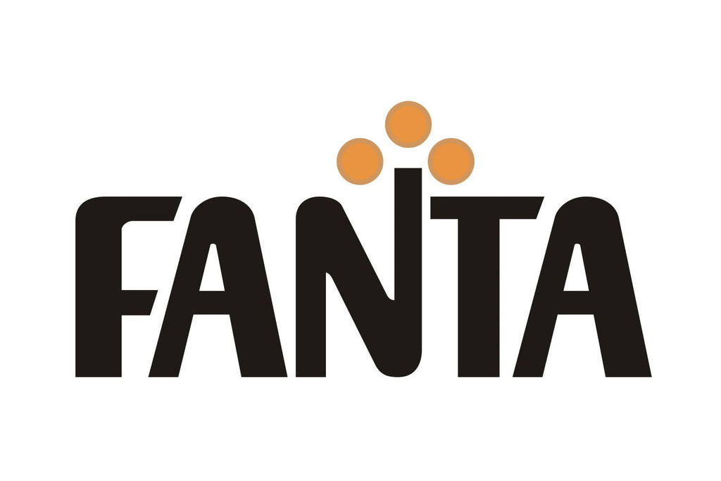
Image Courtesy of Fanta
1980 - 1995
The 1980s ushered in a vibrant era for Fanta logo design, mirroring the lively cultural trends of the time. In a vivid redesign, the black was replaced with an intense blue, and the orange transformed into a striking red, adding even more zest to the visual identity. A subtle yet impactful addition was the smooth, neat leaf adorning the oranges, further emphasizing the fruit's connection to the beverage. The all-caps lettering gave way to a more approachable title case inscription, and the red and green icon was artfully moved to the left. This particular phase in Fanta logo design resonates with graphic designers for its bold color choices and thoughtful refinements. By embracing a playful mix of hues and subtle graphic tweaks, the brand maintained its fun-loving spirit while evolving with the times. It's an exemplary lesson in how thoughtful updates in color and design elements can breathe fresh energy into a classic brand, making the Fanta logo design from this era an enduring symbol of creativity.

Image Courtesy of Fanta
1995 - 1997
In the mid-90s, a bold transformation occurred in the Fanta logo design that marked a significant departure from its previous iterations. In 1995, the recognizable three oranges were replaced by an abstract orange leaf. This new design element wasn't just contemporary and creative; it symbolized the brand's unique ability to change, grow, and adapt to modern tastes. The abstract leaf not only brought a fresh twist but also added a layer of sophistication, reflecting Fanta's forward-thinking approach. For graphic designers, this phase in the Fanta logo design serves as a compelling example of how abstract symbolism can infuse a brand with new energy and perspective. It showcases the potential to retain core brand elements while daring to innovate. This brief yet impactful era of Fanta logo design is a testament to the dynamic and ever-evolving nature of design, reflecting a willingness to embrace change while staying rooted in brand identity.

Image Courtesy of Fanta
1997 - 2004
The late 90s ushered in a new era of excitement and vibrancy in Fanta logo design. In 1997, the logotype was reimagined with a slightly different shade of blue and placed diagonally on a bright orange or yellow background, depending on the drink's flavor. This choice of background color created an energetic contrast, enhancing the logo's visual appeal. Perhaps the most distinctive change was the stylized green leaf, outlined in blue, which emerged from the letter "N." This element not only reinforced the beverage's fruity flavor but also added a touch of modernity and flair. For graphic designers, this era of Fanta logo design illustrates the impact of color and orientation in breathing life into a familiar concept. It's a reminder of how playful adjustments and thoughtful embellishments can invigorate a brand's image. This chapter in the Fanta logo design story reflects a creative embrace of change, reinforcing the brand's reputation for innovation and fun.

Image Courtesy of Fanta
1997 - 2008
The turn of the millennium witnessed a minimalistic yet creative shift in Fanta logo design. Starting in 1997, all the additional details were stripped away, leaving only the blue wordmark. But this wasn't just a simple reduction; the wordmark itself was redrawn in a modern and stylish manner. The thick letter lines were crafted a bit uneven and artsy, bringing a fresh and unique touch to the logo. This redesign marked a departure from the more complex designs of the past, showcasing Fanta's adaptability to contemporary design trends. For graphic designers, this era of Fanta logo design offers valuable insights into the power of minimalism and the artistic choices that can infuse simplicity with character. The focus on subtle irregularities turned what could have been a straightforward logo into a lively and distinct representation of the brand. This phase in the Fanta logo design journey symbolizes how thoughtful creativity can transform even the most basic elements into something memorable and dynamic.

Image Courtesy of Fanta
2000 - 2004
In the early 2000s, Fanta logo design took another innovative turn. The version created in 2000 introduced subtle yet effective white details that were used both as an outline of the logotype and to dilute the gradient orange of the background. This clever use of color and contrast added brightness to the logo and emphasized the visual interplay between the shades. The result was a logo that felt more vibrant and alive, reflecting the effervescent quality of the beverage itself. For graphic designers, this stage of Fanta logo design showcases the transformative power of thoughtful color and contrast adjustments. It's a lesson in how small changes can create a powerful visual impact and enhance the overall aesthetic appeal. This era of Fanta logo design serves as an inspiring example of creative refinement, demonstrating how a well-known brand can continue to evolve and surprise through nuanced and imaginative design choices.

Image Courtesy of Fanta
2004 - 2008
Embracing a less-is-more approach, the Fanta logo design underwent a significant simplification in 2004. The design brought back the blue wordmark and paired it with a crisp white background, but with a fresh twist—placing it diagonally and adding an elegant green leaf above the inscription. This transformation wasn't just about removing elements; it was about refining and elevating them. The contours were meticulously cleaned, and the shade of blue was enhanced to create a more engaging visual appeal. For graphic designers, this stage in Fanta logo design offers a rich study in how strategic simplification can lead to a more focused and impactful brand identity. The subtle changes reflect an understanding of modern aesthetics and the need for clarity in design. This period of Fanta logo design reminds us that sometimes, going back to basics, with a sprinkle of innovation, can create a timeless and memorable visual expression that resonates with audiences.

Image Courtesy of Fanta
2008 - 2010
The 2008 version of the Fanta logo design marked a striking blend of previous elements with a few bold innovations. Composed of a dark-blue inscription encased in a white outline and placed on a solid orange roundel, the design radiated warmth and vivacity. Above the "an" part of the wordmark, a gradient green leaf was thoughtfully positioned, creating a visual connection with the brand's fruity essence. The lettering, set diagonally, had characters that were heavier yet smoother in contours than the previous version, adding a sense of robustness and fluidity. For graphic designers, this phase in Fanta logo design serves as a testament to how combining familiar components with fresh twists can result in a renewed and engaging visual identity. It's an inspiration on how to balance legacy with creativity, showing that the thoughtful evolution of a logo can help a brand stay relevant and appealing in an ever-changing marketplace.

Image Courtesy of Fanta
2008 - 2016
By 2008, Fanta had blossomed into a global sensation, delighting taste buds with more than 70 flavors. This expansion called for a new identity, and the resulting Fanta logo design was an imaginative masterpiece crafted by the San Francisco-based Office. The revitalized logo featured positive imagery: an orange with a green leaf, accompanied by a playful wordmark that resonated with the brand's energetic spirit. But the innovation didn't stop there. The designers went a step further, developing an entire range of branding elements, including shapes, colors, and distinctive lettering. This allowed Fanta to tailor its visual identity according to various flavors and audiences, infusing the brand with flexibility and creativity. For graphic designers, this era of Fanta logo design stands as an inspiring example of how a well-thought-out visual system can harmonize brand consistency with adaptability. It showcases the power of design in shaping a global brand, demonstrating that with ingenuity and consideration, a logo can transcend borders and speak to diverse tastes.

Image Courtesy of Fanta
2010 - 2016
The Fanta logo design saw a refresh in 2010, characterized by a fine balance of enlarged inscription and a reduced orange circle. The change wasn't just aesthetic; it resulted in a logo that was both stylish and bright. The alterations created a design that was memorable and instantly recognizable, transcending borders to resonate with consumers all over the world. This period marked a triumph in Fanta logo design, proving that sometimes minor adjustments can lead to significant impacts. For graphic designers, this era offers a valuable lesson in the importance of scale, proportion, and the strategic use of color. It's a reminder that the subtle reshaping of familiar elements can breathe fresh life into a brand's visual identity. This evolution of the Fanta logo design emphasizes how intuitive design choices can make a logo not only eye-catching but also globally appealing. It's a testament to the power of simplicity and thoughtful refinement in the world of branding.

Image Courtesy of Fanta
2016 - Present
In 2016, the Fanta logo design experienced a transformation that embraced a new geometric direction. The rounded shapes of the wordmark were replaced with square ones, resulting in a bold and confident sans-serif inscription. Each capital letter in white was adorned with a robust purple outline, adding a touch of modern sophistication. The green leaf, a consistent symbol in the brand's history, was redrawn and enlarged, now elegantly emerging from the letter "N" and directed up left. The logotype, resting on a solid orange circle, conjures images of the sun, summer, and of course, the taste of oranges. This contemporary version of the Fanta logo design represents a brand that has continuously evolved while staying true to its roots. For graphic designers, it's a lesson in how to balance tradition with innovation, creating a look that feels both fresh and familiar. This latest chapter in Fanta logo design adds a vibrant page to the brand's rich visual history, showcasing the importance of adaptability and creativity in logo evolution.

Image Courtesy of Fanta
2017 - 2021
In 2017, the Fanta logo design underwent a subtle yet significant refinement. The heavy blue shadow that characterized the logo from 2016 was removed, giving a cleaner and more streamlined appearance. Although all other elements remained the same, the white geometric sans-serif lettering encased in a thick blue outline took on a completely different visual effect without the shadow. This version, more approachable and elegant, remained the face of the brand until 2021. For graphic designers, this particular stage in the evolution of the Fanta logo design highlights the importance of seemingly minor changes. It shows how a single alteration, like the removal of a shadow, can entirely transform the perception of a logo. This era of the Fanta logo design emphasizes the essence of refinement, teaching us that sometimes, less is indeed more, and that careful consideration of details can lead to a timeless and effective visual identity.

Image Courtesy: Fanta
2023 - Present
The 2023 Fanta logo design marks a bold departure from previous iterations. This redesign saw the removal of the familiar orange roundel and green leaf, a significant change in the brand's visual journey. What remains is the white uppercase logotype encased in a thick blue outline, reminiscent of the badge from 2016. However, this time, the shadow is elongated and forms a triangle pointing down, adding an innovative twist. This minimalistic yet intense and bright badge speaks volumes about the new angles of the company and its progressiveness. For graphic designers, this latest Fanta logo design iteration stands as a compelling example of how minimalism can effectively convey brand evolution and forward-thinking. It's a testament to the brand's willingness to embrace change while maintaining core identity elements. The 2023 redesign encapsulates the essence of modern design principles and positions Fanta's visual identity at the forefront of contemporary branding. It's an exciting time in the Fanta logo design history, one filled with inspiration and lessons for design enthusiasts everywhere.

Image Courtesy of Fanta
How Does Fanta Logo Design Reflect The Brand’s Personality?
The magic of Fanta logo design lies in its ability to visually capture the brand’s bubbly, youthful, and slightly rebellious personality. From the very beginning, Fanta has positioned itself as the fun-loving member of the soda family, and its logo design has always echoed that playful spirit. Bright colors, energetic shapes, and expressive typography all work together to communicate one clear message: Fanta is here to have fun.
Bold Colors That Burst With Energy
One of the most recognizable features of Fanta logo design is its vibrant color palette. Orange dominates the visual identity, naturally connecting the brand to its fruity flavor roots. The use of bright blue as a contrasting background element adds freshness and visual punch. Together, these colors create a dynamic and lively composition that instantly grabs attention on shelves and screens. The color choices are not subtle—and that’s the point. Fanta is bold, cheerful, and impossible to ignore.
Playful Typography With Personality
Typography plays a huge role in expressing the brand’s character. Over the years, Fanta logo design has featured rounded, slightly irregular letterforms that feel approachable and spontaneous. The tilted or bouncing arrangement of the letters adds movement, reinforcing the idea of fizz and excitement. Unlike formal or minimalist wordmarks, Fanta embraces curves and exaggerated shapes, giving the logo a friendly and energetic vibe that appeals especially to younger audiences.
Dynamic Shapes And Fruity Elements
Another key element in Fanta logo design is the use of graphic accents such as leaf motifs and splash effects. The small green leaf above the lettering suggests freshness and natural fruit flavors, while dynamic shapes around the wordmark create a sense of motion. These elements make the logo feel alive, as if it’s bursting with flavor. The design doesn’t just sit still—it pops, just like the drink itself.
A Balance Between Consistency And Evolution
Although Fanta logo design has evolved over time, it has consistently maintained its core personality traits. Each redesign refines the shapes, adjusts the typography, or simplifies the graphics, but the playful DNA remains intact. This balance ensures that Fanta stays modern without losing the fun essence that defines the brand.
Ultimately, Fanta logo design reflects a brand that celebrates creativity, youthfulness, and flavor. Through bold colors, expressive lettering, and energetic composition, the logo perfectly mirrors the fizzy, adventurous personality that makes Fanta a global favorite.
How Has Fanta Logo Design Adapted To Modern Trends?
The evolution of Fanta logo design is a masterclass in staying fresh without losing flavor. As design trends have shifted from detailed and decorative to clean and digital-friendly, Fanta has carefully updated its visual identity to match the times. Each redesign shows how the brand understands modern aesthetics while keeping its playful spirit intact. Fanta never chases trends blindly—it reinterprets them in its own bold and bubbly way.
Simplification For The Digital Age
One of the biggest modern trends in logo design is simplification. As brands move across apps, social media icons, and mobile screens, clarity becomes essential. Fanta logo design has gradually reduced unnecessary details, refined outlines, and embraced cleaner shapes. Earlier versions featured more complex shadows and heavy outlines, while recent updates favor flatter graphics and smoother transitions. This makes the logo more adaptable and easier to recognize at any size, from bottle caps to smartphone displays.
Brighter Colors And Stronger Contrast
Modern branding often leans into vibrant color palettes that pop in both physical and digital environments. Fanta logo design has responded with brighter oranges and richer blues, increasing contrast and visual impact. These bolder hues align with contemporary packaging trends, where products compete for attention in crowded retail spaces. The refreshed palette feels energetic and confident, perfectly matching today’s high-visibility design standards.
Dynamic Typography With Attitude
Typography trends have also influenced Fanta logo design. In recent years, brands have moved toward custom lettering to create uniqueness and personality. Fanta embraced this by refining its playful, slightly irregular typeface. The letters feel hand-crafted yet polished, striking a balance between spontaneity and precision. This approach keeps the logo youthful and expressive while ensuring it remains legible and versatile.
Flexible Branding Systems
Another key modern trend is the development of flexible logo systems. Brands today need logos that work in animation, motion graphics, and interactive campaigns. Fanta logo design adapts beautifully to these needs. The energetic shapes and bold forms lend themselves naturally to movement, making the logo ideal for animated ads and social media content. This flexibility allows Fanta to maintain a cohesive identity across multiple platforms.
Staying Playful In A Minimalist World
While many brands have embraced strict minimalism, Fanta logo design keeps a sense of fun at its core. Even as it simplifies forms and refines details, it refuses to become overly serious. The lively curves, fruit-inspired elements, and dynamic composition ensure that the logo still feels spontaneous and joyful.
Ultimately, Fanta logo design has adapted to modern trends by becoming cleaner, brighter, and more versatile, all while preserving its energetic personality. It proves that a brand can evolve with the times without losing the playful spark that made it iconic in the first place.
What Makes Fanta Logo Design Instantly Recognizable Worldwide?
Fanta logo design is one of those rare visual identities that you can spot in a split second, whether it’s on a supermarket shelf, a vending machine, or a digital ad. But what exactly gives Fanta that instant global recognition? The answer lies in a clever mix of bold color, expressive typography, and consistent brand storytelling. Fanta doesn’t whisper—it pops.
A Signature Burst Of Color
The most powerful element of Fanta logo design is its unmistakable orange and blue combination. Orange directly connects to the brand’s fruity roots, especially its iconic orange flavor, while blue provides contrast and depth. This high-energy pairing creates a visual punch that stands out in crowded retail spaces. Around the world, consumers associate this vibrant palette with refreshment, fun, and flavor. The consistent use of these colors across packaging and advertising reinforces instant brand recall.
Playful And Dynamic Lettering
Typography is another secret ingredient in Fanta logo design. The rounded, slightly tilted letters feel lively and spontaneous, almost as if they’re bouncing with carbonation. This playful wordmark sets Fanta apart from more traditional or serious beverage logos. The customized lettering gives the brand a unique voice—friendly, youthful, and full of personality. Even without additional graphics, the word “Fanta” alone carries strong visual identity thanks to its distinctive type style.
Memorable Graphic Elements
Over time, Fanta logo design has incorporated simple yet powerful visual accents, such as a small green leaf or splash-like shapes. These elements subtly reinforce the idea of fruitiness and freshness. They also add motion and excitement to the composition. The details are not overly complex, but they are meaningful. This balance between simplicity and character makes the logo easy to remember and easy to reproduce across different formats.
Consistency Across Generations
One major reason Fanta logo design remains instantly recognizable worldwide is consistency. While the brand has refined its logo to stay modern, it has never abandoned its core visual language. The bright colors, energetic forms, and playful tone have remained central throughout decades of redesigns. This continuity builds trust and familiarity, allowing new generations to connect with the same visual identity their parents once recognized.
Adaptability In A Global Market
Fanta operates in numerous countries, often offering region-specific flavors and campaigns. Despite this diversity, the core Fanta logo design remains unified. Its clean shapes and bold structure allow it to adapt seamlessly across languages, cultures, and packaging styles. Whether printed on cans, bottles, billboards, or animated in commercials, the logo maintains its strength and clarity.
Ultimately, Fanta logo design is instantly recognizable because it captures emotion as much as it delivers branding. Through vibrant color, distinctive typography, and consistent evolution, Fanta has created a visual identity that feels joyful, energetic, and globally iconic. It’s not just a logo—it’s a burst of personality in graphic form.
Conclusion
The journey of Fanta logo design shows how a brand can evolve while staying true to its vibrant identity. From its early typographic experiments to today’s bold and dynamic emblem, Fanta has consistently embraced color, movement, and playful energy. Each redesign reflects changing design trends and global expansion, yet the core personality remains unmistakable. The success of Fanta proves that strong logo design is not just about aesthetics, but about storytelling and emotional connection. Through thoughtful updates and visual consistency, Fanta continues to stand out as one of the most recognizable beverage brands worldwide.
Let Us Know What You Think!
Every information you read here are written and curated by Kreafolk's team, carefully pieced together with our creative community in mind. Did you enjoy our contents? Leave a comment below and share your thoughts. Cheers to more creative articles and inspirations!




Leave a Comment