Instagram Logo Design: History & Evolution
Image Courtesy of Instagram
The story of Instagram logo design is a fascinating journey through color, creativity, and cultural change. Since its launch in 2010, Instagram has grown from a simple photo-sharing app into one of the most influential social media platforms in the world. Along the way, its visual identity has transformed dramatically, reflecting shifts in digital trends, user behavior, and brand strategy. From the retro-inspired camera icon to the vibrant gradient glyph we recognize today, every version of the Instagram logo tells a story about innovation and connection.
The Instagram logo design is more than just a symbol; it's a reflection of creativity, change, and the ever-evolving world of social media. Whether you're a seasoned graphic designer or just someone intrigued by aesthetics, the journey of the Instagram logo design might pique your curiosity. Additionally, exploring the evolution of the logo can provide insights into how to attract and retain an Instagram follower base.This emblematic image has gone through several transformations since its inception, each change resonating with the platform's growth and cultural shifts. From its classic Polaroid-inspired design to the sleek, modern gradient we recognize today, Instagram's logo design narrates a story of innovation and trends.
Understanding the evolution of the Instagram logo design is more than just exploring aesthetic updates. It reveals how thoughtful design decisions help shape brand recognition and emotional impact. Each redesign carefully balanced familiarity with freshness, ensuring that Instagram remained modern without losing its iconic charm. Typography, color palettes, icon simplification, and app icon scalability all played key roles in refining the brand’s identity.
In this article, we’ll take a closer look at the complete history of the Instagram logo, highlighting the creative choices behind each transformation. Whether you are a designer, marketer, or simply curious about visual branding, this deep dive into Instagram logo design will give you a clearer understanding of how powerful and strategic great logo evolution can be.
Instagram Logo Design History
2010
In 2010, the world of social media was introduced to a fresh visual emblem that would soon become iconic: the original Instagram logo design. Conceived by the company's co-founder, Kevin Systrom, this unique design captured the essence of what Instagram was all about at the time. The knock-off Polaroid camera, adorned with a vibrant rainbow stripe, was more than just an image; it was a symbol of the application's core functionality of taking and sharing photos, along with applying distinct filters.
This Instagram logo design wasn't just about aesthetics; it was a nod to the retro feeling, reflecting the original idea behind the application. The light milky shade of the camera body was not only unique but made the logo stand out among the burgeoning list of social media competitors. Though this badge was short-lived, staying in use for just a few months, it marked a great beginning to the iconic cam logo era.
To many graphic designers, the 2010 Instagram logo design is a classic example of how to encapsulate a brand's identity and functionality into a single visual element. Its natural look and feel set the stage for what was to become a continually evolving and influential presence in the world of logo design.
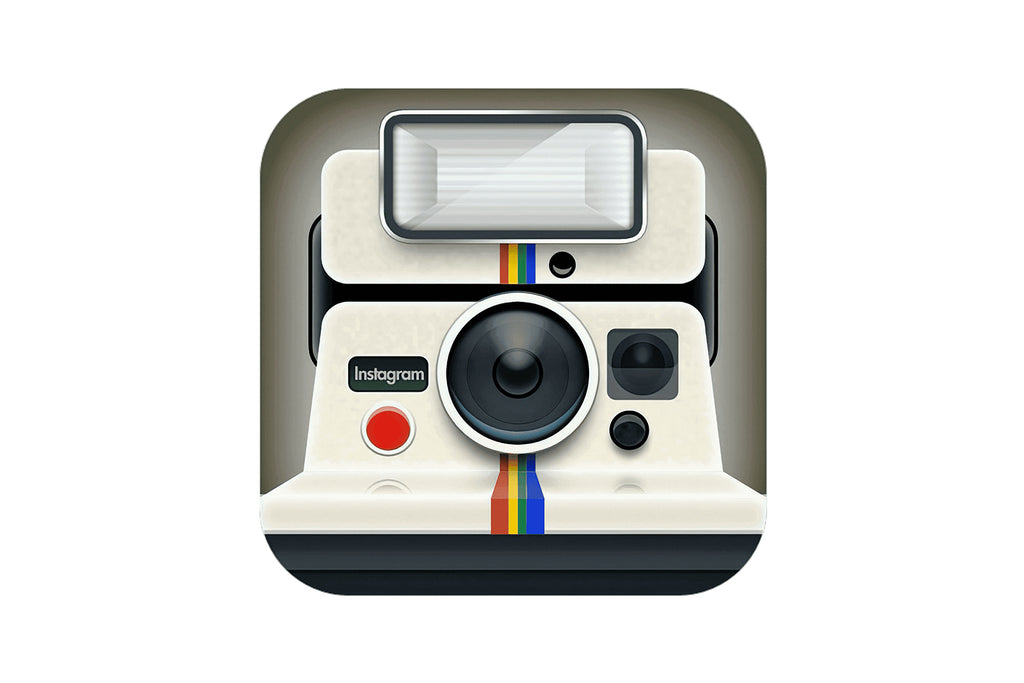
Image Courtesy of Instagram
2010 - 2011
The story of Instagram logo design took an exciting turn later in 2010 when Kevin Systrom decided it was time to bring in professional expertise. Enter Cole Rise, a talented designer and photographer, who was tasked with refining the logo to resonate more with the platform's burgeoning popularity.
Inspired by the classic Bell & Howell camera from the 1950s, Rise maintained the original color palette of beige and brown but added depth by intensifying the shades of the camera body and details. This revamped Instagram logo design wasn't just a rehash; it was a sophisticated transformation that highlighted the brand's evolution.
The new badge was simpler, more memorable, and a testament to the power of minimalist shapes and accents in modern design. The upper left corner of the camera featured a vertically oriented rainbow flag, and the bold "INST" uppercase lettering in sans-serif sat beneath it, grounding the design with simplicity and style.
This phase of Instagram logo design is a favorite among graphic designers for its ability to bridge nostalgia with contemporary design principles. It's a vivid reminder that sometimes, subtle changes can make a significant impact, turning a functional logo into an enduring symbol of a brand's identity.
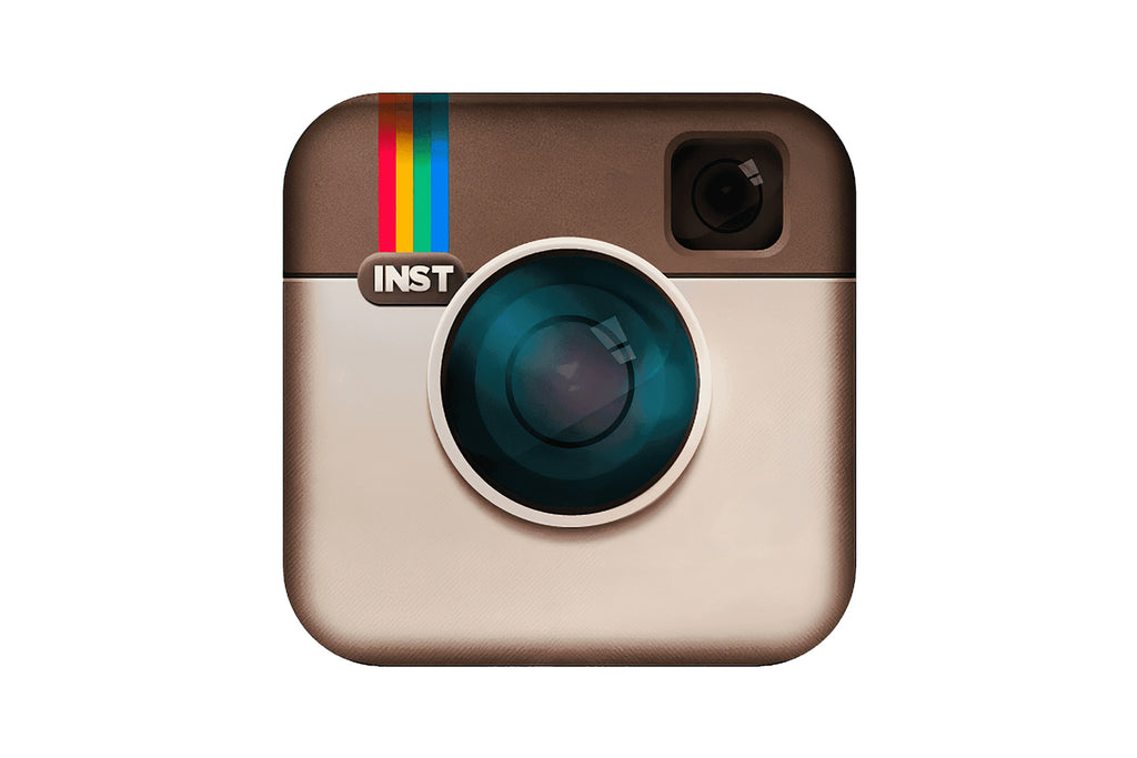
Image Courtesy of Instagram
2011 - 2016
The period from 2011 to 2016 marked a subtle but meaningful shift in the Instagram logo design. While the overall look remained consistent with its predecessor, this emblem made its debut on Instagram v2.0 with key refinements that gave it a fresh flair.
The introduction of a leathery texture to the upper part of the camera on the badge lent a tactile feel, while the lens received more gradient gloss, making it look more natural and vivid. These elements were enhanced by more contrasting gradients on the camera body, infusing the image with vitality and a touch of realism that made it stand out.
Perhaps one of the most noticeable changes was in the typography. The uppercase sans-serif "INST" under the now wider and more visible rainbow was replaced with a bold serif "Insta," capitalizing only the first letter. This nuanced alteration in the Instagram logo design added a touch of sophistication without losing its approachable charm.
For many graphic designers, this phase in the Instagram logo design evolution is a lesson in the importance of subtle changes. It emphasizes that fine-tuning details while retaining the essence of the brand can result in a memorable logo that resonates with its audience. It's about keeping the roots while growing with the times, a philosophy that has defined Instagram's visual journey.

Image Courtesy of Instagram
2016 - 2022
In 2016, Instagram took a bold step forward, unveiling a new logo alongside an updated application interface. This phase in Instagram logo design marked a departure from the familiar, heralding a sleek minimalist approach that struck a chord with some and raised eyebrows with others.
While the change faced criticism from many users, the design has stood the test of time, remaining unchanged for years. Drawing on the lineage of previous Instagram badges, the new logo was redrawn in a flat and abstract manner. It featured a striking gradient orange-to-pink square with rounded angles, overlaid with a bold white camera contour.
The main shape of the camera, repeating the icon's shape, was characterized by a contoured circle in the center and a solid white dot in the upper right corner. This transformation of the Instagram logo design was not just a visual shift; it symbolized the platform's evolution, reflecting a modern, streamlined approach to social media.
For graphic designers, this version of the Instagram logo design illustrates the courage to reinvent while maintaining a connection to the past. It's a testament to the power of minimalism and abstraction in design, and a reminder that even the most controversial changes can become enduring symbols of a brand's identity.
Image Courtesy of Instagram
2022 - Present
The ever-evolving world of Instagram logo design took a fresh turn in 2022 with a subtle yet significant redesign. Building on the 2016 version, this refreshed badge maintains the concept and shapes that had become synonymous with the brand but introduces refinements in color.
The new logo continues to be executed in gradients, flowing from orange to purple, yet these shades have been lightened. The result is an icon that looks even brighter and more vibrant, infusing the logo with a renewed energy that aligns with the platform's dynamic nature.
As for the main elements of the badge, they remain consistent with the previous version: the gradient background featuring a white softened square contour and a circle in the middle, along with the solid white dot in the upper right corner. This continuity in the Instagram logo design pays homage to the platform's roots while embracing the subtleties of modern design aesthetics.
For graphic designers and enthusiasts alike, the 2022 Instagram logo design offers an insightful lesson in the power of nuanced updates. It emphasizes how delicate adjustments in color and texture can breathe new life into a logo without losing its essence. It's a creative testament to the harmony between tradition and innovation that resonates at the heart of effective logo design.

Image Courtesy of Instagram
Instagram Logotype Design History
2009 - 2010
Before it captured the hearts and screens of millions worldwide, Instagram's journey began with a different name and logotype design. In the early months of 2009-2010, the platform was called Burbn, and its visual identity was a far cry from the intricate designs that would follow.
The Burbn logotype design was simple yet distinctive, featuring the stylized name in the lowercase of a custom cursive font. The curved and rounded ends of the lines lent stability and a unique character to the logo, setting it apart without the need for embellishments.
Set in plain black against a stark white background, the Instagram Logotype design of this era was devoid of additional details, graphics, or color play. This minimalistic approach was a clear statement, focusing on the name and allowing the typography to take center stage.
For graphic designers, this initial phase of Instagram Logotype design provides a valuable insight into the power of simplicity and elegance. It serves as a reminder that sometimes, less is indeed more, and that a well-crafted typeface can communicate a brand's essence without the need for complexity. It's a glimpse into the origins of a social media giant and a testament to the profound impact of thoughtful design.

Image Courtesy of Instagram
2010 - 2013
The period from 2010 to 2013 marked a defining chapter in the Instagram Logotype design, aligning it with the platform's rapid growth and aesthetic evolution. Moving away from its initial minimalistic approach, the wordmark embraced a fancy handwritten typeface that captured the imagination of users and designers alike.
Crafted with precision, the cursive letters of the Instagram Logotype were written neatly and accurately, with elongated lines and curved tails bringing an elegant flow to the composition. This graceful design was offset by shorter bold strokes, creating a visual rhythm that was both engaging and distinctive.
Not all the symbols were connected to each other, adding an intriguing imbalance that set the logotype apart from conventional cursive scripts. On the original version, the Instagram Logotype was executed in a simple black color, grounding the expressive typeface in simplicity and allowing the form itself to shine.
For graphic designers, this phase in the Instagram Logotype design represents a rich exploration of typography, illustrating how subtle interplay between balance and imbalance can create a memorable visual identity. It's a lesson in the art of combining elegance with individuality, highlighting how even the smallest nuances in design can lead to iconic branding.

Image Courtesy of Instagram
2013 - 2015
The years 2013 to 2015 brought a significant transformation to the Instagram Logotype design, ushering in a new era of professionalism and modernity. A shift in both the color palette and the typeface marked this redesign, mirroring the platform's continuous evolution and growing influence.
The once-black lettering was replaced with a calm sea-blue shade, adding a touch of serenity to the logotype. Alongside the color change, the straightened and softened cursive lettering set the tone for a more sophisticated appearance. The inscription was now defined by bolder lines, with all letters (except for the capital one) fluidly connected to each other.
Gone were the labra's main curves (on the first "I" and the "G"), and the shortened elements gave the wordmark a streamlined look. This refined Instagram Logotype design not only looked professional but also more in tune with modern design sensibilities.
For graphic designers, this period in Instagram Logotype design provides an insightful study in refinement and brand maturity. It showcases how calculated adjustments in color and typography can translate to a renewed brand image, reflecting its growth and redefined vision. A lesson in elegance, this redesign embodies the dynamic intersection of style, function, and brand storytelling that's vital in contemporary logo creation.

Image Courtesy of Instagram
2015 - 2016
A subtle yet impactful refinement defined the Instagram Logotype design in the transition from 2015 to 2016. While the structure and typeface remained consistent with the previous iteration, the change came through a deliberate deepening of the shade of blue.
This darker and richer blue not only infused the logotype with a newfound depth but also symbolized key brand values such as creativity, loyalty, and professionalism. Through this simple shift in color, the whole inscription started exuding a sense of confidence and chicness.
For graphic designers, the 2015 Instagram Logotype design offers a compelling case study in the power of color psychology. It demonstrates how even a slight modification in shade can dramatically alter the perception and emotional resonance of a logo, reflecting subtle changes in a brand's messaging or positioning.
The refinement in this period emphasizes the importance of color choice in logo design and how it can be leveraged to create connections with an audience. It's a reminder that thoughtful design isn't always about significant overhauls; sometimes, nuanced changes can be equally transformative. This stage in Instagram Logotype design is a testimony to the eloquence of simplicity and the art of conveying complex meanings through color.

Image Courtesy of Instagram
2016 - Present
Embracing the essence of its origins, the Instagram Logotype design underwent another change in 2016. While retaining the iconic typeface that had become synonymous with the brand, the color shifted back to the original black, marking a return to a more classic and logical visual alignment with the bright gradient emblem.
The decision to revert to a monochrome inscription was not merely nostalgic; it served as a thoughtful complement to the vivid and colorful graphical part of the logo. This contrast between simplicity and vibrancy allowed the logotype to balance seamlessly within the application interface, deftly leaving all the visual accents to the photos of the users.
For graphic designers, this latest phase in Instagram Logotype design provides a significant lesson in harmonizing elements. It highlights the importance of considering the overall context of a logo, not just its standalone aesthetic. The choice to integrate a more subdued logotype against the visually rich emblem demonstrates how contrast can be used effectively to guide users' attention.
It's a reminder that great design often lies in understanding what to emphasize and what to downplay. In the case of Instagram's ongoing journey, it also showcases a respectful nod to the past while continuing to evolve and adapt to the ever-changing digital landscape.

Image Courtesy of Instagram
What Inspired The Original Instagram Logo Design?
The original Instagram logo design was inspired by something beautifully simple: the love of photography. When Instagram launched in 2010, the app was all about capturing moments and sharing them instantly. To reflect that purpose, the designers chose a vintage camera as the heart of the Instagram visual identity. This was not a random aesthetic choice. At the time, retro filters and nostalgic photo effects were a major part of the user experience, so the logo needed to visually echo that analog charm.
The very first Instagram logo design, created by co-founder Kevin Systrom, was modeled after a classic Polaroid-style camera. It featured realistic details, including a lens, a rainbow stripe, and textured shading that gave it depth and dimension. This skeuomorphic style was popular in early mobile app design because it helped users connect digital tools with real-world objects. By making the app icon look like a physical camera, Instagram instantly communicated its purpose without needing extra explanation.
Color also played a meaningful role in the original Instagram logo design. The brown and beige tones evoked vintage leather camera cases, while the small rainbow stripe symbolized creativity and the spectrum of captured moments. That tiny rainbow detail later became one of the most memorable elements in Instagram’s branding history. It subtly suggested diversity, expression, and vibrancy—qualities that would later define the platform’s global identity.
Another key inspiration behind the original Instagram logo design was simplicity in storytelling. Even though the icon was visually detailed, its message was clear: this app is about photography. In a crowded app marketplace, having a recognizable and literal symbol helped Instagram stand out. Users scrolling through their home screens could instantly spot the camera icon, reinforcing brand recall every single day.
The design also reflected the cultural moment of its launch. In 2010, smartphone photography was becoming mainstream, and people were rediscovering the joy of documenting everyday life. Instagram positioned itself as both modern and nostalgic at the same time. The vintage camera symbol bridged the past and the future, blending analog inspiration with digital innovation. That balance made the Instagram logo design feel both familiar and forward-thinking.
Ultimately, the inspiration behind the original Instagram logo design came from a desire to celebrate creativity, memory, and connection. It captured the magic of holding a camera and turning ordinary moments into art. While the logo has evolved significantly over the years, that core inspiration—empowering people to share their stories visually—remains unchanged. The early camera icon may look different from today’s minimalist gradient symbol, but it laid the foundation for one of the most recognizable brand identities in the digital world.
What Does The Gradient Represent In The Instagram Logo Design?
The gradient in the Instagram logo design is more than just a colorful makeover. When Instagram introduced its vibrant pink, purple, and orange gradient in 2016, it marked a bold shift from the detailed retro camera icon to a sleek, modern symbol. This change sparked conversation worldwide, but behind the visual surprise was a thoughtful design strategy rooted in meaning, emotion, and digital evolution.
First and foremost, the gradient represents creativity. Instagram has always been a platform where users express themselves through photos, videos, stories, and reels. A single flat color could not fully capture that dynamic spirit. The flowing blend of warm orange, energetic pink, and deep purple symbolizes a spectrum of ideas and personalities. In the Instagram logo design, this color transition visually mirrors the diversity of content shared every second on the platform.
The gradient also reflects energy and movement. Unlike the static brown camera icon of the early years, the new Instagram logo design feels alive. The smooth color transition creates a sense of depth and light, almost as if the icon is glowing from within. This glow effect aligns with Instagram’s role as a lively social space where trends evolve quickly and communities constantly interact.
Another powerful meaning behind the gradient is transformation. Instagram had grown far beyond a simple photo-sharing app by 2016. It had become a global cultural force, influencing fashion, business, entertainment, and communication. The updated Instagram logo design needed to signal that growth. The gradient represents this shift from nostalgic photography to a bold, future-focused digital ecosystem. It tells users that Instagram is not stuck in the past—it is evolving alongside them.
There is also a subtle emotional layer embedded in the color choice. Warm tones like orange and pink evoke feelings of excitement, passion, and warmth, while purple adds a sense of creativity and imagination. Together, these colors create a visually inviting identity. The Instagram logo design uses this emotional psychology to strengthen brand recognition and connection. When users see the gradient icon on their screens, it immediately triggers familiarity and a sense of community.
From a design perspective, the gradient was also a strategic move toward simplicity. The detailed camera illustration was replaced with a clean, minimalist outline. This made the Instagram logo design more adaptable across digital platforms, app sizes, and marketing materials. The gradient ensures that even with a simplified icon, the brand remains instantly recognizable and visually striking.
Ultimately, the gradient in the Instagram logo design represents creativity, diversity, growth, and modern digital culture. It captures the platform’s transformation from a nostalgic photo app into a vibrant global stage for expression. What began as a camera symbol evolved into a glowing, energetic mark that perfectly reflects Instagram’s colorful and ever-changing world.
What Can Designers Learn From The Instagram Logo Design Evolution?
The evolution of Instagram logo design is like a masterclass in modern branding. From a detailed retro camera to a minimal gradient icon, Instagram has shown designers exactly how to adapt without losing identity. If you study the journey closely, you’ll discover valuable lessons about flexibility, storytelling, and long-term visual strategy.
One major takeaway from the Instagram logo design evolution is the importance of clarity. The original logo was rich in detail, featuring textures, shadows, and realistic camera elements. While it worked beautifully in the early days of app design, digital environments evolved. Smaller screens, faster scrolling, and simplified interfaces demanded cleaner visuals. Instagram responded by streamlining its icon into a simple outline. Designers can learn that clarity often wins over complexity, especially in digital branding.
Another key lesson is the power of bold decisions. When Instagram revealed its new gradient logo in 2016, the internet exploded with opinions. Many users were shocked by the dramatic change. However, the Instagram logo design team understood that growth requires courage. The redesign aligned with the platform’s expansion beyond photography into stories, videos, and global community-building. Designers should remember that not every redesign will be instantly loved, but if it aligns with brand evolution, it can succeed long-term.
Consistency is another crucial lesson. Despite the dramatic visual shift, the core shape of the camera remained in the Instagram logo design. The rounded square and circular lens outline ensured continuity. This subtle consistency helped users transition smoothly from old to new. Designers can apply this strategy by preserving recognizable elements during rebrands, even when modernizing the overall look.
Color psychology also plays a huge role in the Instagram logo design evolution. The shift from muted browns to a vibrant gradient signaled energy, creativity, and inclusivity. It reflected a lively digital culture and resonated with a younger, global audience. Designers can learn that color is not just decoration—it communicates emotion, personality, and brand values instantly.
Scalability is another practical lesson. The simplified Instagram logo design works perfectly as an app icon, social media badge, website favicon, and even physical merchandise. Modern logos must function across countless digital and physical platforms. Designing with adaptability in mind ensures longevity and relevance.
Ultimately, the Instagram logo design evolution teaches designers to balance innovation with recognition. Brands must grow, audiences shift, and technology advances. A successful logo evolves alongside these changes while staying true to its identity. Instagram proved that thoughtful redesigns can strengthen brand power rather than weaken it.
For designers, the message is clear: stay curious, stay brave, and design with the future in mind. The story of Instagram logo design shows that great branding is never static—it’s a living, breathing visual journey.
Conclusion
The evolution of Instagram logo design reflects more than changing visual trends; it captures the growth of Instagram as a global creative platform. From the detailed vintage camera to the vibrant minimalist gradient icon, each redesign represents innovation, adaptability, and cultural awareness. Instagram has successfully balanced familiarity with modernization, proving that strong logo design can evolve without losing identity. For artists, designers, and brands alike, the journey of the Instagram logo demonstrates how thoughtful visual transformation strengthens recognition and keeps a brand relevant in a fast-moving digital world.
Let Us Know What You Think!
Every information you read here are written and curated by Kreafolk's team, carefully pieced together with our creative community in mind. Did you enjoy our contents? Leave a comment below and share your thoughts. Cheers to more creative articles and inspirations!






Leave a Comment