30 Best Monospaced Logo Design Ideas You Should Check

Created by Emtype Foundry | https://dribbble.com/shots/12476207-Approach-Mono
In the enchanting realm of branding, where the essence of your identity is distilled into a single graphical whisper, there lies a secret weapon often overlooked yet striking in its simplicity: monospaced logo design. This powerhouse of design philosophy leverages the unassuming charm of monospaced fonts, where each character occupies the same horizontal space, to create logos that are not just visually appealing but teeming with personality. Why go monospaced, you ask? Imagine a world where clarity meets creativity, and uniformity dances with uniqueness—that's the sweet spot monospaced logo designs inhabit.
Diving into the best monospaced logo design ideas is akin to embarking on a treasure hunt in the world of typography and branding. These logos are the unsung heroes that stand tall in the face of the ever-evolving design trends, offering a timeless appeal that resonates with audiences across different sectors. Whether you're a startup looking to make a bold statement or a seasoned brand in search of a fresh identity, the allure of monospaced designs cannot be underestimated.
Get ready to explore a curated collection of monospaced logo designs that are not just designs but stories waiting to be told. From tech giants to cozy cafes, these logos transcend their medium, offering a glimpse into the future of branding. Fun, unique, and endlessly fascinating, these designs promise to ignite your imagination and inspire your next branding masterpiece. Welcome to the world of monospaced logo design, where every space tells a story.
Monospaced Logo Design Ideas
1. Rubo

Created by Lucas Fields | https://dribbble.com/shots/20876412-RUBO-Logotype
2. Sonde®

Created by VASK®️ Studio | https://dribbble.com/shots/19958698-sonde-Brand-Identity
3. Brick

Created by William Suckling | https://dribbble.com/shots/17521617-Brick-Typeface
4. Oxygen Fitness Gym

Created by Kevin Craft | https://dribbble.com/shots/20698300-Oxygen-Fitness-Gym-Logo-Concept
5. Rukol®️

Created by VASK®️ Studio | https://dribbble.com/shots/17888764-Rukol-Brand-Identity
6. Avenue

Created by Milos Bojkovic | https://dribbble.com/shots/19492352-Avenue-logotype-concept
7. Gisa
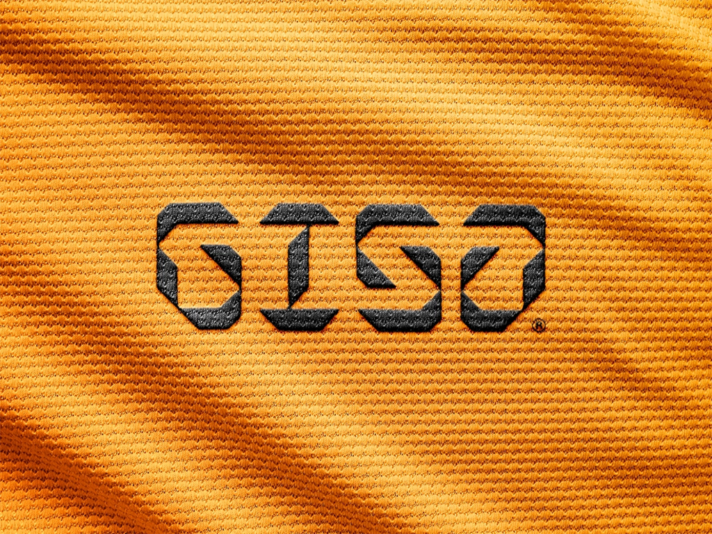
Created by Mase | https://dribbble.com/shots/18722785-GISA
8. Hype

Created by Alen Pavlovic | https://dribbble.com/shots/19583957-Hype
9. Ancor

Created by VORONOI | https://dribbble.com/shots/19284394-ancor
10. Onyx

Created by Olga Vasik | https://dribbble.com/shots/16495522-ONYX
11. Ozone

Created by Milos Bojkovic | https://dribbble.com/shots/18113005-OZONE
12. The Brndhaus PL-ZEN

Created by Mykola Striletc | https://dribbble.com/shots/18918366-THE-BRNDHAUS-PL-ZEN-logotype
13. MNMZ

Created by Faikar | https://dribbble.com/shots/16971352-MNMZ-Minimize-Logotype
14. Zero

Created by Patrick Tuell | https://dribbble.com/shots/16291821-Zero
15. Ciano

Created by Heitor Kimura | https://dribbble.com/shots/4293921-ciano-brand-design
16. Osecure

Created by Ashfuq Hridoy | https://dribbble.com/shots/19253168-Osecure-Logo-Design
17. Modular

Created by Lucas Fields | https://dribbble.com/shots/19952774-Modular-Logotype-Design
18. Gefen Technologies

Created by Benjamin Oberemok | https://dribbble.com/shots/19669983-Gefen-Technologies
19. OpenSorce

Created by Faikar | https://dribbble.com/shots/16650157-OpenSorce-Logo-Design-Concept
20. Icostar

Created by Evgeny Romanczenko | https://dribbble.com/shots/5812636-Icostar
21. Ensage

Created by Zlatko Najdenovski | https://dribbble.com/shots/14470693-Ensage-logotype
22. TabSpace

Created by Tal Shafik | https://dribbble.com/shots/7016132-TabSpace
23. Oversee

Created by Logo Supra | https://dribbble.com/shots/20428422-Oversee-Logotype-Identity-Design
24. ASST.

Created by Mikhail Kostin | https://dribbble.com/shots/16416666-ASST
25. Coto Architects

Created by Lucas Fields | https://dribbble.com/shots/20024253-Coto-Architects-Logo-Design
26. Trick

Created by Typemate | https://dribbble.com/shots/7473813-trick
27. Ellograph CF

Created by connary | https://dribbble.com/shots/14152859-Ellograph-CF-soft-monospace-sans-font
28. Eros

Created by Second Eight | https://dribbble.com/shots/18054336-Eros-Logo-Brand-Identity-Design
29. Vanlo

Created by Andrea Binski | https://dribbble.com/shots/20837828-VANLO-new-logo-design
30. Approach

Created by Emtype Foundry | https://dribbble.com/shots/12476207-Approach-Mono
What Are the Common Styles in Monospaced Logo Designs?
Monospaced logo design, a term that tickles the fancy of designers and brand enthusiasts alike, is a realm filled with character(s) — quite literally! These logos, where each letter stands in its own space with the dignity of a knight in armor, bring a unique blend of uniformity and charm to the branding table. But what styles do these typographic champions wear to the branding ball? Let’s dive into the world of monospaced logo designs and unveil the common styles that make them the belles and beaus of the design world.
The Minimalist Maestro
In the kingdom of monospaced logo design, minimalism reigns supreme. This style is all about stripping down to the essentials, embodying the mantra of "less is more." Imagine a logo so clean and simple that it whispers its message into the subconscious of the beholder. With monospaced fonts, this style achieves an unparalleled balance and symmetry, making it a go-to for brands seeking a sleek, modern identity. It’s the design equivalent of a perfectly tailored suit: timeless, elegant, and always in style.
The Retro Revivalist
The nostalgic charm of the retro revivalist! This style takes a hearty dose of inspiration from the past, blending vintage vibes with monospaced fonts to create logos that feel both familiar and fresh. Think of typewriters, old computer consoles, and the early days of digital watches. Monospaced fonts lend themselves beautifully to this style, offering a throwback feel that’s perfect for brands looking to evoke nostalgia while standing out in the modern marketplace. It's like a retro party where every letter is dressed in its groovy best.
The Geometric Genius
Geometry isn’t just for high school math classes; it’s a celebrated star in the monospaced logo design universe. This style emphasizes shapes, lines, and patterns, using the uniform width of monospaced characters to create stunning visual symphonies. Logos in this category often feel architectural, drawing the eye with their precision and balance. It’s a symmetrical playground where circles, squares, and triangles dance harmoniously with letters, crafting logos that are both visually captivating and intellectually stimulating.
The Tech Trendsetter
In the digital age, the tech trendsetter style is the heartbeat of the monospaced logo design world. This style speaks the language of the future, with logos that embody the essence of innovation, technology, and digital sophistication. Monospaced fonts, with their association with coding and digital interfaces, are the perfect match for tech brands aiming to project expertise, reliability, and cutting-edge cool. It’s where letters don’t the sleek attire of the digital frontier, ready to lead brands into the technological tomorrow.
The Handcrafted Hero
Last but certainly not least is the handcrafted hero style, which brings a personal touch to the monospaced logo design family. This style blends the structured uniformity of monospaced fonts with elements that appear hand-drawn or artisanal, creating a warm, inviting aesthetic. It’s perfect for brands seeking to convey authenticity, craftsmanship, and a personal connection. Imagine a logo that feels like a handwritten note from a friend, standing out for its genuine charm and character in a world of digital perfection.
These common styles in monospaced logo design showcase the versatility and appeal of this typographic approach. Whether your brand is all about the future or fondly remembers the past, there’s a monospaced style waiting to tell your story. So, which style will you choose to dress your brand in?
What Are the Symbolisms Behind Monospaced Logo Designs?
Embarking on the creation of a monospaced logo design is akin to setting sail into a sea of symbolism, where each wave and wind carries deeper meanings and hidden messages. The world of monospaced fonts is not just about uniformity and digital nostalgia; it's a realm brimming with symbolic significance, waiting to be decoded. So, grab your compass and map, dear adventurers, as we embark on a quest to uncover the hidden symbolisms behind monospaced logo designs, infused with a blend of fun and uniqueness that will make our journey unforgettable.
Equality and Harmony
In the kingdom of typography, monospaced fonts are the great equalizers. Each character, whether a humble 'i' or a wide 'w', is allotted the same space to shine. This uniformity brings a sense of equality and harmony to the design, symbolizing a world where balance reigns supreme. For brands, this can reflect values of fairness, unity, and inclusivity, sending a message that, in their realm, every voice is heard and every story matters equally. It's like hosting a roundtable where every letter—nay, every character—is a knight with a seat of honor.
Precision and Professionalism
Monospaced fonts have their roots in the world of typewriters and computer coding, where precision is not just a virtue but a necessity. The equal spacing between characters speaks to meticulous attention to detail, symbolizing a brand's commitment to accuracy, reliability, and professionalism. It's as if each letter is meticulously measured and placed by a master craftsman, ensuring that the final design is a testament to the brand's unwavering dedication to excellence. Imagine a world where precision is the paint, and the logo is the masterpiece.
Modernity Meets Tradition
There's a unique duality to monospaced logo designs, as they straddle the line between modernity and tradition. On one hand, they nod to the nostalgic era of typewriters, evoking a sense of timelessness and enduring values. On the other, they're inherently digital, embodying the forward-thinking spirit of the tech-savvy. This juxtaposition symbolizes a brand that respects the past while boldly stepping into the future, like a bridge connecting two worlds, inviting audiences to cross from the familiar to the unknown.
Clarity and Readability
The clear, unambiguous nature of monospaced fonts ensures that messages are conveyed with crystal clarity, symbolizing transparency and honesty. In a world often cluttered with fine print and hidden meanings, a monospaced logo stands as a beacon of truth, offering a breath of fresh air to those seeking simplicity and straightforwardness. It's akin to a clear, starry night sky, where every star's light reaches the observer undistorted, telling stories of ancient times in a language everyone understands.
Technological Affinity
Given their association with coding and early computing, monospaced fonts inherently symbolize a brand's affinity for technology and innovation. They speak to the geeks, the inventors, the dreamers who gaze at screens, not just as displays of information, but as canvases of possibility. This symbolism is perfect for brands that pride themselves on pushing the boundaries of what's possible, harnessing the power of technology to forge new paths. It's like wearing a badge that says, "Here, we speak fluent future."
Embarking on the journey of creating a monospaced logo design is to weave a rich tapestry of symbolism into the very fabric of a brand's identity. Each element, from the choice of font to the spacing between letters, carries weight and meaning, telling a story that resonates with the audience on a deeper level. So, as you chart your course in the vast ocean of branding, remember that your monospaced logo is not just a mark but a manifesto, a declaration of your brand's values, vision, and voice.
What Famous Brands Are Using Monospaced Logo Designs?
Each logo is a star in its own right, some shine with a distinct light, thanks to their choice of monospaced logo design. These are the trailblazers, setting the cosmos ablaze with their unique identities. But who are these luminaries, you ask? Buckle up, for we’re about to embark on a fun and quirky expedition to discover famous brands that have embraced the charm and charisma of monospaced logo designs.
The Tech Trailblazer: IBM
Leading our cosmic parade is none other than IBM, the titan of the tech industry. With a legacy that stretches back over a century, IBM’s logo is a masterclass in monospaced elegance. The iconic stripes, each standing with the precision of a well-written line of code, embody the spirit of innovation and reliability. It’s a logo that whispers (in a very authoritative tone, mind you) of a brand that’s been at the forefront of technological advancement, making the complex world of tech a tad more accessible.
The Courier Connoisseur: FedEx
Next up, we have FedEx, the courier service that promises to deliver more than just parcels. At first glance, their logo champions simplicity, but look closer, and you’ll discover the ingenious use of negative space between the ‘E’ and the ‘x’ forming a perfect arrow. This subtle nod to precision and forward motion encapsulates FedEx’s commitment to speedy and reliable service. It’s monospaced logo design doing what it does best: combining form, function, and a dash of hidden magic.
The Automotive Ace: Volvo
Steering its way into our hearts is Volvo, the automotive ace known for its commitment to safety and quality. The Volvo logo, with its iconic circle and arrow, is a nod to the brand’s heritage and its forward-thinking vision. The monospaced font used in the logo underscores the brand’s emphasis on reliability, strength, and innovation. It’s a beacon of trust in the automotive seas, guiding customers to a haven of safety and sophistication.
The Entertainment Enthusiast: Netflix
Cue the drumroll for Netflix, the entertainment enthusiast that transformed how we binge-watch. The Netflix logo, with its clean, monospaced typography, is as binge-worthy as the shows it streams. It captures the brand’s dynamic and accessible approach to entertainment, standing out in the crowded marketplace with its bold red background and white lettering. It’s a logo that says, “Your next adventure is just a click away.”
The Space Sentinel: NASA
Last but certainly not least, is NASA, the space sentinel exploring the final frontier. NASA’s logo, affectionately known as the “meatball,” features monospaced typography that speaks to the agency’s precision, expertise, and pioneering spirit. It’s a logo that carries the dreams of humanity to the stars, encapsulating the vastness of space and the boldness of those who dare to explore it.
These famous brands, each a giant in its own domain, showcase the versatility and appeal of monospaced logo designs. From the realms of technology and transportation to the frontiers of space, monospaced logos have carved their niche, proving that in the universe of branding, it’s not just about standing out, but standing firm.
What Are the Essential Tips in Creating Monospaced Logo Designs?
The art of crafting the perfect monospaced logo design—a quest akin to searching for the Holy Grail in the vast kingdom of branding. It’s a journey filled with trials, triumphs, and a whole lot of fun. But fear not, intrepid explorer, for you are not alone. Armed with these essential tips, you’ll be weaving your way through the monospaced maze like a pro, ready to emerge with a logo that’s not just good, but legendary. Let’s dive into the treasure trove of tips, with a sprinkle of uniqueness and a dash of fun, to ensure your monospaced logo design journey is as smooth as a serif-free letterform.
Embrace the Space
In the land of monospaced fonts, every character is a castle, standing proudly on its own plot of land. The key here is to embrace the uniform spacing, using it to your advantage. Think of the space as a rhythm, creating a visual cadence that guides the viewer's eye across your logo. Play with spacing between letters (kerning) and lines (leading) to find the perfect balance. It’s like choreographing a dance for your letters, where each step and twirl is perfectly timed.
Color Outside the Lines
Who says monospaced logos have to play it safe with color? Not us! Injecting vibrant hues or subtle shades can transform your logo from a monochrome monotony to a dazzling display. But wield your color palette wisely; each color should echo your brand’s personality and promise. Think of your logo as a cocktail, where the colors are the ingredients—mix them right, and you’ve got a recipe for success.
Dare to Be Different
In a sea of monospaced logos, standing out is the name of the game. How, you ask? By daring to be different! Integrate unique elements that reflect your brand’s essence. This could be a quirky twist on a letter, a hidden symbol, or a texture that tickles the senses. Your logo should be like that one guest at a party who everyone wants to know—a fascinating blend of mystery and charisma.
Simplicity Is the Ultimate Sophistication
Leonardo da Vinci said it best, and his words ring true in the world of monospaced logo design. The beauty of monospaced fonts lies in their simplicity, so don’t clutter your logo with unnecessary frills. A clean, clear design not only catches the eye but also stands the test of time. Think of your logo as a minimalist masterpiece, where every element serves a purpose, and nothing is left to chance.
Tell a Story
Every brand has a story, and your logo is the first chapter. Use your monospaced logo design to tell that story in a way that resonates with your audience. The font, color, and design elements should all weave together to create a narrative that speaks to who you are and what you stand for. It’s like gathering your audience around a campfire, ready to take them on an adventure they’ll never forget.
Creating a monospaced logo design that dazzles and delights is an adventure in creativity and precision. By embracing these essential tips, you’re not just designing a logo; you’re crafting an emblem that captures the heart and soul of your brand. So, dear designer, ready your tools and set forth on this creative quest with confidence.
What Are Some Creative Ideas for Monospaced Logo Designs?
Monospaced logo designs are like the hidden gems that sparkle with an unorthodox charm. Diving into the creation of a monospaced logo is akin to embarking on a treasure hunt in the enchanting forest of typography, where each letter stands tall, proud, and spaced just right. As we venture into this whimsical woodland, let's uncover five creative ideas that will transform your monospaced logo design from a mere concept into a captivating masterpiece, all the while keeping our journey fun, unique, and brimming with creativity.
Play With Letterforms
Imagine a world where letters are not just characters, but characters in their own right, each with its own story, personality, and role to play. Why not take the individuality of monospaced fonts a step further by altering letterforms to reflect your brand’s essence? Consider a bakery where the “o” is a delicious donut, or a locksmith where the “l” is a sleek, silver key. This approach not only adds a layer of visual interest but also embeds a piece of your brand’s story directly into the logo design.
Integrate Ambigrams
An ambigram is a word that retains meaning when viewed from different perspectives or orientations. Imagine a monospaced logo that looks as engaging upside down as it does right side up. This not only showcases creativity and innovation but also ensures that your brand stands out in a crowded marketplace. It’s like a magic trick concealed within your logo, ready to delight and surprise your audience with each glance.
Leverage Negative Space
Negative space, the canvas of the unseen, holds infinite potential in the realm of monospaced logo designs. By creatively using the space between and around letters, you can unveil hidden elements that add depth and intrigue to your logo. Picture a fitness brand where the space between the “E” and “X” reveals a flexing arm, or a pet shop where the “A” cradles a sleeping cat. This technique not only makes your logo visually captivating but also turns it into a visual puzzle that invites closer inspection.
Create a Visual Rhythm
In the symphony of design, monospaced fonts are the metronomes, providing a steady and uniform rhythm. By varying the weight, size, or color of certain letters within your monospaced logo, you can create a visual rhythm that guides the viewer’s eye and emphasizes key aspects of your brand. It’s like composing a melody where each note (or letter, in this case) plays its part in harmony, crafting a logo that sings your brand’s tune.
Experiment With Vintage and Modern Mashups
Monospaced fonts carry a nostalgic charm reminiscent of typewriters and early digital displays, making them perfect for a vintage vibe. But who says old and new can’t mix? Fuse vintage and modern elements to create a monospaced logo that bridges generations. Think retro color palettes with sleek, minimalist layouts, or classic typewriter fonts intertwined with futuristic icons. This blend of eras not only makes your logo distinctive but also tells a story of evolution and adaptability.
Embarking on the journey to create a monospaced logo design is to explore a world where creativity knows no bounds. By incorporating these ideas into your design, you not only craft a logo but forge a beacon for your brand, one that shines with personality, innovation, and a touch of magic. So, grab your design tools, and let’s turn the ordinary into the extraordinary, one monospaced letter at a time.
Conclusion
Monospaced logo design presents a unique opportunity for brands to stand out with a blend of tradition and innovation. As we've explored, this style is not just about uniformity but about harnessing creativity, precision, and symbolism to craft identities that resonate deeply with audiences. By integrating elements like color, negative space, and visual rhythm, designers can transform simple monospaced text into a compelling narrative. As the digital and physical worlds continue to merge, the timeless appeal of monospaced logos remains clear, offering brands a powerful tool to communicate their essence in an increasingly cluttered marketplace. Embrace the distinct charm of monospaced design to tell your brand's story in a memorable, impactful way.
Let Us Know What You Think!
Every information you read here are written and curated by Kreafolk's team, carefully pieced together with our creative community in mind. Did you enjoy our contents? Leave a comment below and share your thoughts. Cheers to more creative articles and inspirations!




Leave a Comment